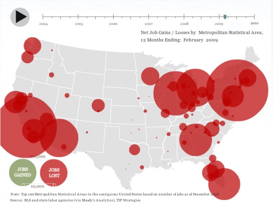
We’ve brought you some fascinating infographics recently, but here’s one that manages to be both awesome and hugely depressing at the same time – and it’s animated too.
TIP Strategies has put it together to show how unemployment has spread across the USA. One click of the Play button and you can see unemployment figures rise and fall in different US cities over the past five years.
While it starts off pretty unremarkable, get to mid-2008 and things turn sour, quickly. As an added bonus you can hover over the different unemployment zones to check figures for individual cities.
Click on the image below to go through to the animated version.
Get the TNW newsletter
Get the most important tech news in your inbox each week.


