Social sharing site Delicious has rolled out a new look as it looks to encourage browsing and content discovery, as the company revealed in a post on its blog.
The original design of the site has been overhauled to place a greater emphasis on images and media, Delicious explains:
We’ve begun a comprehensive overhaul of how the Delicious UI deals with information density and hierarchy, while applying a clean, consistent style. Giving Delicious an interface flexible enough to add new features moving forward was a strong consideration.
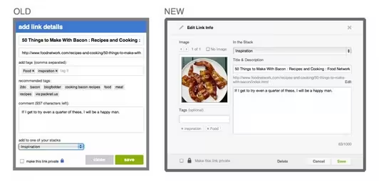
The new version of the link saving page, which users go through in order to add links and content to the site, is more vibrant with an image preview included to ensure that Delicious users pay attention to the photo that will be associated with the link.
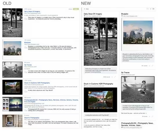
That emphasis on image carries through to stacks, a collection of links on any specific subject, which was introduced during a ‘back to beta’ redesign in September. Items were previously organised in a linear fashion, with the link associated with each image shrunk to fit a standard size, but the new layout gives greater emphasis to pictures.
Other changes to stacks also include more prominent comments from stack creators, “to add a greater level of personalization”, and a more informative presentation and content preview. Delicious has also expanded stacks categories to allow greater content personalisation and discovery.
Delicious will continue to make more changes and refreshes to the site as the blog post, as explained in a blog post authored by lead designer J.T. Trollman and senior software engineer Alex Dong:
Delicious has been a work in progress since the beta re-launch, with our attention primarily on completing the migration from Yahoo!. We’re focused now on innovating Delicious to empower web discovery, and actively building the team and dedicating the resources to make it happen. New features and site updates will start rolling out more rapidly, so keep watching this space.
The changes are very much in line with the new focus on media that has emerged across social sites on the web in response to the growth in web browsing from tablet and mobile devices.
Twitter, for example, began embedding content into timelines, and provided easier access to images and video, some while back, while Facebook’s Timeline feature — which has begun rolling out in New Zealand — is a significant redesign that places more emphasis on content too.
Delicious’ move towards a new more vibrant design and greater content discovery are clearly aimed at encouraging more people to use the site to discover content, in addition to saving links.
The changes to the site come just over six months after YouTube founders Chad Hurley and Steve Chen acquired it from Yahoo in April. The sale price was undisclosed, but speculation during the lead up to the deal suggested Delicious was available for $5 million. If correct, this figure represents a hefty loss on Yahoo’s rumoured $18 million purchase price when it bought Delicious from from founder Joshua Schachter in 2005.
What do you think of the new Delicious? Will the new layout make you use the site more, or even at all? Let us know your thoughts in the comments section.
Get the TNW newsletter
Get the most important tech news in your inbox each week.


