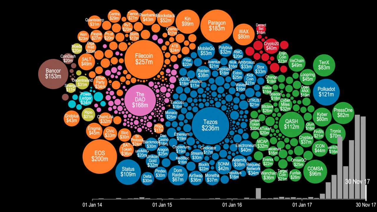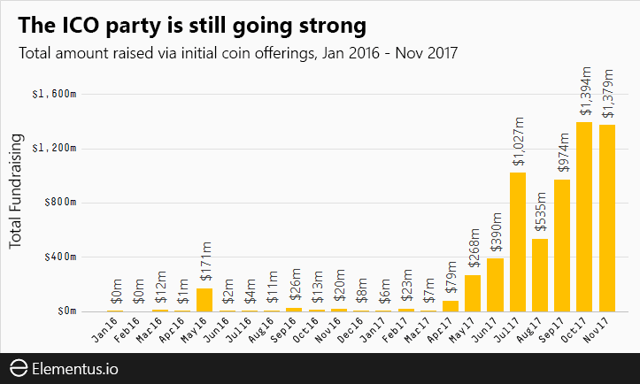
Token sales and initial coin offerings (ICO) were certainly the hottest buzzwords of the year for thousands of recreational cryptocurrency enthusiasts and seasoned investors alike. But have you ever wondered precisely how much money was poured into this trend this year? There’s a visualization that can give you an idea.
Cryptocurrency startup Elementus has compiled a nifty animated visualization that shows every token sale that has successfully raised at least $100,000 since 2014. The graph also displays the entire cashflow that went into these ICOs, with detailed month-by-month information for the past four years.
As you will notice in the video below, following some minor activity for the first three years, all hell breaks lose around May 2017. You can see tens of ICOs kick off around the same time, securing millions in financial backing from cryptocurrency enthusiasts and investors.
Here is the full video:
To put all of this data together, Elementus went straight to the source and collected this information first-hand, gleaning the figures directly from the Ethereum and Bitcoin blockchains.
“We searched for every token, crowdsale, and multisig wallet we could find,” wrote Elementus founder and UPenn adjunct lecturer Max Galka. “We then identified the corresponding owners and added up the total amount of contributed funds – taken either from the blockchain itself or as reported by the fundraiser.”

In case you were wondering, Galka says their efforts estimated that “about $6.4 billion has been raised via ICOs to date” – a sum much larger than the numbers reported elsewhere.
Those curious to have a deeper look into the data can head to this page, where Galka has made an interactive version of the same visualization.
Meanwhile, watch the bubble grow:
Get the TNW newsletter
Get the most important tech news in your inbox each week.


