Whether you think cryptocurrency is merely a passing fad or a phenomenon still maturing into mainstream legitimacy, keeping an eye out on the market is certainly an engaging activity. But it could be quite the hassle to keep up with every alternative out there – unless you use this tool.
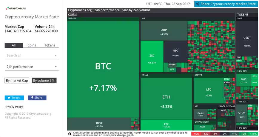
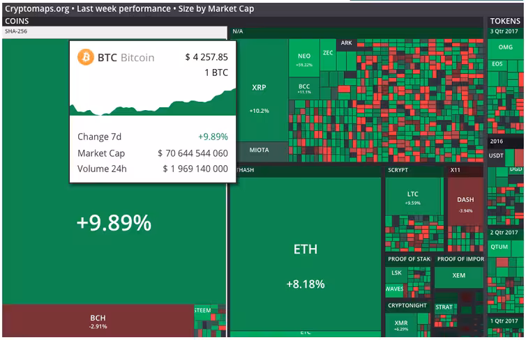
Available for free, Cryptomaps is an interactive heat map that visualizes the current market value and volume of practically any relatively well-known cryptocurrency out there, including Bitcoin, Ethereum, Litecoin, NEO and many more. It’s sort of like Finviz, but for crypto.
Based on your preference, the tool enables you to monitor any changes in the market value and volume during the last hour, day and week.
To see more detailed information for each specific cryptocurrency, simply hover over it and the site will display its value in Bitcoin (or US dollars in some cases), its current market cap, and how its value has fluctuated over the window of time you’ve indicated.

The 💜 of EU tech
The latest rumblings from the EU tech scene, a story from our wise ol' founder Boris, and some questionable AI art. It's free, every week, in your inbox. Sign up now!
Unfortunately, Cryptomaps has yet to clarify where it sources its data from and how often it is updated – though the numbers do seem to coincide with those from other exchange rate sites. We contacted the company for a clarification, but the email unfortunately bounced back (get in touch us here if you see this, peeps).
Head to Cryptomaps by clicking this link.
Meanwhile, those interested strictly in popular crypto alternatives like Bitcoin and Ether should also try out this tool, which displays their ever-changing value in real-time.
Get the TNW newsletter
Get the most important tech news in your inbox each week.