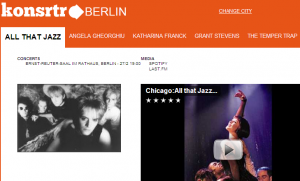
 I am working my way through the new book on search site design, Search Patterns by Peter Morville & Jeffery Callender (O’Reilly), so you’ll be hearing some of my thoughts about this. In fact, I am sending the authors this site as an example of just how powerful the “less is more” design principle can be, as well as spot on color choice. Perhaps they will leave a comment.
Update: And he did! (Peter Morville)
I’m a fan of http://theark.org but searching through their calendar to find shows I might like involves a lot of pogosticking and feels too much like work. In contrast, Konsrtr offers a simpler, calmer experience while providing all the necessary information (date, venue, embedded video).
However, I don’t think they’ll thrive unless they add features. I want to search by artist, limit by venue, and share URLs. By adhering to such design principles as progressive disclosure, they should be able to add more without loosing less.
Simply go to konsrtr and see what you think of its exceedingly plain design. You just type in a city and it brings up the upcoming concerts with some images and videos in sequential order. That’s it. It worked as well for Charlottesville, Virginia as it did for Berlin, Germany.
My question is, how can they allow me to search by artist, thereby bringing up a very different type of search results, and still maintain their cool look and feel? I’ll have to use the feedback box to find out who is behind this effort, but they are smart and talented designers whoever they are. Kudos konsrtr! Now about that domain name…(see this post on RWW)
Get the TNW newsletter
Get the most important tech news in your inbox each week.


