Alexander Huls is a freelance writer whose work has appeared in The New York Times, The Atlantic, Esquire and other publications. This post was originally published on the Shutterstock blog and has been reprinted with permission.
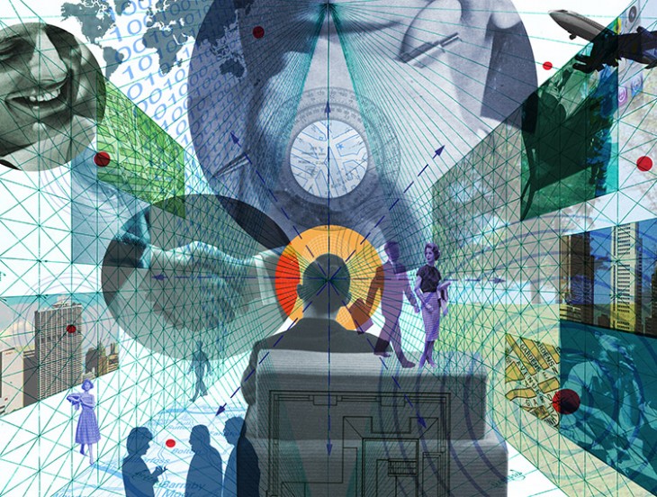
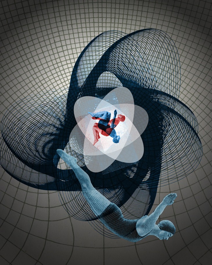
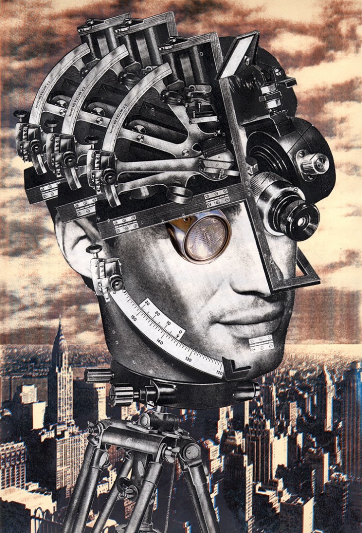
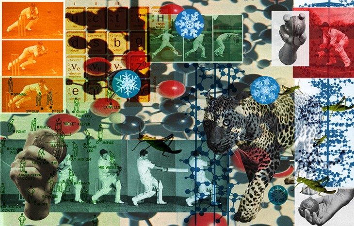
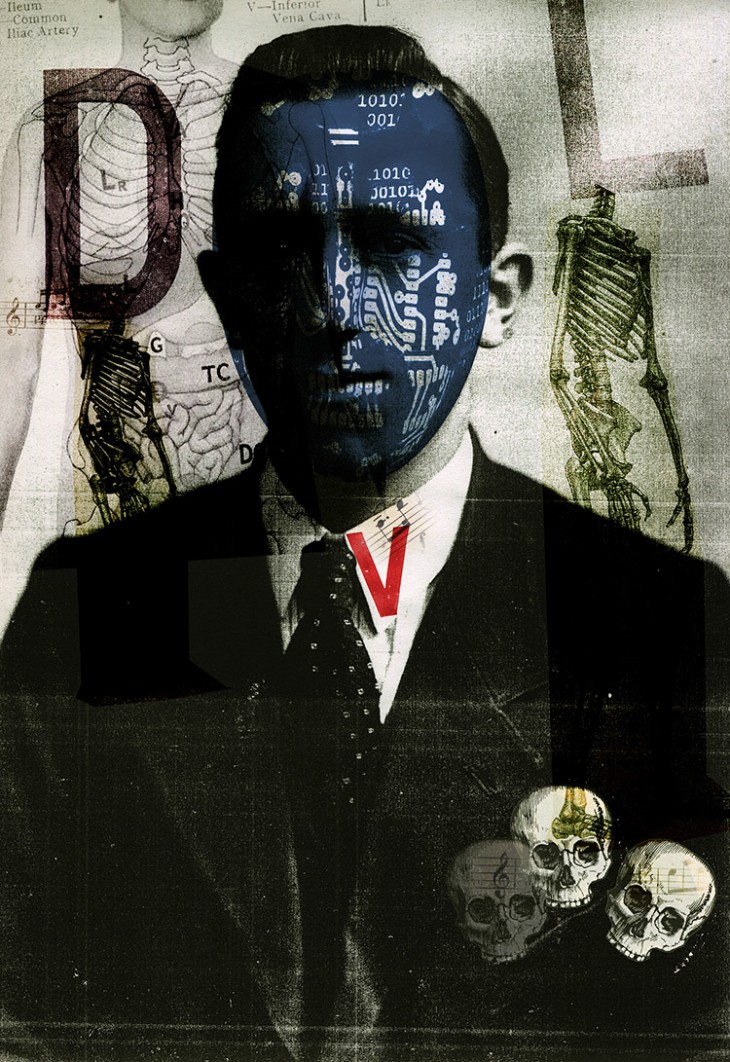
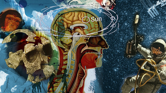
There’s no better word for Darrel Rees‘ collages than “entrancing.” Their rich layers, captivating color schemes, evocative imagery, and powerful use of juxtaposition make you want to stare at them for hours. Rees, in other words, knows what he’s doing.
That’s no surprise, given that he’s been a professional illustrator for 25 years, has produced an invaluable resource on the subject (the book How to Be an Illustrator), and is the founder of illustration agency, Heart. We chatted with the artist to discuss how he approaches the practice of collage. In the process, he revealed several key tips other designers should take note of.
Imagery of heads and faces can be powerful tools
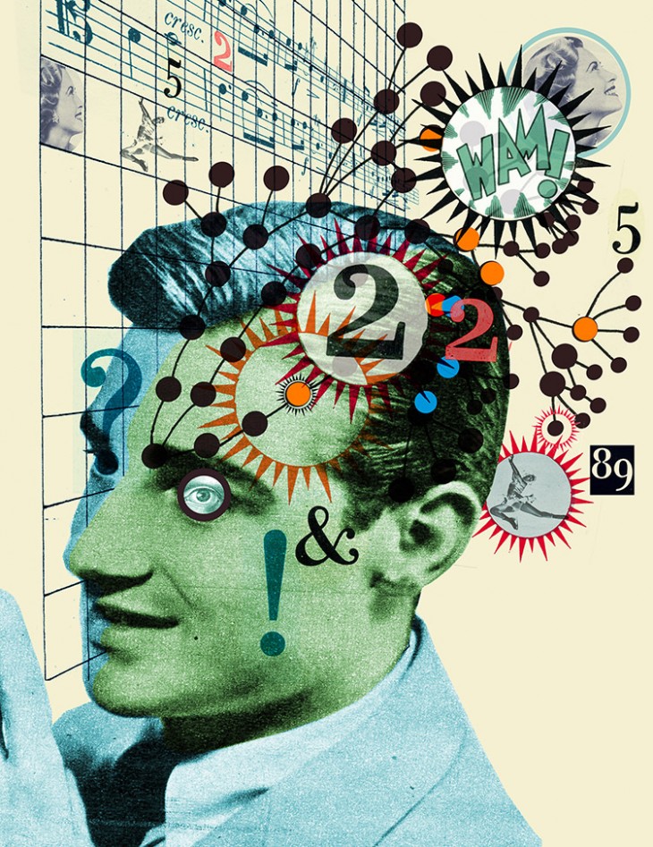
A quick glance at Rees’ work makes it apparent that he has a particular affection for incorporating heads and faces in his illustrations. To him, it’s a useful tool for generating a connection. “It’s an empathetic element that allows somebody to relate to the image,” he says.
“By recognizing the face, it allows you to start reading the image.” From there, the mind can form not just empathetic connections, but connections with the ideas the collage is presenting with its various bits and pieces. “There are lots of juxtapositions of things which create mental, neural connections,” says Rees.
Make sure the art and the ideas it represents work together
Rees does a lot of commissioned work for newspapers and magazines, which means his collages often play directly off the ideas presented in articles. That’s why nudging readers to make mental connections is so vital. To do that, Rees believes it’s about creating a relationship between image and narrative. “Illustrations work in response to a text,” he says. “If you read the text, it should help give you a clue as to why. The text is a way of decoding the image.”
Things don’t always quite work out that way, though. Sometimes Rees finds himself facing assignments where a client doesn’t understand that symbiotic relationship. “I really hate doing collages that basically try to say everything that’s in the text,” he says. “My usual argument with art directors is, ‘To create a whole, the elements are supposed to work together, not say exactly what it says in the text.'”
Always be hunting for materials
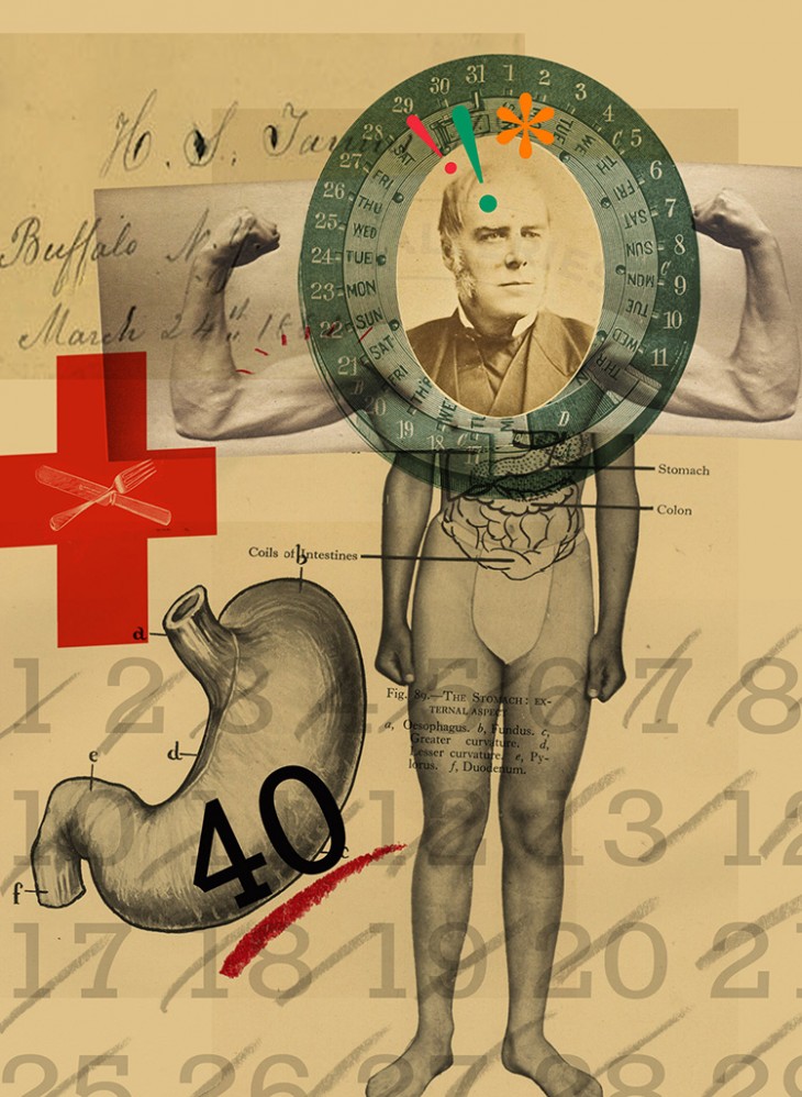
Given that a lot of Rees’ work involves nostalgic imagery from the past — such as old newspaper and book clippings — that means he has to put in time building a catalog of materials to potentially use. “I hunt for stuff all the time,” says Rees. “I’m constantly in secondhand bookshops and junk shops looking at magazines from the ’30s and ’40s for any scraps and bits and pieces that appeal to me. I try and file them, and then when it comes to it, I can start pulling things together from different places.”
It never hurts to mix old and new methodology
When Rees first began putting collages together, he did it physically. “I would work under a big piece of glass, and I would cut things out. I’d go get things photocopied in lots of different sizes, come back to the studio, and cut them all out so I could change the size. I’d cut the same image out five times in different sizes. Then I’d slide things around under glass for the week I had to do the job, and only start gluing it down at the last minute when I finally made a decision.”
Now, he puts collages together with layer-heavy digital files (“I end up with files that are 40 layers deep”) and by scanning elements and changing sizes without having to photocopy over and over. Which isn’t to say he doesn’t sometimes still incorporate the physical approach. “Some of it is scribbling and photocopying first to get a bit of texture and pattern. Some brush marks and pencil marks and drawings over the top are actually done on paper, scanned in, and then laid into the image.”
Old clippings aren’t indulgence — They have a purpose
Given how frequently nostalgic elements are used in collages these days, it can be tempting to write them off as a shallow visual trend. But Rees sees the pieces he finds in old books and magazines as possessing more power than that. “The slightly nostalgic feel of the images can be reassuring when you’ve got ideas that are actually quite revolutionary,” he explains.
That’s mostly true when he’s doing commission work for magazine articles. “The ideas that the pictures are carrying are much more modern and contemporary, even futuristic. So maybe it’s a way of — not exactly candy-coating — but a reassuring way of introducing new ideas. It’s not the shock of the new.”
If you’re an aspiring illustrator, don’t contact pros like this…
A big reason Rees agreed to work on How to Be an Illustrator was to provide, as he puts it, “no bullshit” practical advice to aspiring artists. One of his big tips? Think twice about how you approach professional designers for help or insight. “I have students contacting us all the time, and their social interaction skills are virtually nil in many cases. It’s all about what they want. They don’t think about the person they’re writing to or contacting.”
So what should students and aspiring illustrators keep in mind? “I tell these people, ‘Look, you’ve told me what you want from this situation in contacting me. But really you need to think about your audience.’ If you’re contacting a busy art director, you need to think about how he or she thinks, how you’re going to help them get through their day.
And if you want to show them some work, you need to ask them first. Just because you’ve got an email address for them doesn’t give you the right to just pop up straight in front of their face with a whole portfolio of images that they have to take time to download. It’s basic courtesy to ask if they’re prepared to see the work this way.”
Maximize the possibilities
Not all collages are created equal. Given their juxtaposition-heavy nature, it can be easy to just take a variety of different elements and slap them together without much thought. That, to Rees, represents the shallow end of collage illustration.
“For me, that’s a bit like a splatter gun. You throw a load of thematic elements together and it doesn’t matter how they land on the page.” The result, he says, are collages that miss out on the style’s potential. “If it’s only vaguely visually exciting because it’s all messy and jumping around, it isn’t a controlled piece of directed communication. It isn’t actually talking.”
A collage needs a cornerstone
“If you’re doing a physical collage, you’ve got much more chance to throw in a degree of randomness and accident,” explains Rees. “You could put some glue on something and literally throw it onto the board, and it sticks where it sticks. Then it’s like, ‘Okay, so that’s landed at that angle — that’s the kind of fulcrum around how the rest of the image works.’ And you build on that.”
With computers, there’s a lot more deliberate placement. “You have to place it, move it, and try and get the most dynamic composition. You move things around how you want them.”
But it’s worth remembering the randomness and finality of the physical approach to get yourself going. “At some point, you have to put one thing down. Then you’ll go, ‘Okay, that’s the cornerstone.’ You’ve put that in. On top of that, everything else can move around until it works.”
All artwork © Darrel Rees
Get the TNW newsletter
Get the most important tech news in your inbox each week.
