Circa, a news reader app for Android and iOS that breaks important stories down into bite-sized chunks, has undergone a massive overhaul in terms of its design and user experience.
Articles are still written by Circa’s in-house team of editors and are constructed from “atoms” that include sentences of reportage, quotes, photographs and graphics. However, almost everything else about the app has been tweaked.
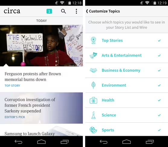
For starters, the navigational menu which offered streams of stories for topics such as technology and health has been removed. Instead, Circa has opted for a single feed that contains all of its news topics; to curate the experience, you’ll need to dive into the settings and manually uncheck unwanted categories.
While sorting the feed takes a little effort, the end result is a simpler users experience that requires fewer taps and swipes to glance over multiple topics.
On the Wire
Circa’s biggest change is the introduction of an area called Wire. It consists of two parts; a Daily Brief and the latest updates to stories you’re following.
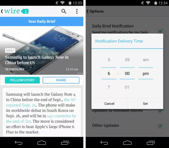
As its name suggests, the Daily Brief is a single snapshot of what Circa considers to be the most important stories of the day. You can set any time to be notified, and the contents of the Daily Brief will be updated automatically in real-time. So if you have five minutes in the morning while you’re eating breakfast, but have an evening alert set up, you can still dive in and start reading.
As with the main feed, you can also choose which news sections are included and excluded for the Daily Brief. If, for instance, you only care about sports, you can just uncheck everything else Circa has to offer.
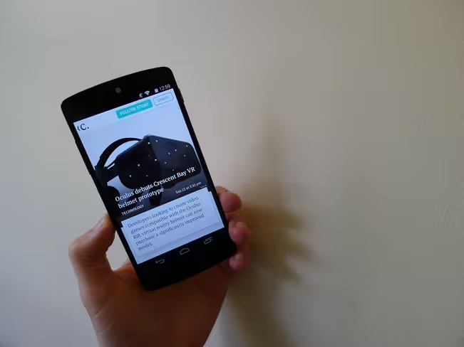
The Daily Brief also increases the amount of space given to each story. A headline is positioned on top of a letterbox photo, followed by an extract from the article and usually some form of graphic. Shortcuts then allow you to follow the story for future updates, read it in full or share it with other people.
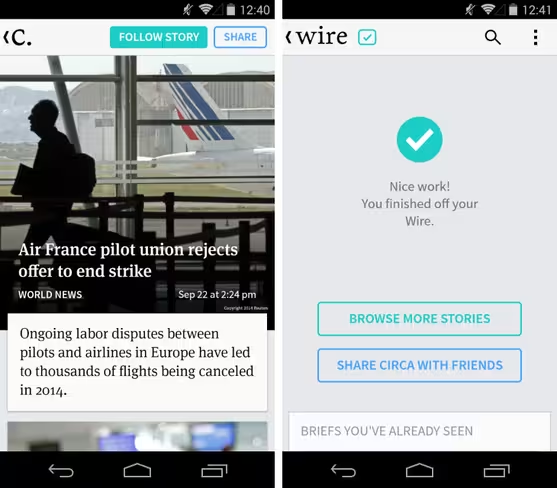
Each brief contains between 10 and 20 stories and as you scroll through the feed, a number at the top displays how many are remaining. When you get to the bottom, you’ll see a green tick and “Nice Work!” message that provides a sense of completion. “Because news is by nature endless, we felt it would be nice to have a feeling of accomplishment when you were done reading the things in your Wire,” Matt Galligan, CEO and co-founder of Circa said.
The second part of Wire is concerned with story updates. If you’ve chosen to follow certain reports and Circa adds new information to them, you’ll see these snippets first when you open up the Wire section. While Circa has offered the ability to follow stories in the past, in this version they’ve been redesigned as a simple, vertical stream of news updates.
Finally, search
The flow of Circa is now split into two experiences: Wire, which is essentially an inbox or newsletter for catching up with the most important stories, and the central feed, which is tailored for longer sessions and spontaneous reading. To aid in the latter, Circa is finally introducing search to its app.
The company says it’s the most requested feature from users. With the removal of story streams for specific news sections, it’s never been more necessary too. I frequently find myself punching in a few keywords to see if Circa’s team has covered a story I remember spotting in my Twitter timeline.
Notifications
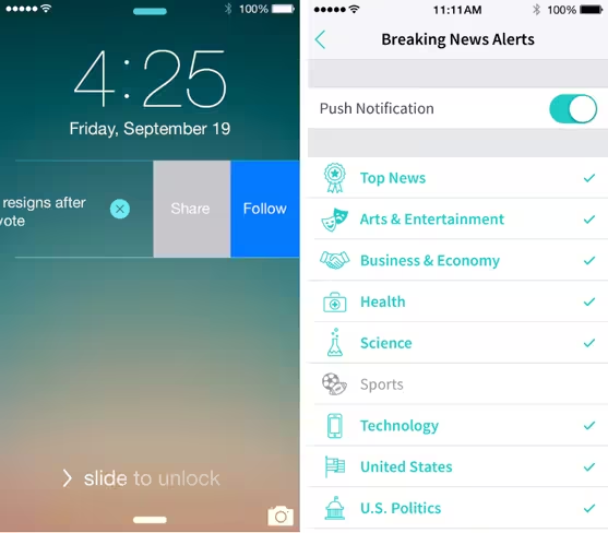
Many news apps offer notifications for breaking stories. Circa is no different, but stands out with deeper customisation options. You can now choose which topics you’re interested in (and remove the ones you couldn’t care less about) while still receiving alerts for the specific stories you’ve chosen to follow.
Notifications are also actionable. So without opening the app, you can now choose to follow stories for additional push notifications, or mark them as read so you can easily dismiss them inside the app. “It sounds crazy, but you can almost use Circa completely from notifications,” Galligan added.
The bottom line
The elements that make Circa so special still remain. The way the app packages stories, with fresh writing and curated “atoms” of information, is designed specifically for mobile consumption. If you want to catch up with the news while you’re out and about, it’s still one of the fastest and simplest ways to do so.
But following apps such as Yahoo News Digest, Circa is clearly rethinking when and how people use its app. Most people probably dip into Circa once or twice a day, with consecutive visits for breaking stories and updates to articles they’ve chosen to follow. Wire is tailored for this behavior; rather than rooting around through different sections and stories, everything is rolled up in a single location. You can stay abreast of what matters most in one session – the Daily Brief – or hunt for more stories if you have some time to kill.
With the brief updating in real-time, Circa is also providing greater flexibility than some of its competitors. It’s a potent combination and could resonate with the millions of commuters and businesspeople looking for the fastest way to keep up with the world’s developments.
➤ Circa (Android, iOS)
Get the TNW newsletter
Get the most important tech news in your inbox each week.
