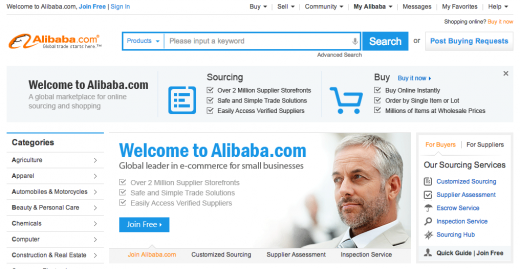
Chinese B2B ecommerce site Alibaba.com is showing off a redesign of its homepage and will gradually be introducing the new look across the site by the end of this year.
The redesign cleans up the page, allowing users more room to breathe while modernizing the look, but it’s all fairly subtle. Frankly, the site hasn’t changed all that much since it launched in 1999, so even small adjustments are welcome. Maybe it’s just me, but the page does bear a certain resemblance to another successful ecommerce player.
Company blog Alizila noted a new navigation bar with drop-down menus and rotating banners as some of the site’s new bells and whistles. According to Maverick Fang, a member of Alibaba’s international marketing team, the whole site is “gradually being overhauled” with the new design tone. In addition to the homepage, a few other pages, such as the user guide and the US channel have been updated as well.
“The home page is 90 percent finished, but we are changing more pages on the site according to the new design, hoping to launch all of them before the end of 2012,” Fang said.
Alibaba underwent a dramatic corporate restructuring earlier this year. Last month, it spun off Aliyun, its cloud-based operating system, as a separate company. It has also reached an agreement with Yahoo to buy back its stake in the company and has completed the initial stage of it.
Buoyed by the strength of the company, Jack Ma, Alibaba’s founder, climbed up to the 11th spot on Forbes’ list of the richest people in China.
Image credit: MIKE CLARKE / AFP / Getty Images
Get the TNW newsletter
Get the most important tech news in your inbox each week.


