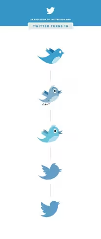
The Twitter bird is instantly recognizable as a tech entity and social platform. It wasn’t always the way you find it now, and actually went through some awkward phases.
In celebrating a decade of existence, Twitter shared a brief look at the iterations it undertook over the years. Over time, it’s gained and lost hair, feet, lighter belly feathers and eyes.
The second two iterations look like some weird Hanna Barbera takes on Twitter, but we’re sure the company had its reason for being weird.
Say what you like about the design, the little blue bird was always easy to identify, and you knew what it represented. Even when it got weird, the bird was successful branding.
Get the TNW newsletter
Get the most important tech news in your inbox each week.