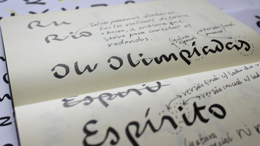
Although the 2012 London Olympics have yet to begin, planning for Rio 2016 has been underway for quite some time. Now, just as the four year clock starts ticking, the upcoming event’s custom typeface is now complete.
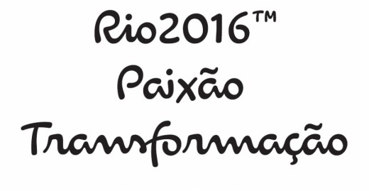
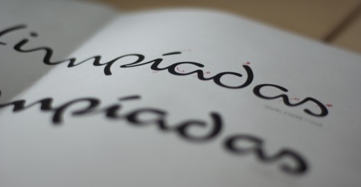
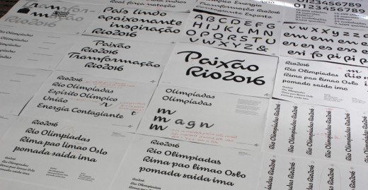
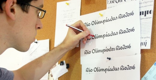
Created by Dalton Maag, the same designers behind Nokia’s Pure typeface, Rio 2016 is a surprisingly gorgeous and unique brush script. It’s fluid and consistent, but maintains a strong personality. More than anything else, it just feels right.
Check it out below:
The official statement on the design:
The design of the Rio 2016™ font depicts the essence of the Olympic and Paralympic emblems: Passion and Transformation. The boldness of this creation is not only in the design – whose contrast between thick and thin was understood while touching the paper with the brush –, but also in its importance for the design market in Brazil: the Rio 2016™ font is one of the few proprietary tipographies created by a Brazilian team.
This face, of course, comes in stark contrast to the London 2012 logo and typography, which you can see here. For more, check out Rio’s official page on this typeface via the link below:
Sources: Design Week & imjustcreative
Get the TNW newsletter
Get the most important tech news in your inbox each week.
