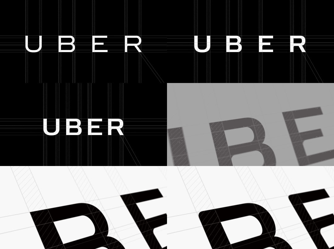
Recently, global transportation giant Uber made headlines for drastically changing the look and feel of the entire brand. One of the main topics of debate was the complete redesign of the familiar logo. While some fans expressed their love for the new colorful look, most of the internet responded with a raised eyebrow. Even Uber drivers seemed disappointed.
But people will adjust, and a change in logo is not what makes them stop using the service.
Reading this you’re probably asking yourself why developers even do this at all. Why change your app, knowing brand recognition is important?
In some cases, an overall rebranding process is necessary to refresh the look and feel of the company’s visual presence or signal a change in direction or approach. In some cases, apps that are released in a hurry with a less-than-perfect look and feel to the brand, need to rebrand to catch people’s attention and ultimately secure more downloads over time.
You don’t need to read all the reports and opinions about Uber’s app logo change to recognize the power of the app logo and its effects.
Instead of fearing it, many companies embrace this power, and alter their app logos as part of their App Store Optimization (ASO) strategy. They engage in vigorous A/B testing in an effort to generate more organic downloads and to find a logo that doesn’t only suit the brand, but one that matches the target market.
Spot the differences
Sometimes it’s the tiniest differences in design that can make the biggest difference in downloads and revenues.
Take for example two nearly identical apps that launched roughly at the same time. ‘Tiny Flashlight + LED’ and ‘Color Flashlight Free’. The first has over 100 million downloads, while the second has less than half of that. Makes one wonder what could cause this difference, if the apps are practically identical in functionality.
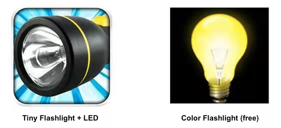
While there could be other variables (like app promotion ads) that affect this gap, let’s focus for a moment on the subtle differences between the app logos.
Both Google Play and Apple iTunes have grey backgrounds. So a more colorful and vivid logo is likely to stand out more. Since according to research, 73 percent of users discover apps via the app store, the more eye-catching an app’s icon is, the more likely it is to get downloaded.
In this case, the first icon is a 3D render with vivid colors and rounded corners. Since this app offers a flashlight, it’s also important to keep the icon bright to exude brightness and clarity, creating in people the sense that it’s the best and brightest option.
Pushing the envelope – MailWise
Understanding the importance of these subtle differences in app logo designs is paramount to ensuring that your app stands a chance in such a crowded marketplace.
One of our clients, a smart inbox app developer, asked us to experiment with the app logo to increase downloads. We conducted a series of A/B tests with three logos: the app’s original logo (A), a 3D render of the logo with more vivid colors (B) and a third option that included only a 3D render of an envelope without the app’s name.
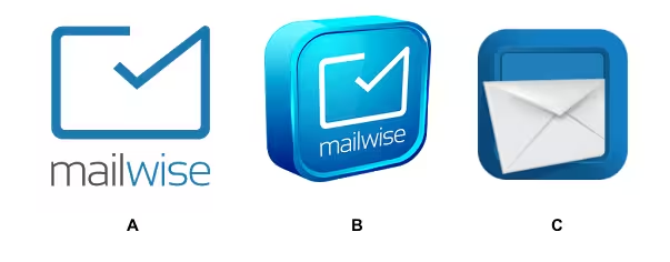
We compared the performance of the three logos over three weeks, and it was easy to see that option C was clearly a winner.
The performance range was significantly better than version A by a minimum of one percent and up to 8.2 percent. The performance rage of Option C was also better than Option B, one by 2.5 percent and up to 4.9 percent.
Keep it Colorful
Despite the initial criticism of Uber’s new app logo, its colorful and sophisticated design, much like our option C, is likely to attract more attention than the old familiar black design. And over time, Uber will see the effect of the app icon change in download volumes.
In our experience, a simple, eye-catching and vivid icon can really help an app stand out and distinguish these products from all of the others on offer – making them more likely to hit that all-important download button.
Get the TNW newsletter
Get the most important tech news in your inbox each week.
