The Content Standard (TCS) is the content hub within the much bigger Skyword, a company that helps marketers create and implement effective content marketing strategies.
One day, the TCS team realized that, though they were preaching about the best practices in content marketing, they weren’t exactly practicing it themselves.
So, they decided to relaunch their site to better reflect what they had been teaching all along and what they would learn. In that spirit, a few months later, they decided to document everything in a series where they’d discuss everything they learned during the relaunch.
One such element they include in the series is the influence user experience had on their design process and decisions.
Outlining their process, Ted Karczewski says that the UX is important primarily because:
- It determines how long a user stays on your website and the number of goals they complete, and
- It has an effect on ranking. In fact, SEO is now better defined as Search Experience Optimization (SXO), first introduced by Google’s Matt Cutts in 2012.
Karczewski admits that at first they weren’t sure what they wanted their site to look like. They knew they wanted a sustainable design that also could help them increase the search visibility around Skyword, as a brand.
They came up with a three-stage process to help them.
First, they researched the important elements needed to help cater for the SEO aspect of their ideal website design. Second was the aesthetics. For this, they got inspiration from other content publishing sites in their niche that they liked and frequently visited then noted the best qualities. Lastly, they knew they needed a responsive design alternative to help them capture the mobile audience. So, they worked to achieve that too.
Here are the stages:
Stage one: Recognizing the effect on SEO
Besides creating a great experience for your digital visitors, you have to make sure that the site is also optimized for search when it goes live. Great UX designers work to find the sweet spot where the design balances SEO with UX.
To create a compliant design, TCS referenced Google’s 2012 page layout algorithm and its 2014 update. Google explains, “Rather than scrolling down the page past a slew of ads, users want to see content right away. Sites that don’t have much content ‘above-the-fold’ can be affected by this change.” The 2014 update however, warns against having too much content above the fold.
In line with these guidelines, TCS looked at some of the top publishers and realized that many of them had highly visual websites with blog images consuming much of the above-the-fold space. They were concerned that this would cost them and reduce the SEO value. Also, they were afraid that users wouldn’t respond well to having to scroll too much before they could read the content.
These, Karczewski says, are the two most important SEO-based questions you’ll have to ask yourself when designing or redesigning your website. And considering there is no clear answer out there, you just have to go with an opinion––your own opinion.
So, how did it go for them? Did it work?
Karczewski says that they haven’t noticed any SEO consequences stemming from their decision to have a visual-first approach. From a UX perspective, however, he says they noticed higher bounce and exit rates and had to run split tests to know if they needed to reduce the image size to present their content higher on the page.
Version one: 

The 💜 of EU tech
The latest rumblings from the EU tech scene, a story from our wise ol' founder Boris, and some questionable AI art. It's free, every week, in your inbox. Sign up now!
Version two:
 He says that had they conducted a usability test before launching the site, they probably would have tweaked the design for a better user experience right from the beginning.
Using software like Crazy Egg and Olark, you can get the data you need to make informed changes to a more functional website.
Stage two: Choosing the design theme
Another challenge that the TCS UX team faced was when deciding on the design theme. They had two choices, which you too will have: Try a new design style that could make them stand out or follow a proven model.
They decided to go with a trusted and trending design style. The style, he says, helps make articles more click worthy as it allows one to use bigger images.
The digital design is also customizable letting them manipulate content above the fold so the most relevant and trafficked content constitutes most of what visitors see. This way, they were able to operate in the controlled environment, without compromising on the content prioritization and amplification. Also, once they were at a position to offer more site maintenance, they would be able to account for user personalization to grow their website’s traffic.
But not so fast.
Before they began their sketch and mockup of the website, they first had to think about what the marketplace would perceive them as:
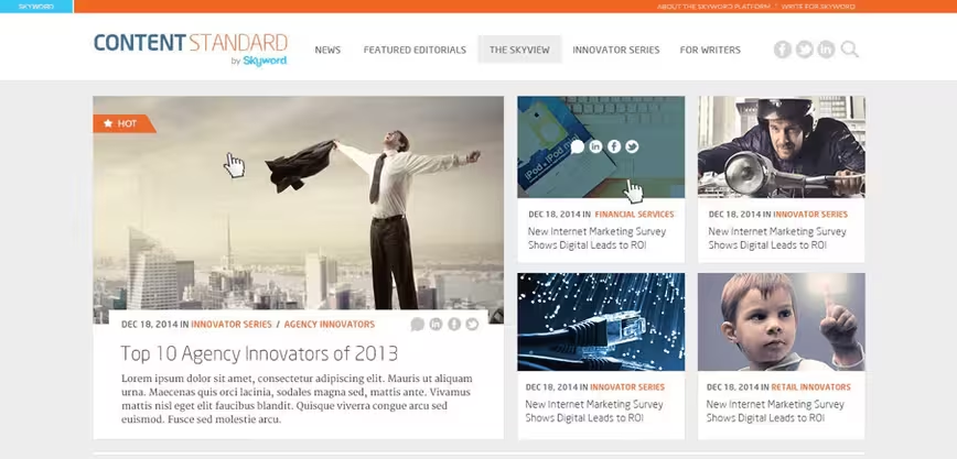
First, they wanted to establish themselves as a credible news publisher, independent of the bigger Skyword brand. The design would play a big role in this. Originally, they had wanted to ensure no mention whatsoever of Skyword to ensure that it had no influence in their credibility. However, after careful thought, this is what you’ll see now:
Second, they wanted to know how far they needed to go in detaching themselves from the traditional Skyword branding. And how would it affect their image. To reflect better representation of the brand, they had to change the template and color palette.
They created two versions of the site. One had no Skyword colors and imagery while the other had brand-alignment.
vs.
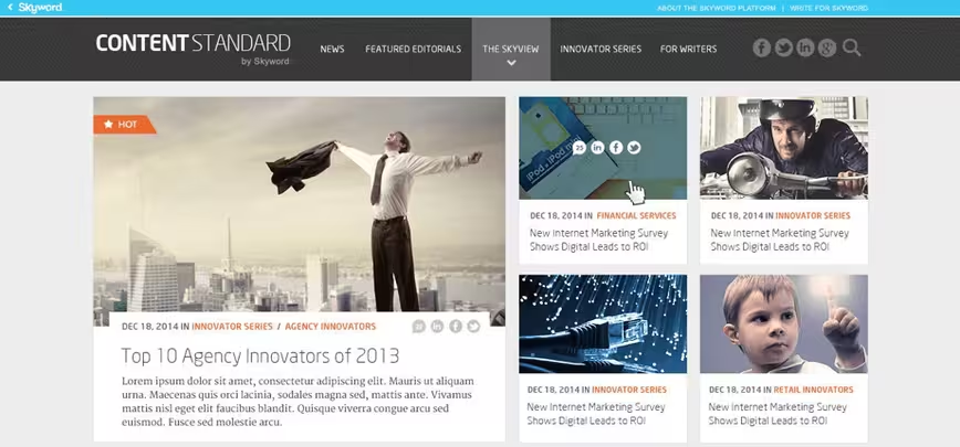
Guess which one they decided to go with.
Stage three: Launching the responsive design
Nowadays, you can’t afford to offer a static version of your site to all users. You have to cover all devices. And TCS knew that after launching the desktop version, they wouldn’t wait long before launching the responsive version.
With responsive web design, your content is automatically adjusted to fit any device that the user is on when accessing your site. And this is how to win the mobile market.
Karczewski says that within two weeks of launching the responsive design, mobile engagement increases steadily.
- Three percent increase in time on page.
- 2.6 percent drop in bounce rate.
- 9.35 percent in exit rate.
Despite the impressive results, they had to keep testing to know if there were any more tweaks needed.
Karczewski says they learned that the UX requires constant monitoring and that work is never over. Content marketing is much more than the content itself. You have to create a great experience for your readers if they’re going to engage with the content.
Get the TNW newsletter
Get the most important tech news in your inbox each week.