UberMedia announced and launched its new social network and sharing service Chime.in this week. We took a dive into the site and its features, and it’s difficult to not compare it to Twitter immediately. That’s not necessarily a bad thing, although the company has an obvious uphill battle to fight.
UberMedia has raised $26.6M to date, compared to Twitter’s $1.16B.
The strength in Chime.in is that it prompts you to categorize your “Chimes”, before you post. Right now, the only categorization on Twitter is the community created hashtagging system. With a lot of content to wade through on Twitter, UberMedia decided to make Chime.in more structured, and it might be a smart bet.
The site is currently in beta, and I found it to be slow loading and difficult to use at times because of that. We’ll give UberMedia the benefit of the doubt for now, since it has the beta tag attached to the service.
Chiming in
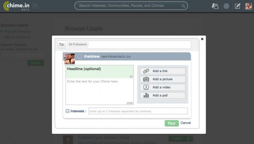
Creating a “chime”, which is basically a tweet with a payload of a link, photo, or video, is pretty simple to do. UberMedia even added an integrated polling system into the mix, which is something Twitter users have to rely on third parties for.

The smart move here was to offer structured media sharing, so that you can later search on all shared photos, videos, and links. On Twitter, a link is shown in a sidebar if it’s a photo or video.
Your Chime.in profile
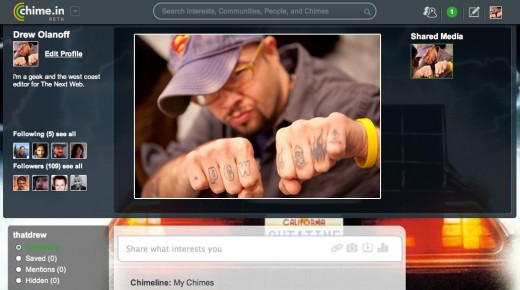
The Chime.in profile is a hybrid of Twitter, Google+’s, and Facebook’s new Timeline. In fact, Chime.in calls your profile your “Chimeline”. You can customize your background, and the latest photos or videos you’ve posted are shown at the top. The page is rather busy, but the interesting part is that the categories you’ve posted about are listed on the left hand side, so followers can see what you’re into immediately without having to read through the content.

Any user can comment on your public posts, which is more Google+ like than Twitter.
Communities
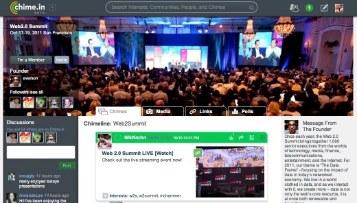
You can create or join Communities, which are basically forums of content about one specific thing. They’re very similar to Facebook pages, and are perfect for a brand or event. Discussions about a specific community are streamed and shown on the left hand side of the page, again, giving Chime.in a more structured feel than Twitter, and even the search driven Google+.

Adoption
For Chime.in, this will all come down to adoption. When looking at a list of popular “Chimers”, yes users already have a nickname, you’ll find Ashton Kutcher, who is extremely popular on Twitter. He currently only has 1,959 followers on Chime.in. If Kutcher and brands like E! can find a content sharing strategy that is different from their Twitter or Facebook Page strategies, perhaps the company can draw a crowd at Chime.in, and that’s exactly what UberMedia needs to compete.
With Sean Parker already saying that Facebook’s worst enemy is losing power users to services like Google+, Chime.in launched at the right time.
From what I’ve seen already, I don’t predict power users dedicating most of their time to Chime.in, as there just isn’t enough for them that makes the experience different than Google+ or Twitter.
It will be interesting to see how Chime.in plays into the broader advertising and content sharing strategy of UberMedia, especially with adoption of partners and advertisers themselves. The company has been clearly watching Twitter closely and has purchased services like Echofon and UberTwitter, who found themselves in trouble after Twitter slowed down its API for third parties.
Will it draw that crowd of power users in time, though? We will see. Sign up and “chime in”.
Get the TNW newsletter
Get the most important tech news in your inbox each week.


