
Javier Sanz is a marketer at Woorank.
After going viral with one of my personals posts, a growing community of Web designers pointed fingers at my site because I was using an aggressive pop-up to grab emails. It’s a similar method used by sites like NYTimes, Forbes or Quora.
Here are some of my findings based on the data collected from 21,000 unique visits.
From the beginning…
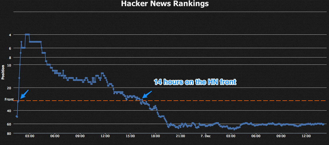
Earlier this year, one of my posts about my experience working on remote +1200 hours in 2012 got featured in Wired, BuzzFeed, Jezebel, and HackerNews. In other words, this meant a huge traffic increase.
If you are a data freak and want me to be more specific:
- 14 hours in HN front page
- 11 minutes server downtime
- 21,062 unique visitors
- 1 mom that still is trying to understand what is a “news aggregator”
When I wrote the post, I conceived it as a way of engrossing a list of people interested in my experience working on remote. Having an audience interested in a certain topic, makes it way easier to write content about it:
You know the audience > You know what you can write about & what they want to read > You just need to give it shape.
Nothing new under the sun, right? Patrick McKenzie and Nathan Barry – among others – have talked widely about the benefits on growing up an email list that can help to target your audience.
For that purpose, I implemented several email signup forms through the text in order to give the opportunity to the readers to receive more selected and detailed info via email. Signup forms between paragraphs, non-interrupting the reading flow… if you want a descriptive term for them, lest say ‘user-friendly signup forms’.
The plugin I used for it was a simple one created by an indie developer to grab emails from WordPress blogs by using the Mailchimp API.
As soon as I saw the post started to rank in HN, I decided to implement a side-product we are working on, in order to give it some promotion and try to have feedback about it and gain some traction.
First complaints: I was being “intrusive”
Among all the comments received in the HN thread, there was one topic flourishing faster than others. It was not something treated in the post, but about the layout that helped me collect some emails of readers interested in further info about what I was writing about.
Some even took to Twitter with a direct allusion to this post where its author stands for avoiding the use of this new ‘wave of second pop-up war’ because they don’t contribute to the user experience, but obstruct it.

The tool that most people referred as user-hostile is the one my colleagues Gary and Alex are working on. It has a feature that allows you to expand a layout once a visitor access to your site, encouraging them to share their email in exchange of something (a .pdf, a discount, whatever).
It’s not setup by default, and it’s up to you if you want to use it. If you don’t decide to use this feature, you will see just a top bar with a layout that you can hide by clicking wherever in the page.
 On one side, I’m conscious about how annoying can it be to have these kind of layouts in every website you visit. If you work with a laptop and Internet, I’m sure you are experiencing them as much as I am.
On the other hand, I also know that it is increasingly difficult to grab the attention of an Internet user. The Web is so overwhelming that you need to make sure that he person behind the computer (no matter if it is just a visitor, recurring reader or user) is aware of what’s your final goal.
Mine, as I have expressed above these lines, was growing an audience.
Numbers don’t lie
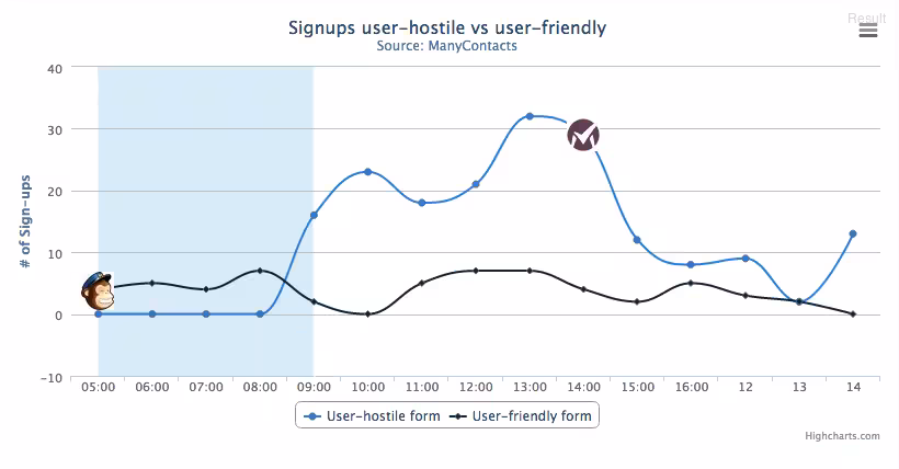
The difference between user-friendly and user-hostile signups speaks for itself. In the first four hours, there were only user-friendly signups forms – email signups forms between paragraphs.
But in the first hour of having both kind of forms, the ‘user-hostile signup’ provided almost three times the signups in respect to the other.
 Perhaps this isn’t a huge figure of signups. That’s not what matter for me in this case. I’m more concerned with how many visitors didn’t sign up cause they were annoyed because of the aggressive layout.
Was it dissuasive? Did the visitors understand that there was content behind the layout?
Hostile vs. friendly
In order to find an answer, I installed a heatmap tracking tool. For those unfamiliar with heatmapping, let’s say it tells you how your visitors (users, readers, whatever) interact within your website: where they click, where they hover their mouses, etc.
I’m sure the picture will be more illustrative than my explanations:

The image above illustrates how 500 of the visitors clicked within the post and its layout. A 500-visit sampling heatmap above the fold, the visible part of your website if you don’t scroll.
The results are somewhat like a forecast map: Areas highlighted in blue represent clicks, and if there were many clicks in one specific area, it will be coloured yellow, passing by a green-gradient.
As you can see two spots in the top right corner stand out from the rest of the clicks. Essentially both spots match up where the close buttons are located.
Around 80 percent of the clicks were made wherever above the fold, the button that deactivates the layout for the current visit and any future visits you make to the site.
After being “hostile” to 21,000 readers and seen these data, my question is: Is this the best way of grabbing your future attention if it’s done to create useful content for an audience pre-interested in it?
As content marketers and consumers, I’d love to hear your thoughts.
Get the TNW newsletter
Get the most important tech news in your inbox each week.