Boris is the wise ol’ CEO of TNW who writes a weekly column on everything about being an entrepreneur — from managing stress to embracing awkwardness. You can also get his musings straight to your inbox by signing up for his newsletter!
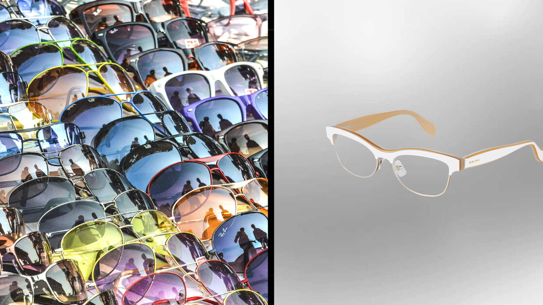
On my way to work, I pass two eyewear stores. They both have a large store window. The first one shows off all the major brands with models wearing sunglasses and normal glasses. They change the setup once a month to keep things lively, and in the winter they focus more on prescription glasses and in summer they show more sunglasses. They obviously gave it a lot of thought; it’s optimized for showing a wide variety of options. It probably works for them.
The second store takes a very different approach. Their window shows a huge steel frame, and in the middle is a small shelf with one pair of spectacles on them. There are a few lights shining on this one pair of spectacles. They’re presented like they’re a precious jewel or a work of art. If you look past the frame — which is about two-by-two meters — you see the rest of the store, where there are many spectacles on shelves. But they only show one pair in the store window, and they change it every day.
I’m not saying one is better than the other. There’s a risk in showing only one pair of spectacles. It might be a pair passersby really hates. One might look for contact lenses and assume they don’t sell them. Showing a lot of choices might confuse customers. They might assume that the many options they see are the only choices they have.
I don’t think there’s a correct answer to the question of how one markets their wares. But I do think you should make a choice. If you have a product and need to market it, are you going to focus on marketing just one thing, or conveying that there are many options? Are you selling a Swiss Army knife and only showing one of the tools? Or are you selling a simple knife, but implying that you can use it for many things?
If you have a new product or service that needs explaining, then showing only one feature is dangerous. People can’t guess what else is included and might move on before they have a chance to discover the rest.
An eyewear store can take this risk, as we can all assume that a storefront showing glasses will most likely also sell other products associated with that. The challenge then is to find out what your customers assume is behind your storefront, and if a single feature will be enough to guide them in, or if you’ll need to show them as much as possible right from the start.
Here’s a joke I recently heard: don’t ask your significant other which restaurant he or she wants to eat at. Tell them ‘You’ll never guess where I’m taking you tonight’ and then take them to the first place they mention.
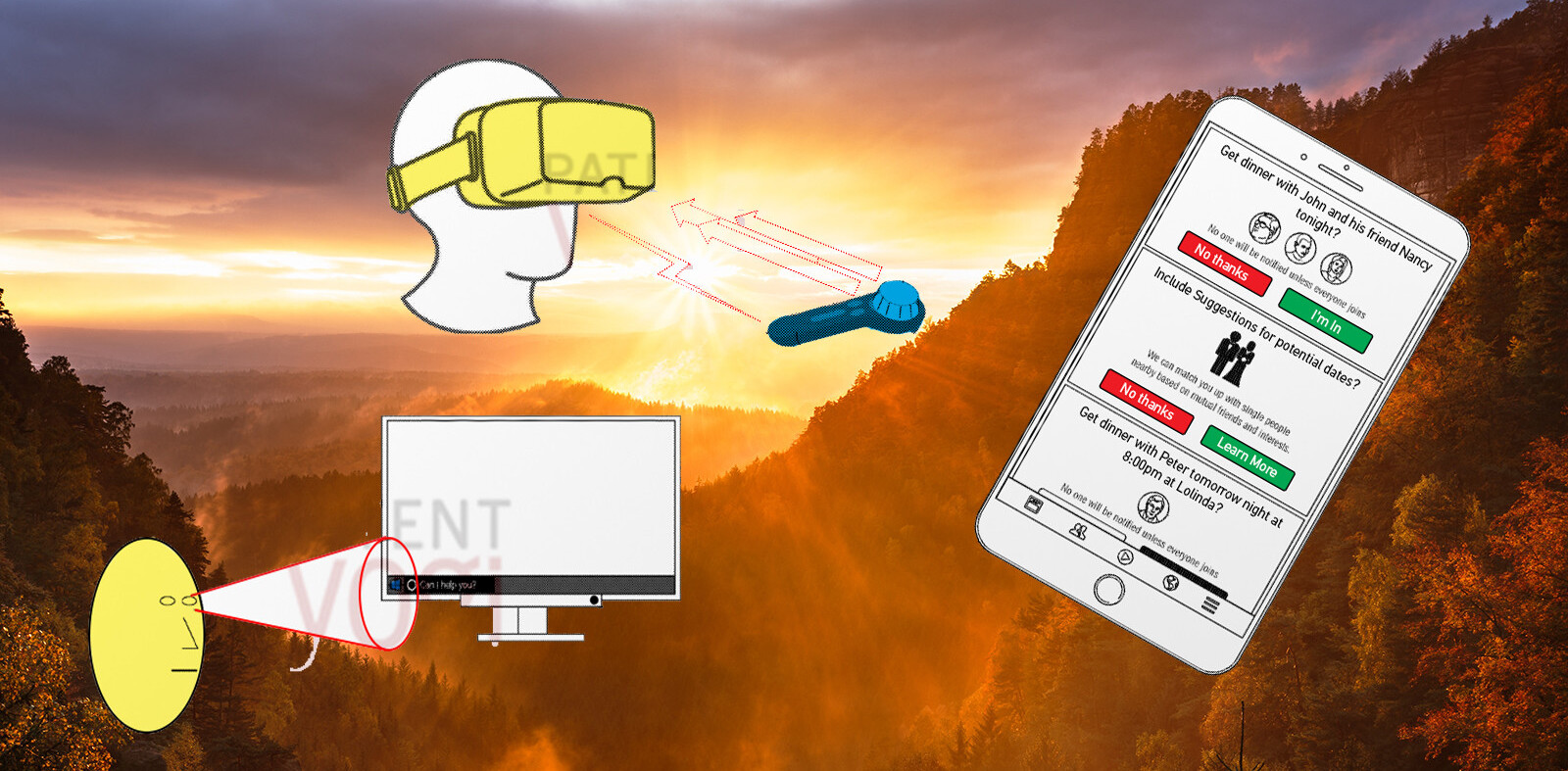
Apply that to your next interface design: show a test audience a feature and ask them to predict what happens next. Build that.
Can’t get enough of Boris? Check out his older stories here, or sign up for TNW’s newsletters below:
Get the TNW newsletter
Get the most important tech news in your inbox each week.


