Sean Mitchell is an interactive designer based in Vancouver, British Columbia, and the editor of TypeRelease.
2014 started us off with yet another month of gorgeous typefaces. Let’s take a look at them below.
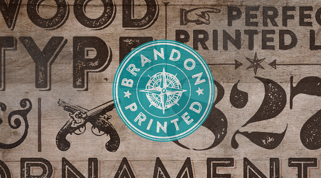
HVD Fonts: Brandon Printed
Brandon Printed has an eroded, printed look with four variations of every letter.
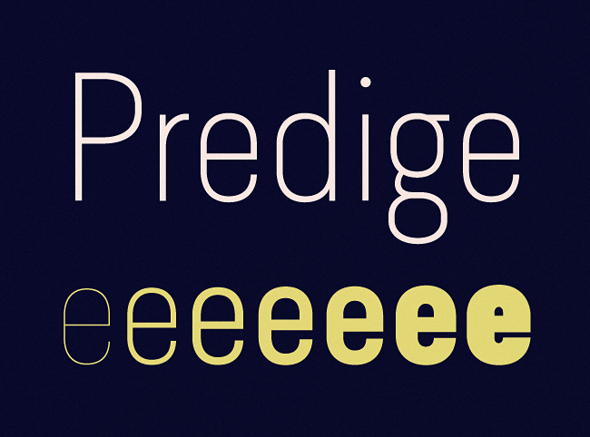
Type Dynamic: Predige
Predige is a condensed and constructed sans-serif type family with a very low contrast.
Parachute: Bague Sans Pro
A versatile monoline typeface with a distinct and eye-catching personality.
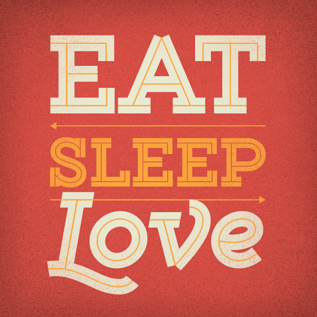
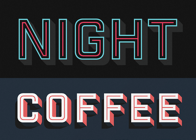
Yellow Design Studio: Gist
Gist is an inline slab-serif with a retro yet contemporary vibe.
Hold Fast Foundry: Industry Inc
Industry Inc comprises numerous standalone styles along with a layered type system.
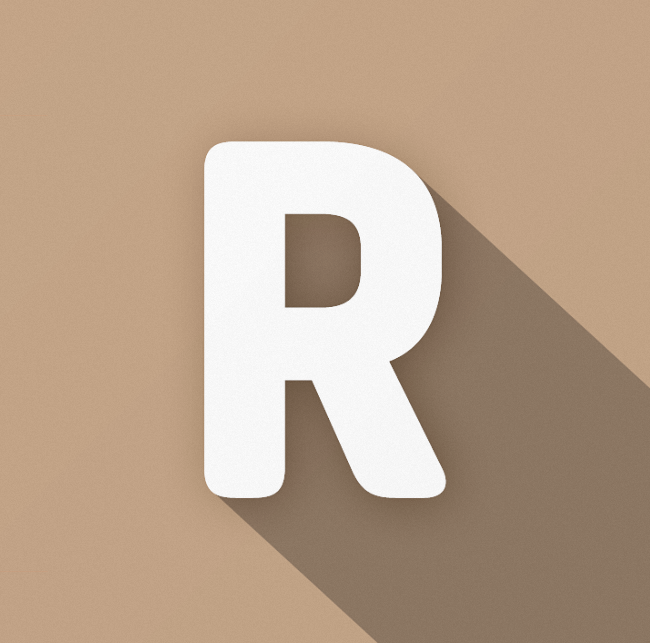
Indian Type Foundry: Pilcrow Soft
Simple and utilitarian, similar to forms found on street and highway signs around the world.
Klim: Maelstrom
A “perverse” typeface, to be sure, but that is exactly its charm.
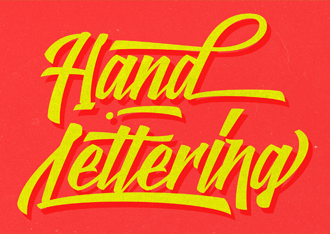
Kyle Wayne Benson: Benson Script
A script that is desperately trying to be anything but a script.
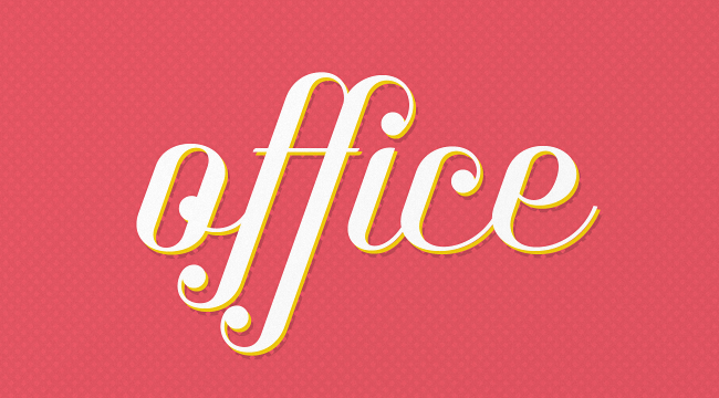
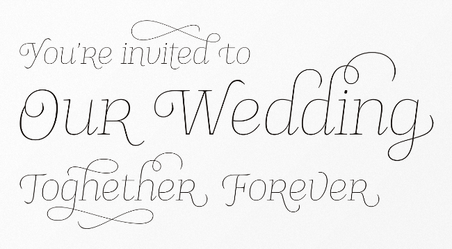
Fenotype: The Carpenter
An elegant and versatile connected script family of three weights.
Commercial Type: Duplicate
A versatile collection of typefaces comprised of three families, each in the same six weights with italics.
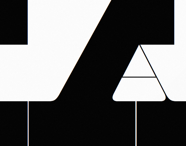
Graviton: Gubia
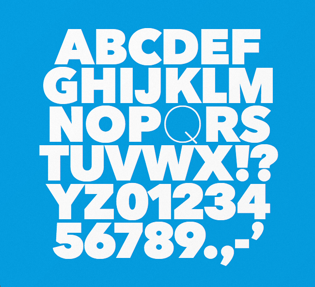
Gubia is a geometric, sans-serif typeface with a slightly condensed design.
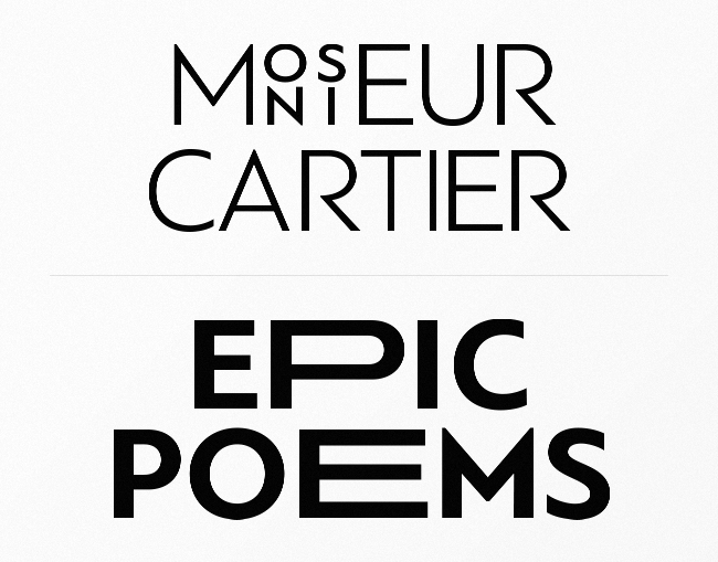
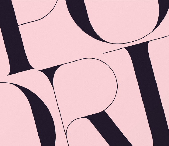
Onrepeat: Port Vintage
Port Vintage is an experimental Didone typeface with a modern twist.
Gunnar Link: Donki
A friendly cursive display typeface.
Playtype: Nationale
Highly legible and communicative – functions well as both body text and as display.
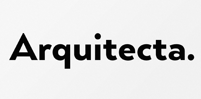
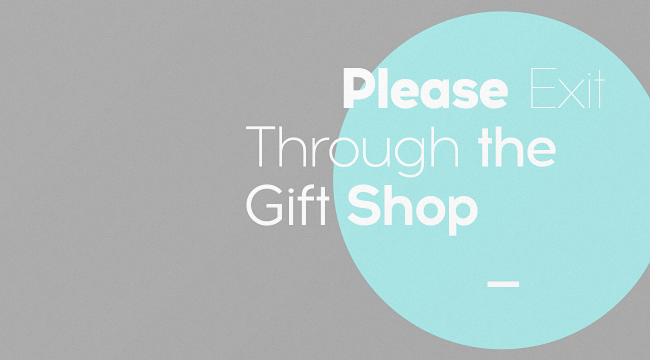
Latinotype: Arquitecta
Arquitecta is a rational geometric with humanist proportions.
Laura Worthington: Ganache
A clear, cheery, eye-catching face.
Corradine Fonts: Sinffonia
A beautiful ornamental font family.
Decade Typefoundry: Logotype Frenzy
Logotype Frenzy – a display typographer’s guilty pleasure.
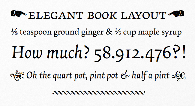
Type Together: Essay Text
An elegant serif typeface intended for setting books.
The Northern Block: Acrom
Acrom is a geometric sans-serif typeface with a minimal stroke contrast.
Get the TNW newsletter
Get the most important tech news in your inbox each week.
