Basil, the once iPad-only recipe organizing app, has received a significant update that’s brings it to the iPhone, as well as adding some new features.
I’ve been using Basil since 2012 on my iPad, but there was no option to sync across devices, I never used it as my main recipe manager, sticking to Yummly instead.
However, when I saw it had been made available on iPhone, I decided to ditch Yummly for a few days and use it as my primary recipe app. Costing $4.99 to download, I was hopeful it had retained some of the iPad features and lived up to expectations.
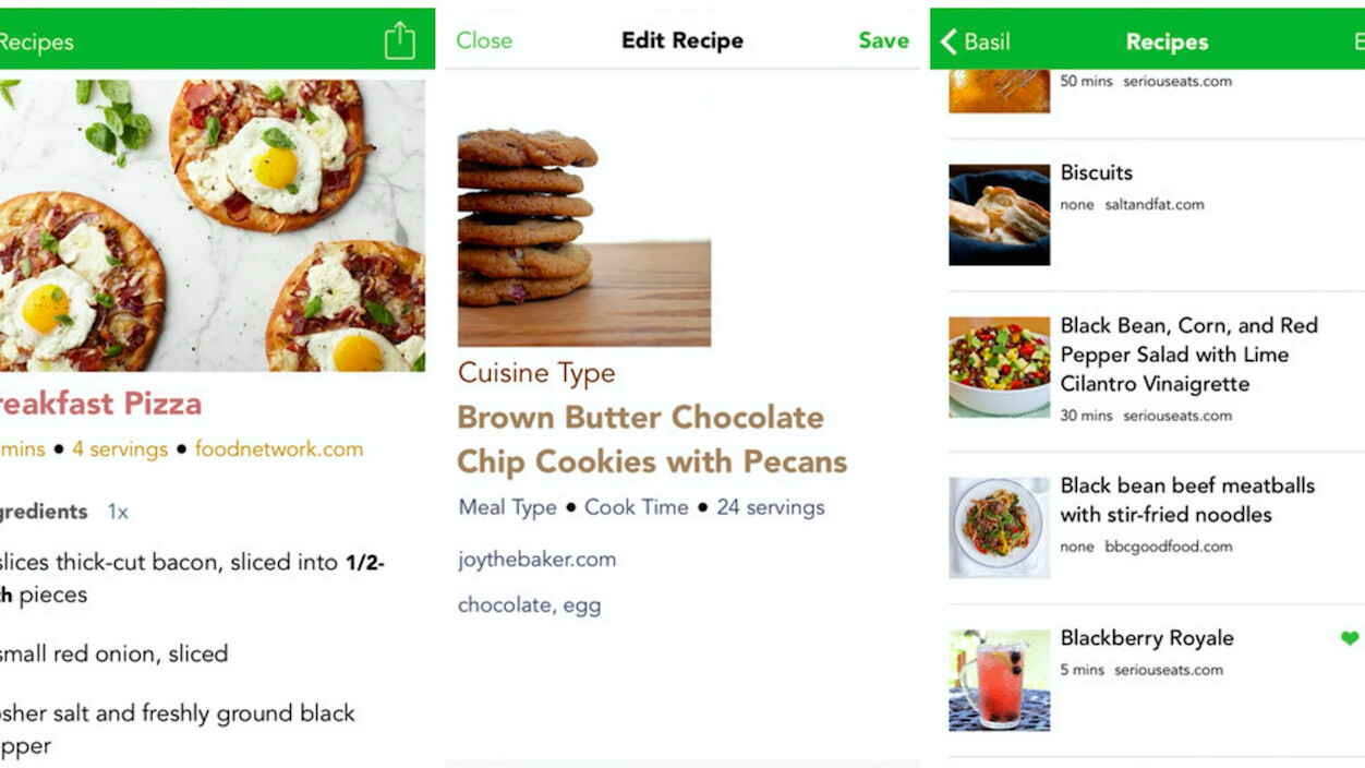
My first impression – I was pleasantly pleased that Basil had maintained its minimalistic interface on the iPhone, with lots of white, green and Avenir text.

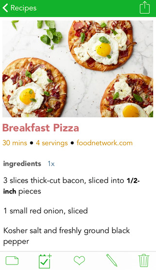
Photos of meals and ingredients are framed nicely, giving the app a visual focus and the consistency of the image sizes makes it more uniform than other recipe apps like Paprika and Yummly.
There are recipes added by the Basil team, but the best ones are from the users. You can add your own recipe manually or import from most of the popular recipe platforms, such as Epicurious, BonAppetit, RealSimple and AllRecipes.

You can import recipes from unsupported websites as well, but it’s a little trickier as it doesn’t format them for the app automatically.
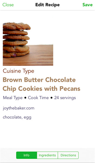
A new ‘Recipe Tag Card’ feature was also added with the latest update. It’s a handy function that prompts you to sort your recipes as you save them by course and cuisine type. Each recipe is automatically tagged by its main ingredients as well, which makes your list much more streamlined and easy to search through.
You can add recipes to your favorites section by tapping on the heart icon and these can be filtered by name, date, ingredients, cooking time and tags as well.

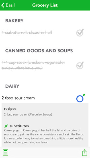
Similar to other recipe apps like Epicurious or Yummly, Basil lets you add the necessary ingredients to a shopping list when you’ve chosen what you want to cook. You can add all the ingredients or manually select the items you know you need.
Cooking with the app was slightly disappointing though. It displays the recipes on one page that you can scroll through from ingredients to the cooking method, however, this was quite tedious for longer ones. I think separating the ingredients and method into tabs would make life much easier on the smaller iPhone screen.
I was happy to see Basil had kept its Smart Timers feature on the iPhone too. It lets you tap on the timing information within the recipes and add timers directly from there. The timers remain beneath text so you can continue to read and browse, without having to navigate back and forth to check on times.
The new version has also implemented iCloud syncing, meaning my reason for not using Basil as my main recipe app before now is defunct. All of my data was saved in real time and synced in the background so I was able to switch devices, without losing out.
The update has also added support for split-screen multitasking on the iPad, which is particularly useful if you’re discussing your recipes with someone else, or browsing for the items you might need at the same time.
After using Basil for a few days, I am enjoying the new aesthetically pleasing iPhone version and compared to Yummly, its streamlined, minimal interface feels less cluttered. The app isn’t as feature-packed as some competitors, but it’s perfectly adequate for anyone who enjoys cooking and discovering new recipes, while also appreciating good design.
Get the TNW newsletter
Get the most important tech news in your inbox each week.


