You might not have heard of Automated Insights before, but chances are you’ve probably seen what its software can do.
The company has developed Wordsmith, which is essentially AI that can write human-sounding reports from raw numerical data, such as financial reports and sales forecasts. It’s already used by Yahoo and the Associated Press, and you can now use it yourself in Microsoft Excel or Google Sheets.
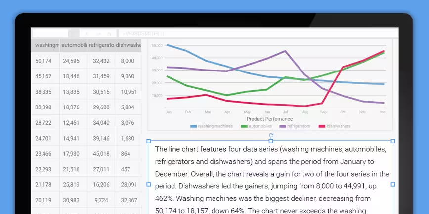
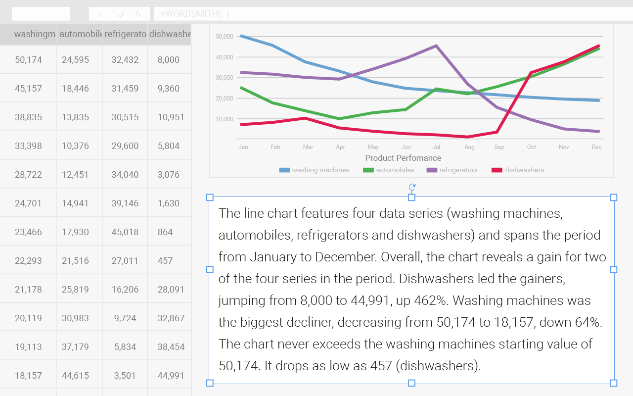
Available from today in beta for free, the plugin comes with an ExplainIt feature that can automatically generate descriptive captions for charts and graphs, making it easier to interpret your data. You don’t even need a Wordsmith account to use it.
It works just like any spreadsheet formula: select your data visualization and hit the ExplainIt button, and Wordsmith will automatically generate a description you can place on your spreadsheet or embed right into your chart.

If you choose to sign up, you’ll be able to take advantage of Wordsmith’s platform to generate descriptions for your data based on custom templates that you can build from scratch.
The templates let you define how Wordsmith should interpret your data, what words it should use to describe things like rising and falling figures and which parameters it should focus on, such as average sales or median prices.
What’s neat about the plugin, as opposed to using Wordsmith’s site or API to interpret your data, is that it works just like a spreadsheet formula and updates descriptions automatically when you make changes to your data. And if you’re using it in Microsoft Office, you can export those descriptions in other apps like PowerPoint and have them update on-the-fly.
The company is using the beta test period to determine pricing for the spreadsheet-based service. It’s also working to introduce Zapier support, so you can do things like import your updated data into Wordsmith from more than 500 apps, as well as work with them using other tools.
Get the TNW newsletter
Get the most important tech news in your inbox each week.


