Last night I attended the 500 Startups demo day, which saw 34 demos from its stable of of companies in just three hours. The rapid-fire event was not only attended by press and the involved companies, there were many investors waiting with checkbooks just in case they saw something that interested them.
One of the companies that jumped out to me was Tiny Review. While I don’t like explaining a startup based on what other startups are doing, it’s the only way to describe Tiny Review. In a mix between Yelp and Instagram, the company thinks it can take on both by allowing people to review the things around them just by providing a three line review and a photo. It’s strange enough to work, actually.
The app, which is only available on iOS, is as simple as it comes, but could provide a new space for those seeking recommendations on places to go and things to get for themselves.
Size does matter
When searching for places to eat on Yelp, for example, you’re met with reviews that most of the time are verbose to say the least. There are no restrictions on how long a Yelp review can be, therefore a lot of people ramble on by writing a book about their experience and it not only takes up a lot of my time, it often turns out to be a review that doesn’t help me make a decision.
Instagram, being the de facto social photo-taking app for iOS has no guidelines or restrictions either, but isn’t geared towards reviewing something you’ve taken a picture of. That’s where Tiny Review slides in between the two.
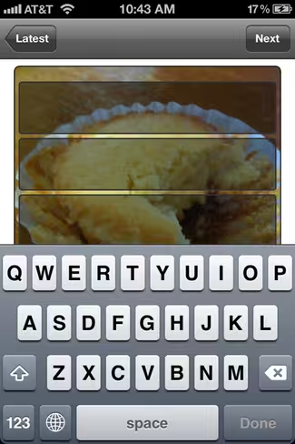
Just by downloading the app and checking the stream, you’ll see photos of dishes at restaurants, drinks at bars, or items at a store. People take a picture of them, attach a location, and then offer their thoughts in three lines. And the three line requirement is what makes Tiny Review unique.
The reviews that you’ll find are either to the point or poetic in some way, as if it were a product Haiku. Since the text is placed on top of the actual photo, you don’t have to divert your eyes somewhere else to find the context. So if someone took a picture of a beer and said something like “Fun. Smooth. Cheap.”, I’d be able to see where they bought it and might want to check it out myself.
During his demo last night, co-founder Dick Brouwer pointed out that Instagram has no model for making money yet, and his service is prime for advertisers and venues to get involved with the community. He has a point, and that point might just get his company funded.
You can add your own reviews just by taking a photo and dropping in your own text, or leave a follow-up review on someone else’s:
The difficulty with Tiny Review is that there is no tagging system that ties all of the content together. So for my review of the Macbook Air, there’s nothing that says its a Macbook Air, and it doesn’t get tied to other photos and reviews of the same product. At least on Yelp, everything is organized.
By leveraging this three lines of brevity, Tiny Review could pick up traction and make some noise in the review space. For some, three lines might not be enough to make an expensive decision on what to buy, but it could help send them in that direction. This is a company to watch out for, and with the viral Twitter and Facebook sharing components in place, this tiny app could do big big things.
Get the TNW newsletter
Get the most important tech news in your inbox each week.


