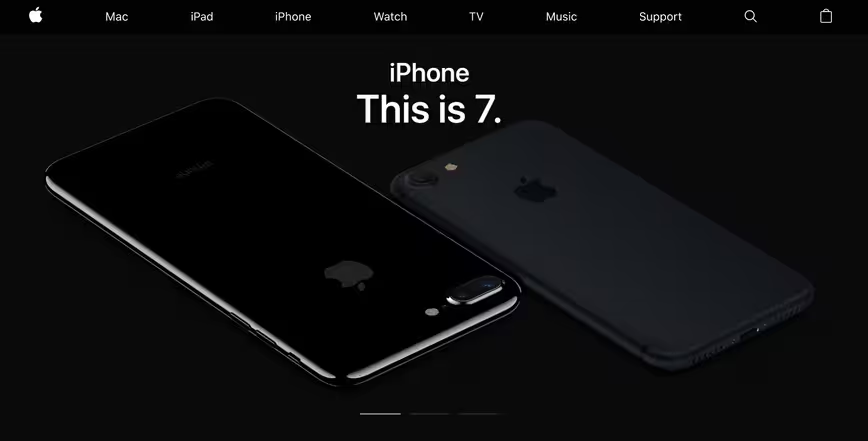
If you visited Apple.com today and noticed something different about the homepage, but couldn’t put your finger on it, it’s not just you. Apple has switched its homepage over to San Francisco; a brand new font the company developed in-house.
San Francisco is a radically new development for the company. It emerged in 2015, and is now starting to replace Myriad as Apple’s font of choice.
As a condensed sans-serif font, it remains legible on smaller displays (like those found on the Apple Watch) as well as on larger, high-resolution displays. In fact, San Francisco was designed with scalability in mind, and can change the typeface depending on context. It’s very cool stuff.
As pointed out by MacRumors’s Juli Colver, San Francisco is the first in-house developed font Apple has released in a while. During the 1980’s, the company produced many of its own fonts, but that largely stopped by the early 1990’s.
Apple hasn’t fully transitioned the homepage to San Francisco yet. There are still a few holdouts, though that many change over the next few days.
Get the TNW newsletter
Get the most important tech news in your inbox each week.


