The most difficult part about dealing with rejection is moving past it – and this is precisely what Northwestern University design student Jason Yuan did after he got turned down for a dream internship at Apple.
While Yuan made it through the first seed and was selected for an interview with the company, the recruiters eventually turned him down with a heartfelt letter, stating that although his work was already pretty decent, the company preferred candidates with more growth and training.
Instead of whining and moaning, the crafty designer took matters into his own hands and embarked on what turned out to be a three-month journey “to the holy grail — the iOS app that Apple Music deserves.”
As Yuan explains in a Medium post, for him “this was an opportunity to really dig [his] teeth into UX research and design, an excuse to spend way too much time on Sketch and Principle.”
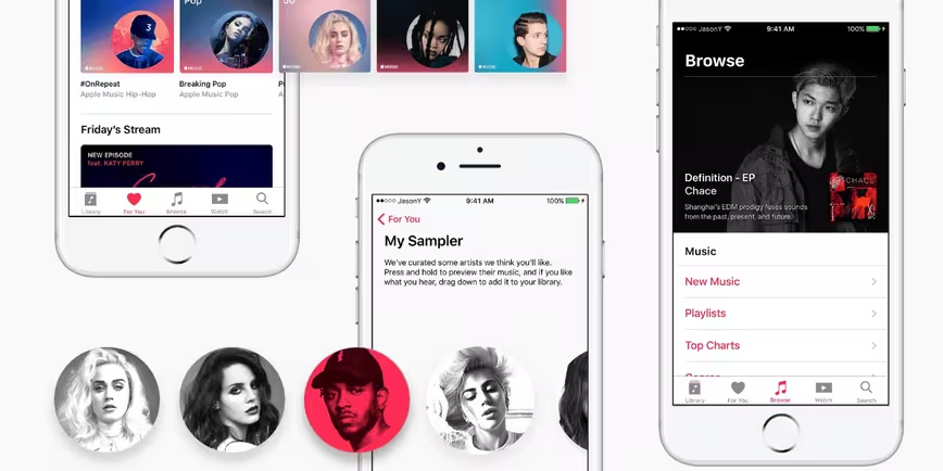
Basing his creative decisions on qualitative user research, the official Apple Design Principles as well as his own “designer intuition,” the inspired student re-imaged a whole new visual identity for Apple Music – and this is the final result.
Overall user interface
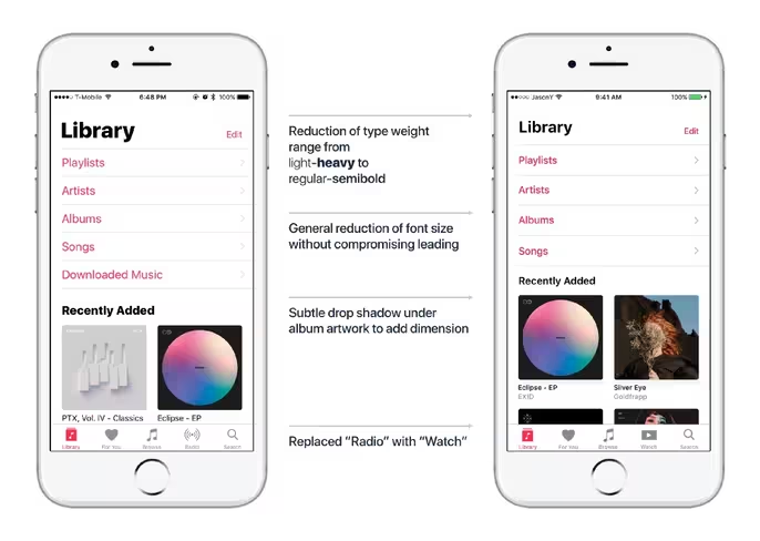
Curated artists and tracks
Improved artist and playlist spotlight artwork
Old:

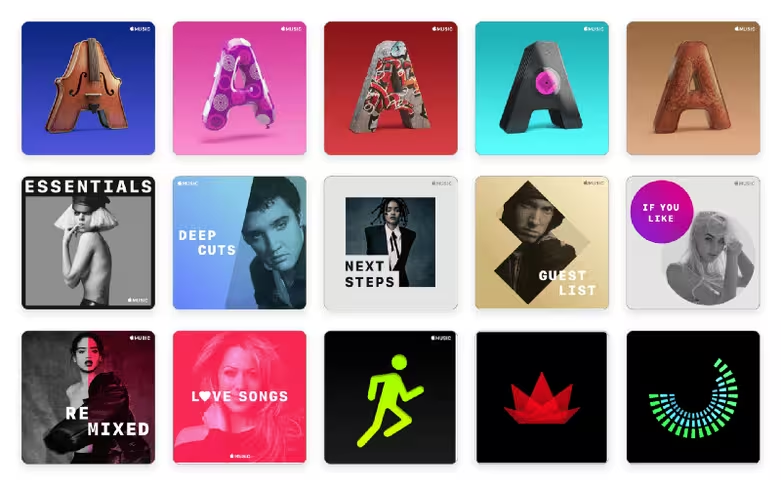
New:


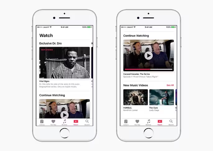
Smoother browsing experience with new ‘Watch’ section
Revamped ‘Now Playing’ experience
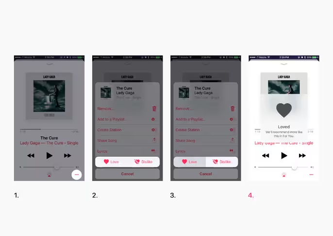
Head to Medium here to read Yuan’s full story for more insight into his creative choices and images of his gorgeous Apple Music redesign.
Would you take this design over the current one? Let us know down in the comments.
Get the TNW newsletter
Get the most important tech news in your inbox each week.
