We knew AOL was planning its own replacement to the soon-expiring Google Reader, and now we’re able to share a complete look at the upcoming service.
Pitching with the slogan “all your favorite websites, in one place,” AOL’s Reader came as a surprise to us at first, but when you consider AOL’s history, much of it involved surfacing, creating and managing content. In fact, AOL’s content play, like Yahoo, is one of its strongest efforts, which is why this release isn’t that much of a stretch after all.
Now, let’s get to it. Shift your eyes below to soak up everything you need to know.
(You can check it out for yourself if you visit reader.aol.com where beta access is being given out — but you’ll need an AOL email address, at this point.)
AOL Reader
The design of AOL Reader won’t sweep you off your feet. The service features much of what you’d expect, and little more. This in mind, sticking to a limited feature-set is perhaps what AOL should be doing if it wants to go after Google Reader’s fleeing user-base.
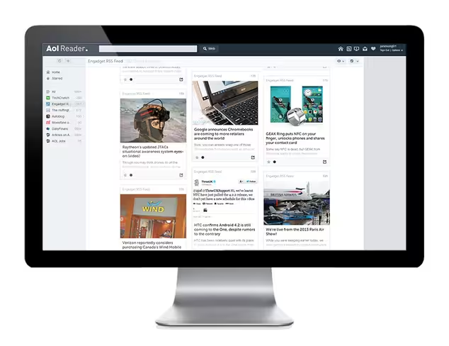
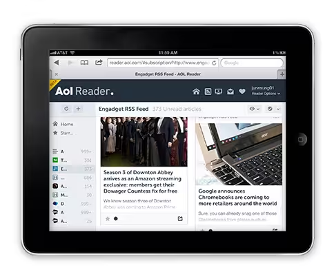
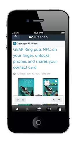
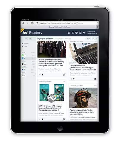
As shown above, the service is entirely Web-based, but offers an optimized, touch-friendly design for mobile users. To sign up, use your AOL account (if you still have one); but you can also join via Twitter, Facebook or Google accounts, which is handy.
On first login, AOL Reader prompts you to add new subscriptions, and you have three ways to do so: import your feeds from another service (including Google Reader), add them manually, or browse through categories of sites suggested by AOL. After subscribing to at least one feed, you’ll be dropped into a familiar view:
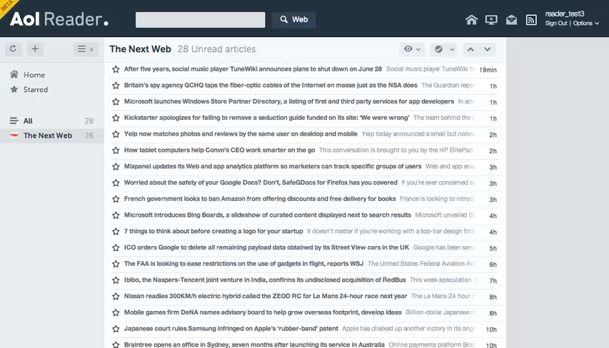
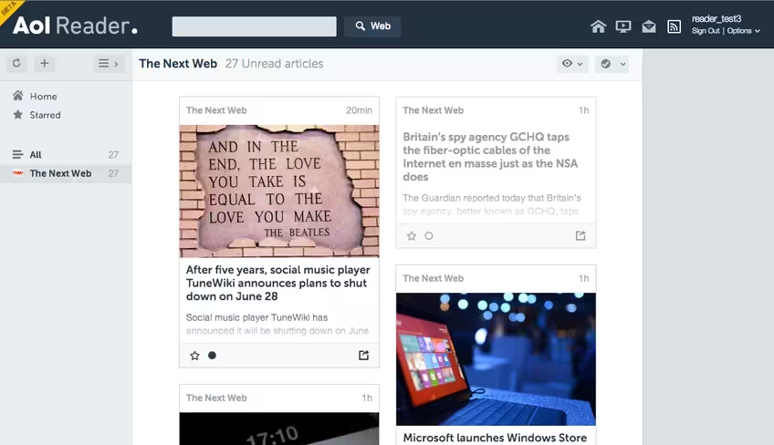
A number of different layouts are available, making AOL’s Reader a rather flexible solution. You can see a masonry-style design below, complete with photos.
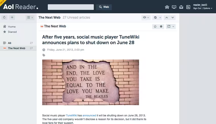
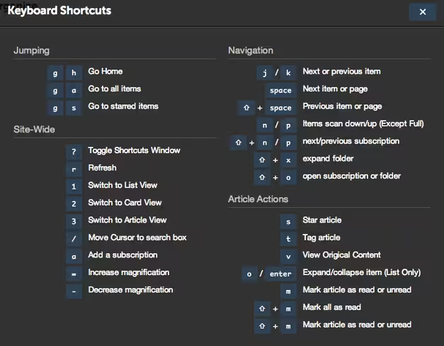
Of course, there’s the individual article view, which, again, doesn’t offer anything that stands out from any other reader. And no reader is complete without dozens of keyboard shortcuts.
Additional features in AOL’s Reader include sharing to social networks, “simple tagging and organization capabilities,” read it later-style article saving, and an API which lets developers build third-party apps atop the service. Clearly, AOL is looking to rebuild the sort of ecosystem that Google decided to demolish.
All in all, AOL Reader appears to be a quality attempt, and it could be a decent solution for many following Google Reader’s demise — especially for those who actually have AOL accounts.
That said, the service is also highly unexciting, given its extreme similarities to Feedly and Google Reader. But RSS feeds were never that sexy in the first place, were they?
➤ AOL Reader
Featured image credit: Thinkstock
Get the TNW newsletter
Get the most important tech news in your inbox each week.

