The history of animation goes back even farther than Mickey Mouse and steamboats, but they’ve entered a completely new era of interactivity thanks to HTML5, jQuery, and Javascript.
In the beginning, animations were treated more as an aesthetic luxury (remember all those Flash splash pages?), and it’s now evolved into a powerful tool for smoothing over user interactions. And yet, when we look at the entire scope of past, present, and future, we see that the fundamentals remain unchanged – just with better implementation thanks to better technology.
In this article, we’ll explore the practical forms and functions of web animation, where they came from, and where they’re headed.
The Past: Roots in Traditional Animation
To understand animation, we must first return to the fundamentals that existed well before the web.
The guidebook and animation bible comes from a name that screams animation – Disney. Frank Thomas and Ollie Johnston, two Disney animators, published the “Illusion of Life: Disney Animation” in 1981, outlining the guidelines for animation as we know it. That framework is still the standard today.
The book outlines 12 principles that dictate how to take full advantage of the magic animation can offer. Our free ebook Interaction Design Best Practices: Mastering Time, Responsiveness and Behavior goes into further detail about how these concepts works with examples, but for now we’ll summarize the main points:
Squash and stretch – Give objects a feeling of physical mass and responsiveness by allowing them to contract or stretch when moved. Decide the level of realism you want, then apply the effect accordingly.
Photo credit: UXPin inspired by Pete McGrath
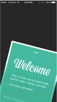
Anticipation – The appearance of the object suggests the action. In the below screenshot from Jelly, you can see that the card is placed at an angle to hint that the content will drop once you swipe downwards.
Photo credit: jelly.co
Staging – Present the action you wish to illustrate as clearly as possible. Apply colors, contrast, and composition to focus attention on the primary object. In the below example from Apple iOS, you can see how the background blurs to focus the user on the search bar.
Photo credit: Apple iOS
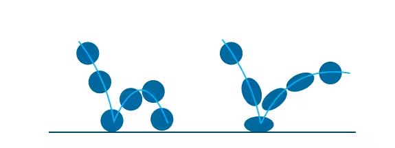
Straight-Ahead Action and Pose-to-Pose – Straight-ahead animation conveys dynamic and complex movement, while pose-to-pose covers more predictable movement. As you can see in this illustration, the first image shows straight-ahead, while the second shows pose-to-pose.
Follow-Through and Overlapping Action – Like squash and stretch, these two effects apply principles of physics to make your animation look more realistic. As you can see in this illustration, the cape swings for a moment after landing as a result of momentum (follow-through). Upon landing, his legs and cape then move at different speeds (overlapping action).
Slow-In and Slow-Out – Objects should accelerate and decelerate just like they do in real life. For example, a side-swiping gallery on a mobile device should respond according to the speed of swiping.
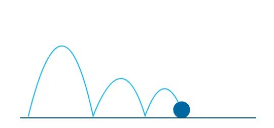
Arc – Movement that follows an arc feels more natural, while movement along straight lines feel mechanical.
Photo credit: UXPin inspired by Tom Waterhouse
Secondary Action – Actions trigger multiple consequences. In the below example, you can see how the body and tail moves (primary action) which triggers a different movement of the tail (secondary action). Like Rachel Hinman suggests in her excellent article on mobile animations, this means that your interface should reflect a similar reciprocity: when a submenu opens, animate the previous one closing.
Timing – Timing is tricky and highly subjective since different speeds convey different feels to the interaction. Lightning fast may work well for lighthearted and fun apps, while a steadier pace may work better for more complex apps. Regardless, you’ll want to make sure the animation gets triggered within 0.1 seconds to make users feel in control.
Exaggeration – As the name suggests, pushing an object beyond the realms of reality can create a feeling of playfulness. But you should use it in moderation, otherwise your interface might just seem tacky. As you can see in this animation, an exaggerated wobble and squash-and-stretch makes the ball bounce look more fun.
Solid Drawing – Objects should reflect weight and balance just like their real-life counterparts. In this example, you can see that the person on the right better represents the mass and behavior of human limbs.
Appeal – Characters and objects in animation should appear lively and interesting. Follow the best practices of emotional design.
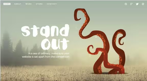
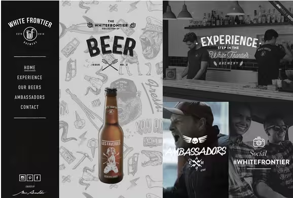
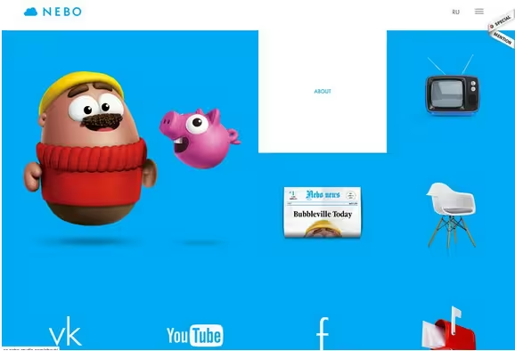
In the modern examples below, you can see the influence of traditional animation. While the “cartoony” style still holds a magic that brings out a childlike wonder in us, and while it’s not appropriate for every site, the principles are certainly applicable to animation across the board.
Photo credit: http://www.denisechandler.com/
Photo credit: http://www.whitefrontier.ch/
Photo credit: http://en.nebo-studio.com/
To learn more about the practical application of animation in web design, we highly recommend designer Val Head’s article on A List Apart which examines animations from a UX perspective.
The Present: The Role of Animation in Web Design
As we mentioned earlier, the core functions of animation remain the same, but their application becomes more sophisticated as technology advances. Let’s take a look at the traditional roles animation fills, and how that’s accomplished today.
1. Communicating function
When communicating function, an animation shows the user how something works. Regardless of the controversy, hamburger menus are a popular use of an animated user interface tool that opens into a bigger element.
Brian Hoff Design uses a circular hamburger menu to pop out an oversized menu box from the right side of the web page. Hover over the icon itself and it animates to expand and changes shape to communicate how the hamburger menu will slide out additional options.
Photo credits: http://www.brianhoffdesign.com/
2. Revealing information
In addition to hinting at functions, animations are also an excellent tactic for revealing secondary information. Two common techniques are revealing upon hover and revealing upon clicking.
In the hover technique, a user mouses over content to uncover additional options. Due to the “hidden” default state of hover content, you only want to use this for secondary information (nothing that’s completely vital to navigating your site). Also, remember that hover won’t work for mobile devices.
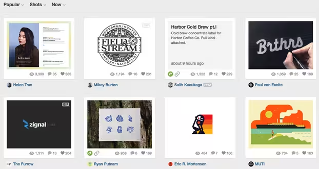
For example, on Dribbble, hovering over each card reveals a supplementary short description.
Photo credit: Dribbble
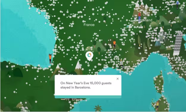
Alternatively, you can also use click-to-reveal if you’re presenting a wealth of secondary information and don’t want users to accidentally trigger it with a simple hover. For example, AirBnB’s map presents tons of interface objects (per destination), so it makes sense to reveal the fun facts with a click rather than hover. Imagine how difficult the interface would become if mousing around destinations kept triggering little pop ups.
Photo credit: AirBnB
3. Distraction
Aside from interface functionality, animations serve as a great distraction as well. A neat loading “trick” keeps users from noticing that a site is not fully loaded.
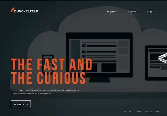
Duncklefeld uses a great bit of CSS in the orange polygon – which fills with color and contracts/expands – as the full-screen video background loads. Once the site loads, the orange bar relocates to the top-left as part of the company brand – a very nice subtle touch.
Photo credits: http://www.dunckelfeld.de/en/
4. Storytelling
One of the most fun ways to use animation is in storytelling.
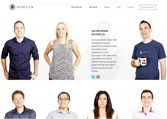
More websites are using animations that load automatically and loop through a simple story. The entertainment value keeps a user engaged with the site longer and provides a more lasting impression of the experience. For example, Humaan tells an interactive story with bits of movable and clickable copy, moving parts and tools that visually showcase their work.
Photo credit: http://humaan.com/about/
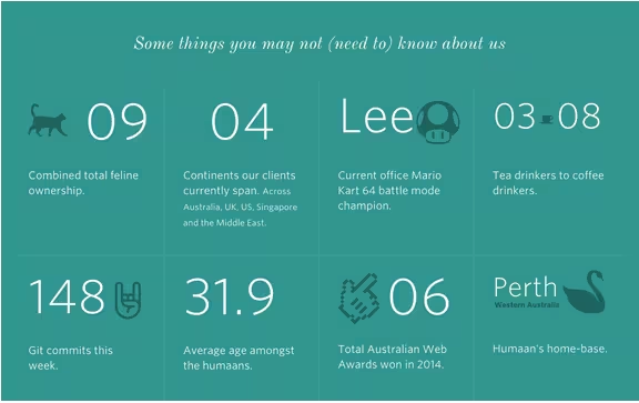
As you scroll down the About page, fun facts about the agency are also revealed as part of a larger grid. Without the clever animations here, it might feel overwhelming to suddenly see a large block of text all at once.
Photo credit: http://humaan.com/about/
5. Pacing
All animation is a representation of change in time, as outlined in Interaction Design Best Practices.
Time is represented by pace, responsiveness and context. While you can play around with different durations for animations, you generally want to trigger the animation within 0.1 seconds from the moment of user action to make the interface feel responsive.
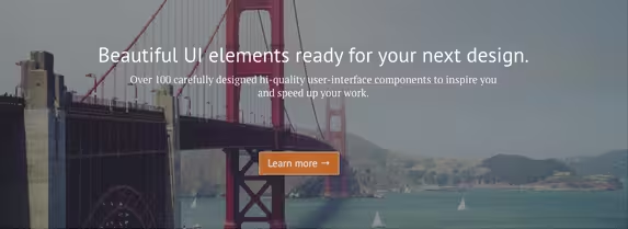
For example, in this preview of a project, click on the “Learn more” button.
Photo credit: UXPin
Once you’ve scrolled to the bottom of the screen, the signup form transitions into view within 300 ms. In this case, we didn’t set a delay on the scroll itself since that’s directly triggered by the user action, but we added additional time to the secondary transition animation. This subtle touch prevents a jarring effect.
As a means to control time, animation in moderation sets are more comfortable pace for the website experience.
The Future: Up-and-Coming Web Animation Trends
The types of animation we are seeing on websites today are just the beginning. Animated techniques will continue to evolve as designers break out of using animation for only text, shapes and drawn elements by incorporating it into design projects that use more still photos as well.
1. Animation for “traditional” business:
You’ll likely start seeing companies such as financial institutions, colleges and other visually conservative businesses feature more animation on their websites. It’s not surprising considering how far animation has progressed in the past few years in shedding its cartoonish qualities (except when intentional).
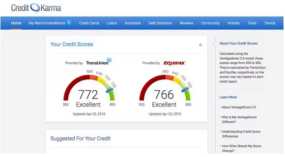
Photo credit: https://www.creditkarma.com/
Credit Karma, which provides individual credit reports and suggestions, uses simple animations for each report in the user dashboard. Animated loading effects entertain the user as information is populated, hover animations tell users what specific blocks of information mean and a scroll animation shows user progression on the site.
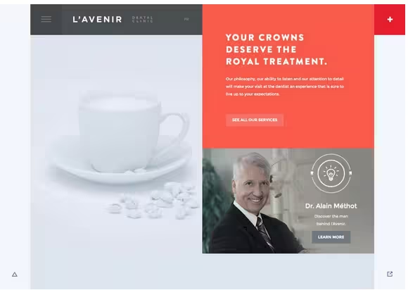
Photo credit: http://avenirclinic.com/
L’Avenir Dental Clinic uses animated effects for a website in a field where they are seldom seen – medicine – with the neat light bulb over the image in the bottom corner and an impressive navigation. The animations and generous use of white space create a sophisticated and luxurious ambiance, which makes a lot of sense considering that the clinic highlights its specialty in cosmetic dentistry.
2. Animation as a sales tool
Animation can showcase products and provide neat details in the user experience. Think of those 360-degree angles available from some retailers.
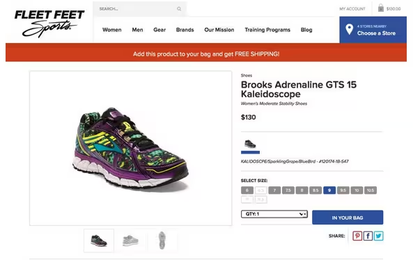
Photo credit: https://www.fleetfeetsports.com/
Fleet Feet Sports zooms an item from the screen to the cart in the top right with a single click. The animation is fun and provides an instant gratification experience for the shopper because the speed of the animation makes the purchase feel immediate.
3. Flat Design 2.0
Flat design 2.0, first coined by designer Ryan Allen, is the next iteration of the vibrantly colored and grid-friendly design philosophy. As we described in Flat Design Trends Present & Future, flat design 2.0 actually embraces design elements traditionally associated with skeuomorphism (like gradients and textures).
The tradeoff for flat design’s visual maturity, however, is familiarity. As the name suggests, flat design strips away any flourishes so that the interface prioritizes the content. Despite the generous color on most flat-inspired sites, the experience can feel a bit mechanical and stiff. Luckily, animations complement the experience by adding fluid feedback.
In fact, Google’s Material Design (a philosophy related to flat design) specifications include a section devoted to animation. As more designers embrace this design philosophy, animation will be essential to injecting liveliness into an otherwise industrial layout.
Photo credit: http://www.google.com/design/spec/material-design/introduction.html#
Material Design describes animation as an “authentic motion” in this way: “Just as the shape of an object indicates how it might behave, watching an object move demonstrates whether it’s light or heavy, flexible or rigid, small or large. In the world of material design, motion describes spatial relationships, functionality, and intention with beauty and fluidity.”
Animation is a design technique that is not going anywhere any time soon. Animations add life to any design, engage users in even the most mundane tasks, and of course make you stand out from above the crowd. When we consider web design based upon the hierarchy of UX needs, animations are a core component to helping your site make the emotional leap from usable to desirable.
To learn how to master the art of modern interaction design, check out the free ebook The Curated Collection of Design Techniques: Animations & Interactions. The book teaches with 42 examples of some of the best web interactive designs.
10 Additional Free Resources and Tools
- 12 Principles of Animation Video: Animator Ceno Lodigiani illustrates the principles with a GIF representing each concept.
- CSS3 Animation Cheat Sheet: This set of preset, plug-and-play animations is ready-made with a set of style sheets you can add to your website and apply the premade CSS classes to the elements you want animated.
- Web Animation API: This document provides a unified language for animation and how to develop it. It outlines everything from the basics of animation to providing an API.
- “Mythbusting: CSS Animations vs. JavaScript” by CSS-Tricks: What’s the best method for creating a website animation? This article weighs the options.
- “Web Animation at Work” by A List Apart: This article looks at how animation can be used (and overused) in a variety of projects and that animation is just a further expansion of other design techniques.
- “15 Animation Tutorials” by UltraLinx: What’s nice about today’s web animation is that almost anyone can do it. This guide teaches you tricks of the trade.
- Elastic SVG Elements: Learn to create SVG shape animations for user interfaces.
- Top Tools to Create Animations With: This list of 15 resources can help you find all the tools you need to create beautiful animations.
- Transit: Create smooth CSS transitions and transformations.
- Material Design Animation Examples Gallery: Take a look at what designers are envisioning for material design and glean a little inspiration from it.
Read Next: The changing face of animation & interaction design
Image credit: Shutterstock
Get the TNW newsletter
Get the most important tech news in your inbox each week.
