Today, at Apple’s Education Event in NYC, the company announced iBooks Author, a new Mac application that enables authors to easily publish interactive ebooks into the iBookstore.
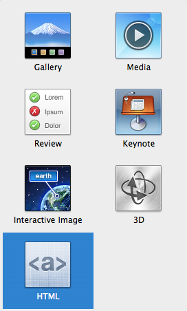
The app is a WYSIWG (what you see if what you get) editor, giving the user the option to add their own text, images and video with “drag-and-drop ease”. Different tools can used to embed interactive galleries and 3D objects, plus there’s support for HTML5 widgets and Keynote presentations.

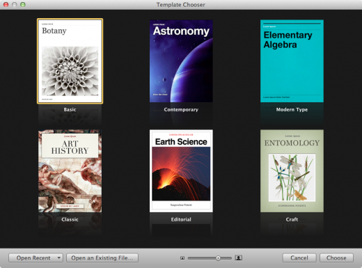
The app, which just went live, looks predictably great so far. Upon launching, you’re presented with a template chooser (like in the Pages and Keynote apps). The choices are focused on science and math textbooks, rather than novels or children’s books.
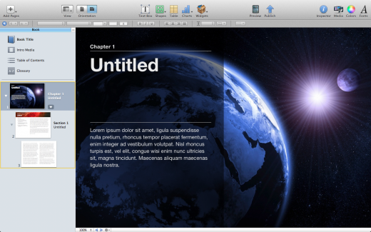
The app actually feels like I’ve used it before, which is probably a good thing for someone trying to get started. It’s remarkably easy to drop in an intro video, add glossary terms and set the text layout by column-style.
Upon opening the styles drawer, you can see how in-depth your customization can go, with presets that save heading, list, paragraph and quote styles for quick layout work. As far as actual editing goes, the experience is pretty fluid, even though WYSIWG can get pretty clunky.

All the content you add can be easily separated into sections, and each section can be swiped through via a trackpad. There are also tons of different ways to customize your workflow with the view drop-down menu. You can show/hide rulers, navigation bars, etc.
Now it’s easier than ever to create for iBooks, but everything is so customizable that it seems like a professional layout design may still be necessary. After actually using the app, you start to realize how easy all of this can overflow with a 500 page text-book.

Shorter books, in fact any sort of book other than a giant textbook, may be a better candidate for this app, which is why it’s interesting that Apple has focused so much on textbooks instead of every type of book.
For publishing, there’s a whole icon dedicated to previewing your book on your iPad. Once you’re ready to publish, you can export an iTunes Store package, a PDF or a text document. There’s a help guide present to explain publishing steps for serious users, too.
Overall, I’m happy with the design, which is clean, polished and a bit predictable. I’m glad Apple didn’t go for pseudo-realistic iCal textures, as it did in the past. The UI is simple and well-organized, and there isn’t much of a learning curve involved, until you want to really start customizing things. Exporting and sharing PDF samples is also a snap.
iBooks Author is easy and powerful, but we’ll have to wait and see what kind of users it attracts before we know what it’s truly capable of. Philip Schiller, Apple’s Senior Vice President of Worldwide Marketing, explained in the presentation that there are already “20k education applications built specifically for the iPad,” and that “it’s not a big surprise that students get excited to learn on the iPad — it was #1 on teen’s wish lists this holiday.”
With “over 1.5m iPads in use in education,” it’s hard to argue the impact iBooks 2 will have, especially now with the new iBooks Author. The app may prove to be a major step forward for independent publishers and authors looking to join the digital revolution.
➤ iBooks Author, for free via the Mac App Store
Get the TNW newsletter
Get the most important tech news in your inbox each week.


