Amazon may have just announced a new flagship Kindle, but it knows a lot of people do the bulk of their reading on their smartphones. The company today announced an extensively redesigned version of its Kindle app for Android and iOS.
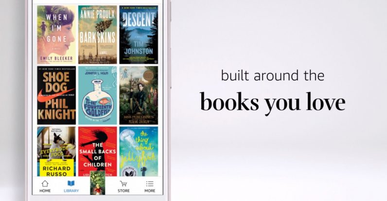
It’s largely a cosmetic overhaul, but one that has important changes for usability. The most obvious change is a new a light theme, meant to better replicate the physical reading experience when browsing your library (don’t worry, you can still pick a dark theme). It also uses larger book covers and new fonts to complete the look.
Search is now integrated more heavily into the app – available from virtually any screen. The idea is that you should be able to both search your library or find new books at any time. My favorite change, however, is that the book you’re actively reading now gets its own permanent button on a navigation bar. That means you can always return to the book you’re reading from anywhere in the app without having to tap through a myriad of menus.

The other big change is a much larger emphasis on social; the Kindle app now directly integrates reviews and community features from Goodreads, the biggest social network for readers around. You can highlight portions of a book you’re reading, for instance, and directly share it to Goodreads. You can check what your friends are reading in a community tab (iOS only to start), chat with them about your analysis, and see suggestions on more people to follow.
The new Kindle app is rolling out to iOS and Android today. Keep in mind it has a new icon that doesn’t actually say ‘Kindle’ on it (it’s just the picture of a kid reading under a tree now). Goodreads integration is available on both apps, but the community tab for discovery and discussion is iOS (and US) only to start.
Get the TNW newsletter
Get the most important tech news in your inbox each week.


