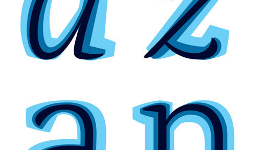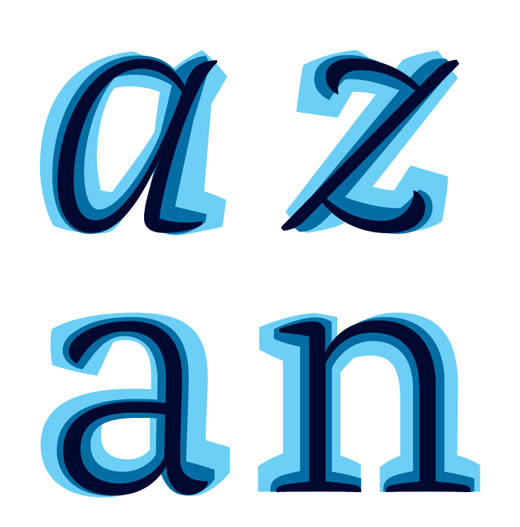
Alda, a typeface that’s currently being developed by Berton Hasebe, is an incredibly interesting exploration of how the weight of type can be conveyed “beyond the width of a stroke”.
“By changing details specific to each weight, my intention was to fully emphasize each weight’s inherent characteristics, where the bold is robust and sturdy, and the light is delicate and soft.”
I love the look of Alda even in its incomplete state, and I hope we get to watch its development until it’s published by Emigre when it is completed.
Get the TNW newsletter
Get the most important tech news in your inbox each week.


