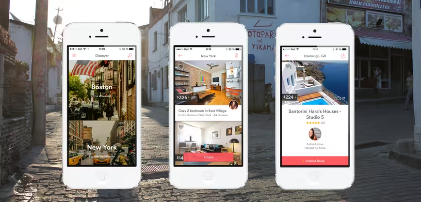
Airbnb today is rolling out an update to its mobile site, matching the mobile Web experience with its redesigned app and desktop site. The update is a move toward responsive design to accommodate users on various platforms while letting non-Airbnb users learn about the site without forcing them to download the app.
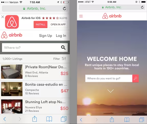
Much like the revamped desktop site Airbnb launched this past July, the new mobile Web experience will feature full bleed images to make browsing listings more inviting. Users can also flip through the photos of the listing directly from the search results instead of clicking the listing to see more.
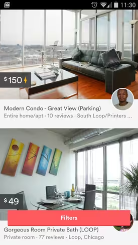 Additionally, the “Filter” button stays stickied at the bottom of the results page, so users do not have to scroll back up to narrow down their needs.
The responsive design will also allow users on larger screens to view more results at a time, streamlining the experiencing to as few clicks as possible.
Airbnb hopes that by making its mobile Web experience more attractive, it will be able to convert more users without requiring them to download the app, or revert back to their desktops at a later time to book. The company says that 20 percent of its traffic comes from its mobile site, so it aims to see those numbers rise with the redesign.
Previously: Airbnb updates design and introduces controversial new Bélo logo
Get the TNW newsletter
Get the most important tech news in your inbox each week.
