Adobe Lightroom, likely the world’s most popular editing and management app for photographers, is getting a massive overhaul today. The company today announced the release of a totally redesigned version of Lightroom CC, complete with an all-new UI, significant speed improvements, and a focus on cloud-based file management.
But before you complain about having to relearn your workflow, don’t fret – the traditional version of Lightroom isn’t going away anytime soon either.
Lightroom Classic
Lightroom is essentially becoming two products now. The version you know and (maybe) love will now be called ‘Lightroom Classic CC,’ and it’s getting some significant speed improvements and nifty new features. Adobe says Classic is not going away anytime soon, and it’s added a suite of new features and improvements to prove it.

Performance wise, Adobe says it’s tangibly improved on some of Lightroom’s biggest pain points including, application launch time, creating previews, switching between modules, switching photos, and using brushes. One feature I particularly like is the ability to use embedded preview files created by your camera manufacturers, instead of waiting for Lightroom to create its own.
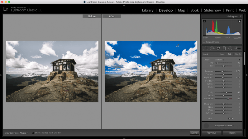
The biggest new editing feature is something called a Range Mask, which helps easily modify your filters and brushes to only affect a certain portion of an image.. Say you want to darken or desaturate the sky in a landscape without affecting the rest of the scenery; the range mask lets you only apply your filter to a specific region without going through the hassle of doing precise brush work.
Adobe says more improvements are on the way, including optimized performance on high-end systems and high resolution monitors.
Lightroom CC
But the redesigned version of the app is much more exciting. It eschews the focus on folders and old-school file management for a cloud-based, multi-platform approach. It’s designed to work as intuitively as a mobile app, and more importantly, be just as fast.
Catalogs are gone and all your photos are uploaded to the cloud and linked to your Adobe ID. Like Google Photos, Adobe intelligently frees up space on your disk as photos are backed up to the cloud, and pulls them in quickly when you need them (you can manually sync photos and adjust how much local storage Lightroom is allowed to use too). And no, they’re not just previews – Adobe will upload full-sized RAW files.
This has a few benefits:
- It makes managing your photos much less of a pain; accessing old photos is traditionally a hassle if your catalog extends multpile years.
- It also allows you to use AI search, meaning you can look for what’s actually in an image – without having to create any keywords yourself – as opposed to digging through folder dates or trying to remember metadata.
- You can edit all of your photos on Lightroom’s mobile apps, not just a few synced collections or photos.
The UI is also completely different; Lightroom CC has a more minimal, smartphone-era look. Most notably, Adobe got rid of the different modules, allowing you to finally organize and edit your photos in the same space. Search is prominently featured atop the app, making it easy to find images on the fly.

It features the same engine as Lightroom CC, and most of the same tools, but having used it briefly, it immediately seems much faster and more intuitive to use. There are even useful tooltips that pop up for beginners when you hover over a slider.
Unfortunately that “most of the same tools” bit might be the deal breaker for many photographers. The majority of the basics are included, but there are a several tools I regularly use that would prevent me from doing a full transition:
- There’s no tone curve, a tool I use on every edit job
- The Range Mask I just mentioned is coming to classic is missing
- You can’t use presets
- You only have basic toggles for fixing chromatic abberation or applying lens corrections
- There’s no split-tone tool
- You can’t select or adjust different RAW camera profiles
- You can’t set color labels
- You can’t view edit history
- You can’t use third party plug-ins
So yeah, Adobe has a long way to go.
Still, it feels so much simpler than Lightroom Classic that I’m compelled to try and do as much as possible in the new app – the first time I’ve significantly changed my workflow in years. I’ve come to dread making some edits because Lightroom Classic can be so overwhelming with a large catalog. Lightroom CC, on the other hand, brings the simplicity I’m used to on mobile devices to the desktop. And the idea of being able to edit photos on my phone without remembering to upload them to the cloud in the first place is enticing.
Thankfully it shouldn’t be too much of a hassle to access more advanced features when you need them, as Lightroom CC photos will sync back into Lightroom Classic. There’s also still an ‘edit in Photoshop’ shortcut, and you can sync your photos between the classic and new versions of Lightroom.
Which brings us to the pricing; Adobe is doing something a little different thing time around. There are now three plans catering to different types of users:
- The new Lightroom CC plan includes Lightroom CC and 1TB of cloud storage for $10 a month.
- The Photography Plan is the same as before, including Lightroom Classic, Photoshop and 20GB of storage for $10 a month, except it now includes the new Lightroom CC as well.
- Then for $20 a month, you get all the above, except with 1TB of cloud storage.
They’re a sensible collection of plans, with the Lightroom CC-only option catering to new photographers, and the other one’s for everyone else.
That said, 1TB strikes me as a little low if Adobe expects professional photographers to go all in on the cloud. A full-time photographer could go through that in less than a year, considering the huge file sizes of many cameras shooting in RAW – let alone if you shoot any video. You can always download your photos and store them yourself, but that seems like it could be a pain in the long term – especially considering Adobe is trying to simplify our photo Libraries.
Still, it’s the most exciting change to Lightroom in a long time, enough to make me actually consider changing things up. Let’s just hope feature parity comes sooner rather than later.
Get the TNW newsletter
Get the most important tech news in your inbox each week.


