With all Facebook pages now upgraded to the new Timeline whether they like it or not, many brands have found themselves struggling with the challenge of adapting their content and marketing approach to the new layout.
A new Simple Usability study, which uses the firm’s eyetracking technology, is giving companies an interesting insight into how effectively Facebook Timeline is working as a marketing tool. The company has also provided a series of tips for areas to focus on to make the best of the new layout.
To draw its conclusions, Simple Usability monitored the Facebook pages of six brands American Express, Pizza Hut, Manchester United, Gap, Coldplay and Coca-Cola, assessing how fans are interacting with the new features.
Don’t worry too much about your cover and profile photo
We’ve seen people getting creative with their cover photos, on both personal profiles or brand pages, but Simple Usability’s findings suggest it might not be worth the effort.
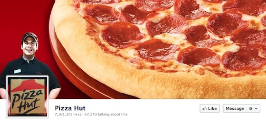
So while Pizza Hut profile photo shows a pizza box that is cleverly held up by an employee featured in the cover photo, its creative efforts didn’t get fans’ attention in the way that you might expect.
The problem, according to the report, is that users are seeing images like this in the same light as ‘advertising space’. Since they’re not looking for ads or corporate messages from their favourite brands on Facebook, the images are going unnoticed despite the significant effort that is going into their design.
Another reason that the cover photo won’t necessarily have the impact brands are hoping for is that users naturally scroll down to find information on Facebook pages.
In that sense, the cover photo and profile image do little more than let the user know what page they’re on.
Share information about your brand and its history
If you haven’t already filled in your brand’s history into the Timeline, you should do it now. It certainly will take a bit of effort, but it’s worth it. Simple Usability found that users gravitate towards the Timeline navigation on the right hand side of the page.
Users are interested in finding out more about the brand, pre-dating its Facebook existence, which represents a chance to communicate with them.
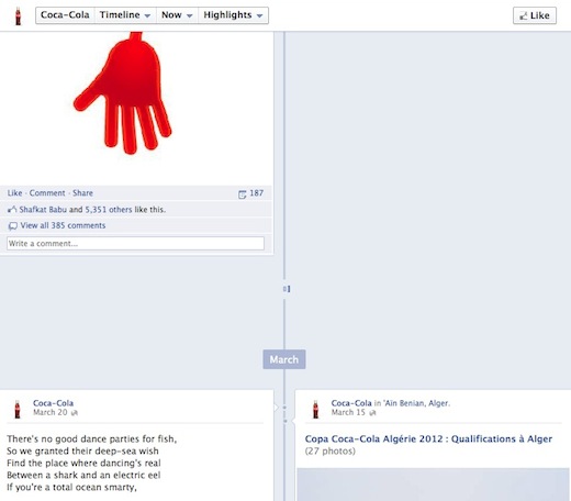
Some brands are already taking advantage if this and Coca-Cola has added content going all the way back to its origin in 1886, while Pizza Hut only had to go back to 1958.
These two are certainly not alone. A lot of major brands were quick to fill out their company history, including the New York Times, Manchester United and Tiffany & Co.
Simple Usability reports, however, that the feature is something of a double edged sword. While people were interested in finding out more about a brand’s history, it was also a source of confusion for some, who didn’t fully understand how content pre-dating Facebook’s existence was on the social network.
Aside from the actual historical timeline, fans were found to often visit the ‘About’ page to find out more about the brand, so companies would be wise to include relevant information, such as links to online profiles, and other details, to help fans learn more about what them.
Facebook’s layout was raised as one problem, according to one user canvassed by Simple Usability, but unfortunately there isn’t anything that brands can do about it:
“I was looking for what American Express was, you know a description, but it was just telling you about if you had [a credit card] what your rewards were and stuff like that… [but] I don’t know why I didn’t look at [‘About’], my eyes weren’t drawn to that.”
The ‘About’ link is not hard to miss, and you could easily not realise it’s there at all:
One suggestion is to feature the ‘About’ link next to page’s photos and apps, where it would be far more prominent. Since this is something that is entirely in the hands of Facebook to fix, one alternative open to brands is using a pinned post at the top of the page to give greater attention to the About link.
Make sure your most engaging apps are visible
Did you notice that there’s a little arrow next to the series of apps under the cover photo? If you didn’t, you’re not alone. The little arrow indicating that there are more apps to discover beyond what’s presented at a glance is easy to miss, and for the most part, visitors are focusing only on opening up photo albums.
Placing engaging apps, or even getting a sense of what users want to see on a regular basis is a great way to decide which apps are visible on the front page.
Speaking about the placement of apps, one user told Simple Usability, “I never even noticed that arrow, maybe it should be set out slightly differently.”
Update your page regularly
Simple Usability found that, when scrolling through the page itself, users don’t scroll back further than a month. The break in the Timeline has also proved to be another source of confusion. Users often thought that once the page stopped scrolling, and with a rather slow loading time to bring up previous content, they thought that they had reached the end of what the page had to offer.
The huge gaps that can be seen on all Facebook pages now certainly didn’t help matters either.
Some users also felt that they were completely up to date on information that these pages might offer, making it important to always be one step ahead, and provide content that is fresh and interesting for readers.
Users are noticing friend activity on pages
Facebook’s decision to feature friend activity on brand pages, while it may be a little creepy, is being noticed by users, but it’s not something that brands need to really worry about.
There’s something to be said for the viral nature of the feature, which according to Simple Usability it gives Facebook pages a 50/50 chance of attracting new fans, but it has its shortcomings.
Some of the content that is displayed includes mentions of the brand that are several months old, and we’ve caught sight of content shared by friends on their friends’ pages, and it was all just a little bit worrying.
Some users commented on the fact that the content was old, saying, “The comment bit was there, but it was from last year, if it had been more recent I would have probably commented [on it].”
This issue is, however, irrelevant to brands to a certain extent, since it really has more to do with Facebook users interacting with each other rather than with brands.
Pinned posts need to be more distinct
Another issue that Simple Usability found was that pinned posts weren’t easily differentiable from other posts. Users simply didn’t realise that it was an item that was intended to be highlighted, and few Facebook pages appear to be taking advantage of the feature.
Simple Usability notes the differences it found between Facebook’s pinned posts and Twitter’s promoted tweets:
Promoted tweets worked well amongst users, often featuring a photograph that conveyed company values informally, such as a dog by a printer sent in by a follower for HP. Similarly, promoted tweets could be used to good effect in reinforcing something alluded to in the main ‘cover’ image: Staples referenced the competition advertised in the main image. Finally, Coca Cola used a short video in its promoted tweet, which went down well with users. Clearly there is scope for Facebook to do something similar and make pinned posts more prominent.
While it’s in Facebook’s hands to clarify the distinction between regular posts and pinned posts in the design and layout, Facebook page administrators can take advantage of the feature to share specific types of content with fans – either factual information, or to promote content that you know fans want to see, like competitions. The pinned posts can be used to share the page’s moderation policy on wall posts, frequently asked questions, highlight competitions, or sales and discounts.
Taking a page from what users liked to see in Twitter’s promoted tweets, administrators would well to make the pinned post media rich, by including photos or videos that will attract the attention of fans.
Do you have any tips or tricks that you use on your Facebook page? Let us know in the comments.
Get the TNW newsletter
Get the most important tech news in your inbox each week.


