
Tomas Dirvonskas is the co-founder and CEO at mobile product design boutique Lemon Labs. You can follow him and the company on Twitter: @tdirvonskas and @lemonlabs
Just recently, Baltic-based startup Vinted – a marketplace for girls to buy and swap pre-loved clothes – raised $27M from Insight Venture Partners. A year ago, they did not have any mobile presence; today more than 50 percent of its traffic comes from apps.
During the redesign process we helped facilitated, we’ve learned some useful lessons about redesigning an app for growth. After the redesign, app usage increased 170 percent, and here are our nine tips.
1. Decide clear priorities for information on one screen
If there’s one tip you take, it’s this. When redesigning member profiles, we’ve evaluated the importance of every element (there were nine in total).
Since the Vinted app is about clothes and fashion, a key element we’ve selected is the member’s clothes, placing them front and center. Other information was simplified, removed or combined and moved up to the header and visually separated from the item list.
This enhances user experience and let’s them focus on main content. The more user focuses on content, the higher probability for the transaction.
2. Call to action buttons should always be on the screen
To help your conversions, make a call to action button sticky – that is, ensure it’s always visible on the screen. It’s even better if it’s big and red – just don’t go too far. You don’t need to make it bounce, sing, or otherwise disrupt the user experience.
When evaluating the item screen, we focused on the single most important goal: to make the sale. Action buttons were placed right below the photos of clothes to keep user’s focus on content, but in addition we made the bar with the button “Buy” sticky. If member scrolled the screen, it would stick to the top and remain visible all the time, allowing interaction.
3. Make as few steps to reach the content as possible
We had this goal when redesigning the catalog, but this tip applies anywhere: users are not really that interested in your smart categories tree, they want to see the content, and then, maybe, narrow it down.
The clothes’ catalog in Vinted has a six-level deep hierarchy. We set out a goal to show items to the members within two taps.
For the entry into the catalog, we created an iconic grid of categories that led directly to the item listing within the chosen category. After many iterations the final solution allowed a member to navigate deeper via a dropdown in the navigation bar.
4. Chat is how people message on mobile
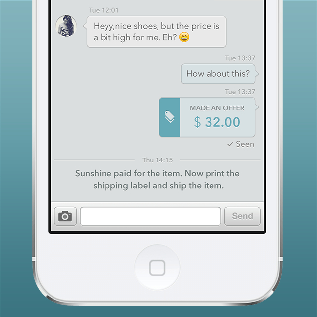
Email-like communication feels foreign on mobile. Chatting is a more natural process, and makes for better communication between users overall.
For commerce apps, adding useful tips along the sales process could also enhance user experience. In Vinted’s case, we advised users to make an offer with a lower price. This allowed more context in conversation and shortened transaction time.
5. The shorter signup form, the better conversion
When we see a form that is so long that we need to scroll, we instantly feel tired, and mobile apps can be closed with a press of a button, and deleted with another one.
Try to ask for as little information upfront as possible, and get user inside, even without the complete profile. You want them in the door first before they familiarize themselves with your app.
6. Upload content first, describe it later
We found that the more content we have, the more transactions occur. To encourage users to contribute content, we split the actions into two steps, allowing members to be creative first by shooting images and uploading them before they need to fill in information about the item.
Users like experimenting with creative tools. Let members try out the visually appealing features first before forcing them to go through the formal tasks to finish up their efforts.
7. On iOS top bar, left is for navigation, right is for actions
Back button always take space on the left, there is nothing you can do about it. But do yourself a favor and don’t clutter the right side with persistent buttons.
In version 1.0, the Vinted Menu button occupied right top corner, so we needed to put action button somewhere else – usually in between the content or at the end of the screen. That never feels right on mobile and usability suffers. The solution is straightforward: move menu to the left.
8. Heart is magic
Here’s a tiny little tip: if you currently let users to favorite anything within your app using a star, consider a heart. We’ve changed it to a heart for members favorite clothes and to our own surprise this feature’s usage increased 10 times.
We actually learned this from Airbnb. By simply switching star to heart for a Wish List listings, Airbnb increased its usage by 30 percent. Something as small as a symbol is truly worth trying.
9. Documenting design flows is essential
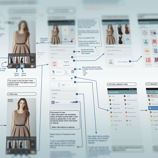
Vinted app has 90+ different screen and even more member flows, thus communication of these dynamics is difficult and prone to misunderstandings. Code has commit history, documentation and comments on Github repositories.
Design deserves good documentation as well, and we used App Flow documents – large flowchart-like diagrams showing every screen relevant to a particular flow (e.g. Sign Up) with every possible state and transition between the screens.
These documents proved to be invaluable by serving for a reference point when discussing and implementing design solutions.
The redesign worked: every metric increased, some – considerably so:
- Android usage increased +163%
- Android item upload +74%
- In total, the app has been downloaded 2M+ in a year
After spending 30,000+ hours of concepts, design and development we’ve created user experience which accelerated growth. What are some design changes that have helped your app grow?
Get the TNW newsletter
Get the most important tech news in your inbox each week.