Once in awhile, when browsing the internet, you might get on a homepage or landing page that takes your breath away. Having a great home page does take a lot of effort and time, but when it’s finally done, you can really take pride in your work.
And there’s nothing better than that!
The reason of this article is showing you that landing pages don’t have to be cluttered with information and lots of visuals to be good!
They only need a few great well-executed elements and some eye-candy characteristics!
Let’s start with the beginning.
What is a homepage and what’s its use?
The homepages we’re talking about can represent the pages on which an user gets after clicking a banner ad, a PPC ad, promotional email, a social media post or a link. But also a homepage can the first page presented when a user selects a site or presence on the World Wide Web.
There is more than meets the eye when it comes to landing pages. That’s why a good landing page isn’t about great design or CTA’s or even about very useful visual elements.
The best homepage is considered successful when it drives good ROI and when it starts converting.
Landing pages and also homepages can inspire users to:
- Buy certain products
- Sign up for newsletters
- Create an account
- Contact team
- Download exclusive content
- Connect on Social-Media
Take away Fact:
A landing page does not represent your homepage, but it’s most of the times the first page a visitor sees!
So, what are the components of a great landing page? What are the elements that creates the best homepages for your website?
Well, it’s easier if I’m showing them to you through some great examples I stumbled upon in the last few months.
1. Interactions
There are a few things that can keep a user engaged more time on your website. And one of those things is interaction. If while browsing your website a user goes over an element which has interaction with his mouse, he’ll definitely be attracted to it. It works like magic! And everyone loves magic.
What you can do is simply think about some of the things that can be made more fun and animated on your page. Be it a chat bubble (for support) or some basic interactivity on some of your elements.
These little gimmicks are called ‘easter eggs’ and represent an intentional joke or a hidden message or feature. You might remember them from the online games you played when you were younger.
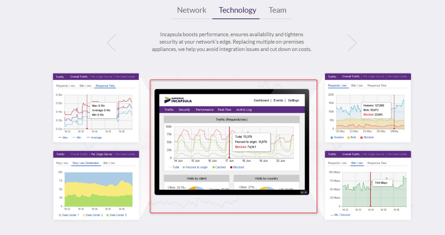
Incapsula is already mastering Easter eggs and has many interactions on its website meant to give something fun and attractive to its visitors. These are the little interactions that makes the difference between an UX designed homepage and just a well designed homepage.
Like this one.
2. Simplicity
‘Less is more’ works in this case too.
Do you remember those cluttered sites of the 90’s? With lots of text, small images and many links? You could get lost in there! Nowadays, people’s attention span has lowered to the point that if they are not immediately attracted to something, they will close the tab.
So make sure your homepage is clean and the epitome of simplicity! Concentrate on what you know is important for visitors, not on what you believe they might like.
Take away fact:
Did you know that 48 percent of landing pages contain multiple offers? That might give a headache to anyone who gets on those landing pages. Why not keeping your offers specific? via Marketing Sherpa
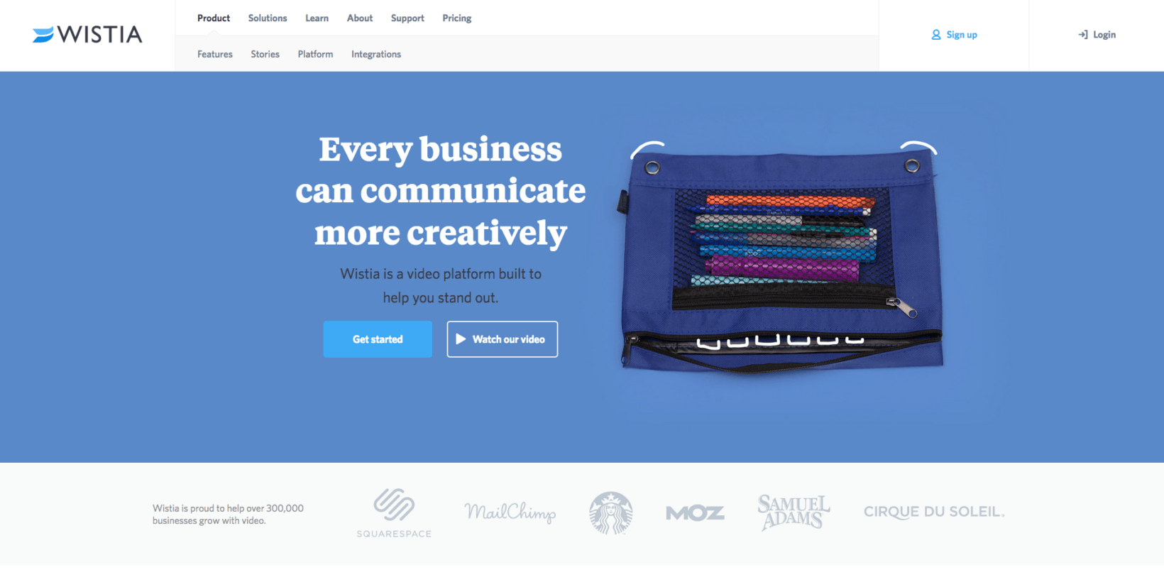
Wistia has a really simple and specific homepage. A simple form with basic information needed and no unnecessary information.
3. Great headline
I like to call the headline – the hook of a great landing page.
Why? Because its role is to grab the attention of the reader and inform him what the product or service is about! And that’s what keeps users on the page.
Remember to keep it simple and short. Not more than 10 to 15 words.
What’s important to know when it comes to headlines, is to match the message on your banner ad with the one of your landing page. If your banner ad promises something, make sure that the visitor won’t be disappointed when he gets to your page.
Quicksprout for example, choose “Grow your website traffic.” as a headline.
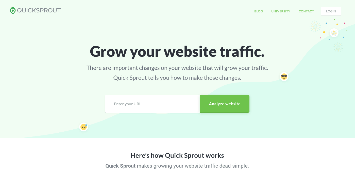
Why? Because they know what their potential client’s needs are and they can fulfill them.That’s a pretty good ‘hook’!
4. Benefits of the visitors
Your homepage should send the idea that it can help solving a problem or just tell them who you are and what you do. That’s why whatever you choose to have on your page, be it graphic elements or text, they should push the idea that they’re in the benefit of the visitor. People get to your page because they have a pain, a need they hope you can help with.
One example I love is Officevibe’s homepage on how easy they can sign up.
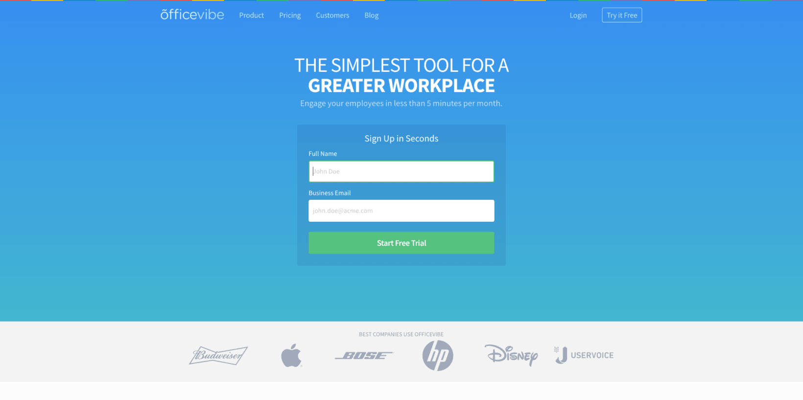
You can see that the text is concentrated on the visitor with words like “workplace”, “employee”, and last but not least – the CTA “Start Free Trial”.
So if you want to design one of the best homepages out there, make sure that you present your visitors their benefits.
5. CTA
CTA is one of the most important elements in a landing page.
It’s how you get something back from all your marketing efforts.
Try to avoid words like ‘BUY!’ or ‘Download’ and use something more personalized and unique about your product or service.
Smartketer, a banner ad design service, chose a customized CTA for their homepage. If you arrived on that page, you’re probably interested in someone helping you with your banner ads, Facebook or mobile banner ads.

You can simply click the CTA which says “Order banners” and you’ll be taken to an order form to choose your plan.
Quick and efficient!
6. Branding and design
As I said above, there must be a correlation between your banner ad and your landing page, and not only when it comes to text.
We, as humans, are attracted to variations of colors! The difference of color between the background and the key points of you landing page directs the visitors exactly where you want them to go. What’s really helpful when choosing the right palette for your landing page, are your brand colors. You can always use your main brand color for your background and contrast your CTA with something else from you color scheme.
When it comes to visuals, they can be photos, illustrations, graphic elements or even short videos! If you’re a blogger or a thought leader, one of the greatest strategies is using a photo of yourself in the homepage or landing page of your website.

Paul Jarvis chose to use his photo as background for his homepage, while still focusing in the email subscription box.
The white space is also very useful in this case.
If used correctly, it gets from ‘nada’ to ‘Prada’ in seconds by directing the viewer’s attention to what’s important.
7. Social proof
What’s the best proof that a product or service is worth your attention? Some other people that can swear by it, of course!
Susan Weinschenk author of Neuro Web Design: What Makes Them Click? said that,
“If you want people to act on the data, then you need to couple it with emotional data.”
And that’s exactly what social proof is.
There are a few ways through which you can use Social Proof on your landing pages or homepages:
- Testimonials
You can easily ask some of your customers to tell you why they love your product. This tactic credibility can be boosted if you’re adding a photo next to the quote. Or you can talk with influencers from your industry to give you a quote about your work.
- Social Media shares
Social sharing buttons are besides great tool for growing your community, but also, an efficient tool to prove the reputation of your product.
- Embeded Social Media posts
Nowadays, in the age of opinion, everyone is encouraged to put it on the Internet. Even though most people use Social Media for rants and public shaming of some brands, you might find a gold mine of positive posts about your product. Don’t forget to ask for permission before embedding the posts on your website!
- Publications proof
Top websites in your industry that wrote an article about your brand can be a social proof. For example, if you are an entrepreneur and you have a personal website and publications like Inc or Entrepreneur mentioned you in one of their article you can add it to your website. People will know that you are a big deal in your industry.
Conclusion
If your purpose is to increase conversions and have great results (and don’t we all?), you should really give all you’ve got to create a rocking landing page! You don’t even have to follow all the guides and trips and tricks you find on the internet.
All you need to do is keep in mind your objectives, your audience and keep all simple!
What are other examples of the best homepages you found while browsing?
Get the TNW newsletter
Get the most important tech news in your inbox each week.
