This post originally appeared on Sinch.
Everyone is different and so are your users and customers.
More and more apps are starting to use psychology in their attempt to boost app engagement and retention, and understanding how we work psychologically can help find some low hanging fruit to A/B test in your app.
I think it is really interesting to understand how our minds work, and how small triggers can change the way we think and approach things such as the web and apps. Of course this is nothing new. Psychology in advertising and marketing has been used for over 100 years but as always, there are some great insights we can takeaway as app developers.
Remove Negative Feedback (Like Tinder)
No one wants to be rejected when looking for dates and the feeling of being “beaten down” can give a negative impact on your users and customers. Negative feedback is where a user gets a rejection which “undermines people’s confidence in their ability to pursue their goals and their expectations of success” according to Psychology Today.
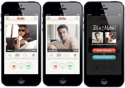
Tinder gives a great user experience by removing this negative feedback in their dating process. If two users do not match, instead of informing the user of this “rejection” the app just moves on and goes to the next potential match. The user sees nothing and just goes through the Tinder experience.
Key Takeaway
Keep your users happy and pleased to improve their experience in your app. Remove negative feedback such as failure and rejection to keep the best mindset for the user.
Social Proof (Like Basecamp)
Nobody wants to be made a fool and as clever as we might think we are, one of the most common ways people do this is with group validation, or social proof. An example of social proof is Basecamp who, on their homepage, have always led with the headline that people like you are using their tool.
“Last year alone, Basecamp helped over 285,000 companies finish more than 2,000,000 projects.”
This helps users understand that other businesses are solving their project issues with Basecamp. It also gives validation that this app is being used by lots of people and it is not a scam. Users fear failure in their choices online and a very common way to alleviate this is by adding a validation statement like this or by adding pictures of customers or even a Facebook Like Box to show that people in your social circle are also using this tool.
Social proof is a big topic and Buffer have a great walkthrough on some of the ways you can boost the social proof of your apps and websites.
Key Takeaway
Make sure your app looks real and used. No-one wants to use an app no-one else uses so do all you can to build a community that users will want to join.
Headline Curiosity (Like Upworthy)
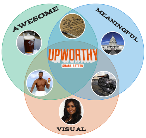
Since day one, UpWorthy has curated content that has been click worthy and creates curiosity. Its headlines make you read and really want to know what is on the other side.
Examples like:
“Before You Argue On The Internet, Stop And Hear This Dude Give You A Few Good Pointers”
It makes users want to click “gossip” and fulfil a guilty pleasure. Although there are many people who find this type of “click baiting” annoying, the truth it that these are insanely popular with readers online and can turn a normal article or video into something viral.
Key Takeaway
Spend time making your copy in your app or on your app store listings interesting and appealing to your audience. A/B test for the best effect.
Personalisation (Like Amazon)
Amazon has spent millions of dollars and has an entire team working on the personalization system they have. Every Amazon account has a customized homepage with suggestions based on your previous browsing and buying experience with Amazon. Rather than the classic upsell, these are data based, rich suggestions that understand and predict what you may want to buy next.
Personalization can even extend to email. Emails with personalization in the body copy or even the subject line often get much higher conversion rates, in some cases by as much as 50 percent.
Personalization does not just have to be name. It can be location, browsing or buying habits, website referral source and many more. Anything that segments customers based on data you already have.
Key Takeaway
How can you use user data to provide a more customized and individual experience for your app users?
Reward Users (Like Yelp)
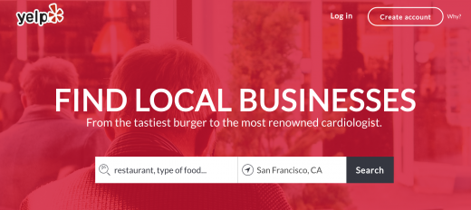
Yelp is a great example of rewarding customers. Everyday, thousands of customers review restaurants, cafes, shops and businesses with the aim of building a better database of places to go. But there is a sense of reward and success in using Yelp.
Rewarding users can be anything from giving a simple badge for completing a task (like CodeAcademy) or becoming Elite with Yelp based on previous performance. As long as users have something to give positive feedback and a desire to return, your app will be in good standing.
Key Takeaway
Use rewards and giveaways in your app to entice users to be more active in your app. Free credit, unique content, extra levels…anything that can give a enrich their experience.
Be Persistent and Keep Them Coming Back (Like CSR Racing)
Ok, guilty pleasure. I have been playing CSR Racing for about a month and one of the things that annoys me but keeps me coming back is their purchase feature. As you advance, you can buy upgrades and new cars but some need you to wait (or buy it now for a real cost…no thanks). This is great because if I know I need to wait 10 minutes, I will close the app and wait and then come back.
In my opinion, tactics like this really boost in app engagement and retention. Rather than playing the app once a day, users will play numerous times based on their performance.
Key Takeaway
Use notifications carefully and selectively for optimum impact.
These are just some of the areas psychology can help you give a better experience to your users and I would recommend that you experiment with these via some A/B testing to see the impact on your conversions and KPIs.
For more information, follow the work and podcast of Nathalie Nahai a.k.a The Web Psychologist. She has some fantastic insights into how designers, marketers and advertisers can use psychology to improve their user experience and get the results they want. Also checkout the Buffer Blog as they have a small psychology section.
What ways do you use psychology in your apps and marketing? Let me know in the comments!
Read Next: 6 important things to know about how your brain works
Get the TNW newsletter
Get the most important tech news in your inbox each week.


