There is nothing more pleasing for a creative designer than a new challenge. User Interface designers are sick and tired of standard screen sizes and similar UIs. Apple has provided an opportunity for those who want something extraordinary — the iPhone X with its unusual screen is the most exciting task for UI designers for many years.
However, with great opportunities come great responsibilities. Let me show you a few things that mobile designers will have to keep in mind when working with Apple’s new flagship phone.
Adjusting the UI for iPhone X
The first change and challenge is the screen size. Obviously, the new iPhone X is taller — 20 percent taller, to be precise — compared to the three previous iPhone designs: 6, 7, and 8. That is 145px of extra screen space interface designers have to deal with. I’ll make some troubleshooting analysis of the main elements that designers will have to handle.
If you have an application that was created using native iOS components in design, you have nothing to worry about. Your app will be adapted for the new iPhone automatically. That can include navigation bars, tables, collections, and tab panels. They’ll be automatically inserted and located, easy-peasy. However, if you don’t have that luxury then you’ll have to worry about the following screen features:
Full-screen view
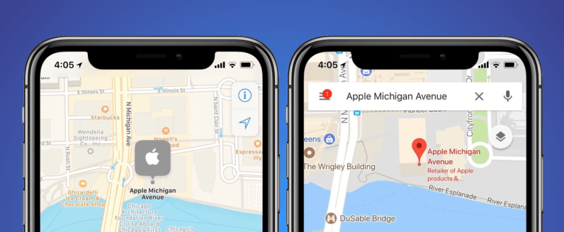
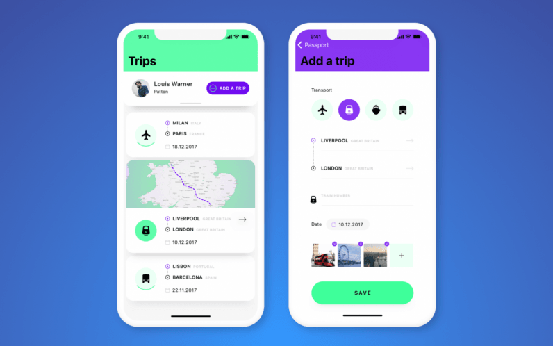
Make sure you extend the content of the app to the edge of the screen as Apple’s Human Interface Guidelines suggest. Users should have the opportunity to scroll content to the very bottom of the screen going beyond the rounded edges.
Status bar
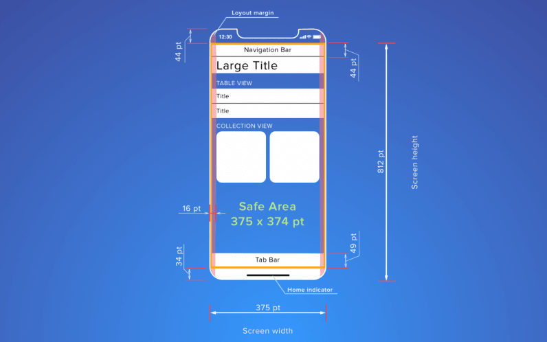
The Status bar is an integral element of any smartphone screen. Compared to the earlier models, the status bar of iPhone X is double the height — 44pt to 22pt in iPhone 8 — and is split into two parts by a notch.
It still provides users with important information about the device’s current state such as battery level, network access, etc. That’s why Apple recommends not to hide it during app operation.
Obviously, there are certain types of content (photos, videos, games, etc.) that require full-screen mode. This is the main reason for hiding the status bar. In all other cases it isn’t recommended. Instead you can make the status bar part of your product design by applying the full-screen view shown above.
Safe areas
Another thing that can’t be ignored by UI designers is ensuring safe areas on a screen. The main principle is not to place important or clickable elements there to prevent accidental activations — we all know how frustrating those can be!
Fortunately, Apple has created Safe Area guides to show designers where to place the content in apps.
The notch
This is an absolutely new screen element which has taken its place on the device screen because of both objective reasons and as a marketing hook. The notch was a bit controversial to say the least when the iPhone X was launched, and I must admit I found it a bit distracting at first.
However, now designers will have to deal with it somehow to include it to interface design smoothly. The first requirement that Apple tells designers is not to hide the notch. It is wrong to mask the notch behind a black tape, making the screen look like an iPhone 8. If you splurged for the X you might as well show it.
There are cases where some creative designers have tried to make extensive use of the notch and exploit it as an element of the user interface. Just check out these examples.
Bottom of the screen
Usually the bottom part of the screen has the majority of app’s control elements. However, dealing with iPhone X, designers should keep in mind the home indicator area. There is no hardware home button anymore, so designers are not free to place control elements on the bottom line of the screen.
Besides, the abundance of control elements are as confusing for users as they have always been. Don’t try to fit everything in the tab bar. Edge-to-edge buttons, timelines, or ad banners can be replaced with floating elements — so make the most of it!
Landscape mode
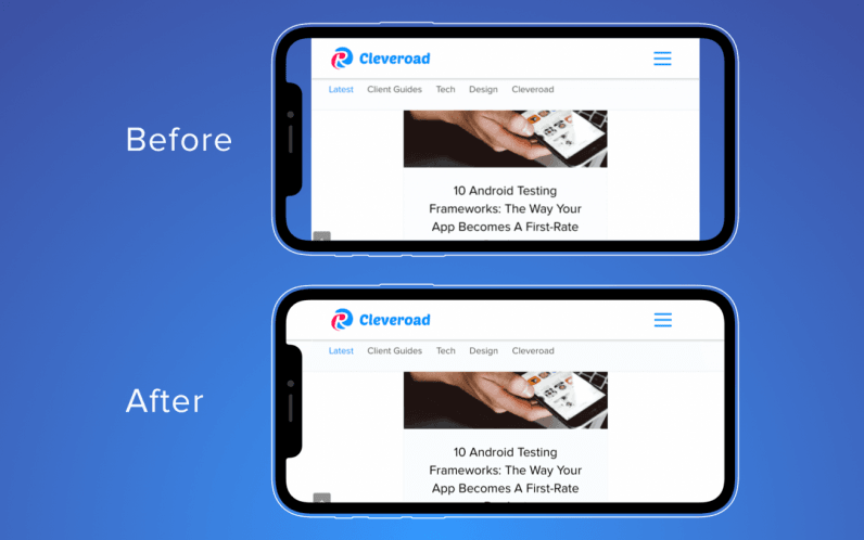
Landscape mode is the only way to get rid of the status bar ‘legally.’ The main goal of switching to landscape view is gaining maximum space for content; be it text, games, or video.
Designers should also take into account that the screen bars will become smaller: the navigation bar in landscape takes 32pt instead of 44pt and the tab bar size narrows from 49pt to 30pt.
Web designers should also consider adapting websites to landscape mode even if they look fine in portrait mode. The Safe Area leaves lots of free space on each side of your website when browsing in landscape. So Apple has created a dedicated guide to educate designers on how to adapt websites.
Dealing with gestures in iPhone X
The absence of a physical button gives new value to gestures which UX designers should be aware of. Apple has changed the meaning of some familiar iOS gestures and invented new ones — kind of confusing but also exciting.
Users have the tough task of getting used to these new interaction patterns. That is why the introduction of custom gestures to an app is not welcomed at all. One more thing, the Home button is replaced by a home indicator and designers are recommended to avoid hiding it unless it’s absolutely necessary.
As you can see, there are lots of details that should be taken into account when designing for the iPhone X. The main thing is to remember the main task of user interface design: to make user’s interaction simple and efficient.
A thoughtful approach is more than just ordering interface elements, designers need to predict user behavior and balance those elements to make users launch an app again and again.
Get the TNW newsletter
Get the most important tech news in your inbox each week.


