
Let’s start by stating this: Not every visual story has to be interactive! Say it again: Your visual story does not have to be interactive to be effective!
Your story, however, must be engaging. If your users barely look at it, or get bored with it, then what was the point of creating a visual story in the first place? You might as well have left it out entirely.
An engaging story doesn’t have to be complex or elaborate. In some cases, you can tell a cohesive story with just one image.

Photo credit: Blackhouse
If your story can be told with a single image, then don’t use twenty. But if your story needs twenty visuals to work well and be understood, then definitely don’t try to do it in eight. It’s all about making your story as detailed or simple as it needs to be: no more, no less.
Some sites wouldn’t benefit from interactive stories. A site where users want to instantly access information wouldn’t work as well with drawn-out interactivity. The point isn’t to create a connection on those sites – the point is to provide knowledge quickly and simply. A site like Wikipedia, for example, wouldn’t do well with loads of interactive content slowing down the user.
Some stories, though, are more complicated, and aren’t well suited to static images. Sometimes they greatly benefit from directly involving the user in the story itself. In these cases, figuring out how to get the user to interact becomes key.
In this piece, we’ll explain a few ways to approach creating an interactive story.
-
Make users a character in the story
As described in the free Visual Storyteller’s Guide to Web Design, one of the easiest ways to directly engage your user is to make them a character.
The Slavery Footprint website, for example, uses a guided questionnaire to make the information they’re presenting personal to the user. Effectively, the website becomes directly about them, rather than just some general, faceless person.
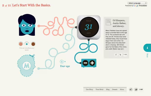
Image credit: http://slaveryfootprint.org/ via Digital Telepathy
This is an excellent way to engage your user. They immediately become invested in what you’re telling them because you reveal something new about themselves.
Think of ways you can make your user a character in your story, by directly involving them and personalizing the way information is presented. Whether it’s based upon user input (e.g. sites that first make you choose if you’re a developer, marketer, or designer) or based upon complex real time-data, this kind of interaction is incredibly effective – especially if the goal is to get your user to care about a cause to topic.
Another great example of a site that leverages involving the user directly as a “character” is Tesla Motors, specifically their “Go Electric” page, which showcases some of the common questions a user might have about switching to an electric car. By addressing the user directly, it makes the user feel like they matter (which of course improves engagement).
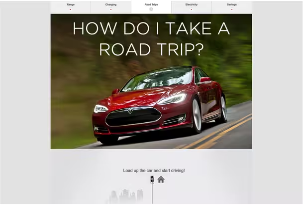
Image credit: http://my.teslamotors.com/goelectric
Also, notice how Tesla creates a fully immersive learning experience through high-resolution visuals and a long-scroll. Through tasteful parallax techniques like scroll-triggered animations, the site takes the user on a linear journey from exploring how the battery works to learning how to take a road trip, finishing up with a subtle conversion-driven section regarding fuel savings.
The site speaks directly to the user, then frames questions as product benefits. Tesla’s “Go Electric” page strikes the perfect balance between product focus and user focus.
2. Gamify your site
While gamifying your site is related to making your users feel like characters, the two tactics can function independently.
Gamification, in simple terms, is a system of risk (or other cost) and reward. You want to find ways to make your story reward your users for performing certain tasks.
It’s most commonly seen in Web and mobile apps, though that doesn’t mean you can’t use it on your website. Think of sites that offer credits or points in return for completing tasks (like filling out a registration form or completing special offers). That’s gamification.

Image credit: UXPin
Rewards, when they’re worthwhile (either psychologically or physically), are a huge motivator for users. Just be careful that the rewards you’re offering are appropriate to the level of risk for your user. Too small a reward isn’t enough incentive, while too large of a reward may make them wary (“Why am I getting so much for so little? There must be a catch.”).
On the most basic level, visuals that change, improve, or do something “cool” can be a great reward for simple tasks. After all, that’s how many video games work: complete a task, move on to the next level. Your website or app can do the same thing.
Foursquare has long used gamification in their app to encourage users to continuously check in at various places. The more users who check in, the more useful the app is to everyone, so gamification makes a ton of sense in this case. In their Swarm app, you can also gain rewards like becoming “mayor” of a place you check into often (among your friends who also use Swarm).
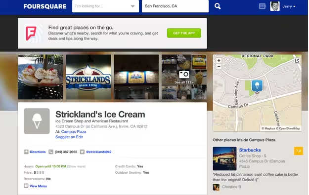
Image credit: Foursquare
As we described in Interaction Design Best Practices, gamification works off of the simple cue-routine-reward loop that creates user habits.

Image credit: UXPin
Because it’s difficult to change the actual cue, you’ll want to either change the routine or reward.
Dropbox is a good example of gamification through voluntary reward. They dangle a reward (250MB of free space) in front of users in exchange for a series of small actions, which it cleverly frames as “a series of quests”. They also present the seven quests in a checklist format, which taps into people’s need to feel a sense of accomplishment.
Unsurprisingly, this gamification model actually played a huge role in Dropbox’s initial growth.
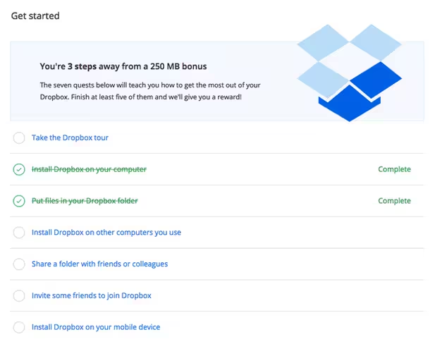
Image credit: Dropbox
As you approach your initial data limit, users will be shown a notification (cue) to either upgrade their account or invite others (both of which are routines). By presenting a simpler routine (inviting others) without altering the reward, Dropbox manages to capture value from less convinced users who otherwise might just abandon the app if they didn’t want to pay.
While gamification isn’t a direct form of storytelling, it does create a stronger overall narrative for the experience. By offering different rewards for different actions, you end up creating more of a “choose your own adventure” feel to your site or app.
3. Supplement common actions with interactivity
Certain actions are quite commonplace online. For example, clicking (or tapping on mobile devices) and scrolling are actions that users complete without a second thought – you might as well add some interactive value.
When it comes to clicking, use your images to reinforce where users should click and what will happen when they do (and why that’s beneficial). As described in Web Design for the Human Eye, you must ensure consistency between the tone of your copy and the images.
Notice in the below example from Squarespace that the high-resolution image fulfills the promise suggested by “Create a beautiful website”. If you want to capture user attention, keep the headline within 5-7 words, then find (or create) the right graphics to communicate the message on an instantaneous level.
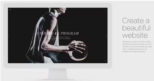
Photo credit: Squarespace
When it comes to scrolling, you must be very nuanced in your approach if you want it to work. Parallax scrolling has become one of the most popular techniques to tell a linear visual story as a user scrolls down a site.
Of course, you don’t need a full parallax site to create a more immersive experience. For example (also from Squarespace), you’ll see below that the image in the computer and copy on the page rotate in place as you scroll downwards. As a result, the overall scroll is shortened while also providing a bit of unexpected visual delight.
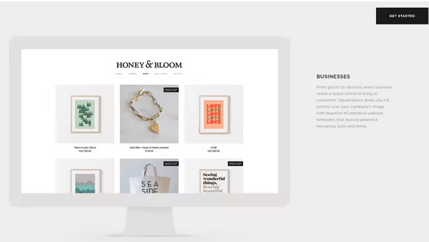
Photo credit: Squarespace
Also borrowing some tricks from parallax design, design agency Humaan tells a fun interactive story with hover-to-reveal copy and scroll-triggered animations.
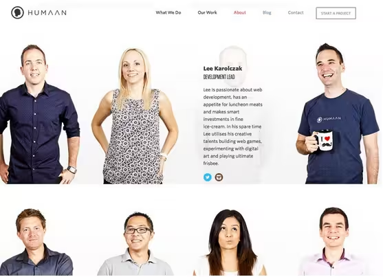
Photo credit: http://humaan.com/about/
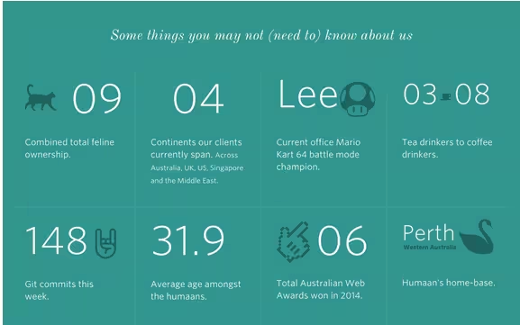
Photo credit: http://humaan.com/about/
As you scroll down the About page, fun facts about the agency are also revealed as part of a larger grid. Without the clever animations here, the storytelling pace is ruined since the user would feel overwhelmed by all the copy appearing at once.
Remember that interaction design isn’t about flashy animations at every corner. Embed additional interactivity into existing user actions, and you’ll find that the effects quickly add up to create a more delightful experience.
4. Make your visuals respond
Adding visuals that respond to user actions is tactic that’s similar to our previous tips on leveraging common actions. In most cases, this is going to be some simple animation that they’ll perform (like we mentioned with Humaan). The visual reaction can be triggered by clicking, scrolling, or a more complex action like a form submission.
Take the Babel app website, for one great example. As you scroll down, a cat (the title character, Babel) seemingly falls from the sky, tumbling on the way down. Stop scrolling, and the cat rights itself, holding onto an umbrella. (You can’t see the effect here, but visit the site to try it out for yourself.)
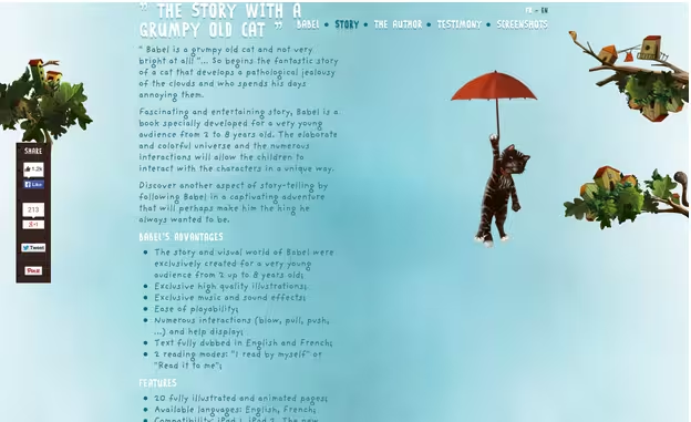
Image credit: http://babeltheking.com/eng via Digital Telepathy
5. Hide secondary elements for an “easter egg” effect
This is one of the trickiest interaction design strategies to pull off, and is only suitable for certain sites. But if your project is well-suited, the joy of discoverability can be one of the most memorable experiences for users. Some types of sites that might be appropriate for this:
- Game sites (both those for actual games and those about gaming in general)
- Giveaway or contest sites (it can add to the fun of the contest)
- Sites aimed at geeks, nerds, and the computer-proficient (who doesn’t love a good Konami Code easter egg?)
- Any site where the premise is supposed to be fun and lighthearted, or where the user will feel a sense of accomplishment at discovering something hidden
One great example of a site that uses this tactic well is The Museum of Mario website, which showcases the evolution of the Super Mario Bros. and related video games. Different areas on different screens within the site perform a variety of actions, including mimicking game play and revealing information about characters and games.
Because The Museum of Mario site is already targeting gamers who mostly enjoy easter eggs, this kind of hidden information works. It’s also effective because it says right under the header “click around to find hidden interactions!”
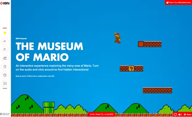
Image credit: http://mario.ign.com/ via TheUltralinx
But be careful that your audience actually understands and enjoys this kind of playful interaction. Not everyone will appreciate it, and for some users, it may prove to simply be frustrating. We can’t emphasize this enough: before you design anything, know your users inside and out.
Once you know your users, make sure you prioritize the tasks. Actions that are critical to completing user goals must be explicitly visible, while those that are more occasional can afford to be less visible or even hidden. As you can see in the previous Mario example, you can still experience the whole history of Mario without ever using the hidden click feature (which means they prioritized correctly).
6. Keep the bigger picture in mind: a beginning, middle, and end
Every good story has a beginning, a middle, and an end. Even a story told with a single image follows the same narrative arc (just completing the cycle faster), but it becomes even more vital for a longer, more complex story (like explaining why your cloud CRM solution stands out from the dozens of others).
Take time to map out the beginning, middle, and end of the experience. You should approach it from the point of view of the user: the beginning is the stimulus of the customer journey, somewhere in the middle you’ll engage with them, and the end is where they complete their final goal.
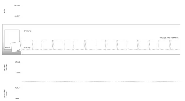
Image Credit: Designing CX Free Customer Journey Template
The stage of engagement and completion of sale varies dramatically depending on product and service. For example, a user might discover your product comparison tool at the beginning of their quest for a better computer, do some research, then decide it’s easier to pay for the tool. Your part of that experience is technically complete, but the user still has a ways to go before completing their final goal.
It’s never a bad idea to conduct user research and then create a thorough experience map for the whole journey (Adaptive Path offers an excellent free guide, and Designing CX provides a helpful free toolkit). Once you’ve explored the complete journey, you can then create a more localized experience map that focuses only on the beginning, middle, and end of where your site or app plays a role within the context of the bigger picture.
After you know the high-level and more focused customer journeys, you’ll be able to craft the most intriguing story to tell through your site’s visual and interaction design. Align your multimedia efforts to that narrative, and you’ve now crafted a targeted experience that is far more than just pretty pictures and animations.
Conclusion
Interaction design isn’t an ornamental branch of web design. It is the core to allowing users to become part of the story you tell, which makes them more of a participant than a passive observer.
Make your visual story as simple or complex as it needs to be to get the job done. Don’t add interactive elements just for the sake of adding them, and consider carefully those that you do add to ensure they add value to the end user, rather than just being there to “impress”.
For more tips on designing better websites through storytelling, check out the free Storyteller’s Guide to Web Design. Plenty of tips are provided through analyzing 29 examples from companies like Fitbit, Microsoft, Squarespace, and others.
Read Next: 5 psychology secrets for great interaction design
Image credit: Shutterstock
Get the TNW newsletter
Get the most important tech news in your inbox each week.


