While it continues to sell like hotcakes and new significant apps appear nearly everyday, the iPad platform has at least one glaring weakness regarding apps compared to its big brother the iPhone: the iPad App Store ain’t that great. This isn’t a scale problem either – the problems below have been there since the iPad launched. Here are the ways in which we think it can be much better:
Redesign the “Featured” page from scratch
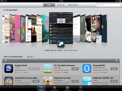
The “Featured” page in the iPad App Store is pretty much useless. First of all, the number of apps that it displays is minimal. Secondly, do we really need to know what Apple’s staff think are good apps? Third, the navigation is really clunky with those small arrows – more on that below -and the “In the Spotlight” at the top of the page frankly make the apps look horrible. Fourth, on both the “New and Noteworthy” and the “Staff Favorites” there are a very limited number of apps that scroll around without telling you you’ve reached the end of the list. Of the four ways to find apps in the iPad App Store, this page is by far the worst.
Auto-refresh to show more apps on the Top Charts
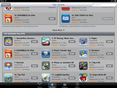
Of the current options to discover apps for the iPad in the App Store, the Top Charts screen is probably the best way. Not only does it look good in both portrait and landscape views, but the side-by-side comparison of paid and free apps is quite useful. That said, it would be nice if it was possible to just scroll down on one column at a time, as sometime you’re looking to spend some money, and sometimes you’re not. The best way to make this page better, however, would be to load more apps at a time.
As it is right now, you have to hit the (poorly placed) “Show More” text – which if they are going to keep this less-than-idealshould really be a big button – numerous times if you want to drill down to see more apps. It’s slow and annoying to go through only 10 apps at a time, and would be much better served if it simply auto-refreshed when you get to the bottom of the page. Also, does anyone (other than Apple and developers) really care what the “Top Grossing Apps” are? Wasted screen space.
Get rid of those awful small navigation arrows
Of all the problems of the iPad App Store, the small navigation arrows to slide screens is probably the biggest. Why is this necessary on a multi-touch device? Why can’t we just slide the screens from left to right like in nearly every touchscreen app there is? Those arrows just don’t make any sense whatsoever.
Improve comments on apps pages
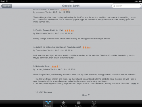
The way that comments on app pages are set up are another annoying part of the iPad App Store. First of all, the number of overall comments never seems to be right. Secondly, why only show 5 reviews at a time – most reviews are only a few words, and again, having to click the “Move” text just takes too much time (and again, why not a bigger button?).
Build it for the iPad not for a PC
While writing this review, we’ve come to a realization – the iPad App Store is ironically the much more like what we would expect for a PC with a mouse interface, and not built around the tremendous multi-touch capability of the iPad. Hopefully, Apple will simply trash most of it (though as we said, with a few modifications, Top Charts should stay) and give us a new store, maybe in time for the iOS4 launch on the iPad this fall. If Apple doesn’t feel like innovating, then they should just port the much more intuitive iPhone App Store to the iPad and be done with it.
Get the TNW newsletter
Get the most important tech news in your inbox each week.

