At EverythingMe we’ve been using Google Play Store Listing Experiments for the past six months. It had a dramatic and immediate effect on our numbers. It doubled our Google Play page conversion and had direct impact on our daily organic growth. We tried to compress six months and tens of experiments in multiple locales into five tips we thought you might find useful.
For Android developers, Google Play is the largest (and in most cases the only) source of organic installs. A tool that can double your page conversion is pivotal and if “Set my first Google Play Store Listing experiment” isn’t your current #1 priority, it should be!
Tip #1: Changing your app icon can have an incredible impact
A lot of developers get “attached” to their app icon and if you’re a brand there are also wider branding considerations. We put all these considerations aside and tested. The results amazed us.
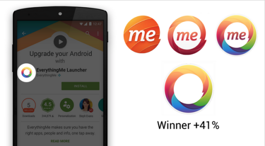
We conducted our icon tests in two phases which resulted in an overall 41 percent improvement in conversion!
- Phase A: tested different designs of the EverythingMe app icon which had a double digit effect on our page conversion.
- Phase B: tested removing the word “me” from our app icons. Which resulted in +41 percent conversion compared to our original icon. We realized that English is a barrier.
Tip #2: integrating a slogan as part of the feature graphic design can improve conversion
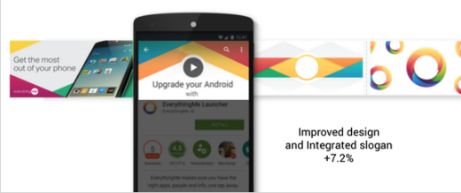
“Feature graphic” is Google’s term for the “cover” of your mobile Google Play page. We tested:
- Different designs
- Adding and removing a slogan from the feature graphic
- Different slogans
We found out that adding a slogan was effective and that getting the slogan right can have an significant effect on conversion. We also found that localizing that slogan had great effect.
Tip #3: Your App’s short description can help you capture the essence of your offering in one line (and increase conversion :-))
We found there is a “conversion loop” between the short description and the slogan we added to the feature graphic. This is how it works:
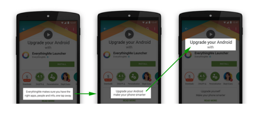
- We use the short description to fine tune our message. For example we started with “Personalize your phone” but found out that the term “upgrade” was converting better.
- When we find an effective message/term we reflect it in the feature graphic slogan design and localize to all languages.
- We then go back to the short description and experiment until we find an even better message… and so on
Tip #4: When it comes to product screenshots we invest our energy in the visible ones
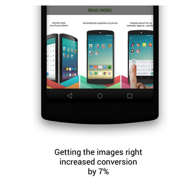
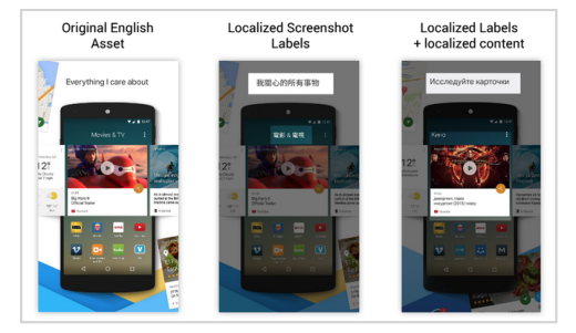
Google lets you add multiple screenshots to your app page. Getting the first, visible, image right is the most critical aspect in improving your page conversion. It took us time but it was worth the effort. One other thing we always do is make sure we include actual screenshots in our designs.
Tip #5: localization = increased conversion!
We tested localization across different elements of our Google Play page. Without dragging you into too many examples, let us say that localization works! From the product description, to any text you have on your Google Play assets. If you localize them there is a great chance you will see better conversion.
Localization isn’t limited to the messaging. If you have content in your screenshots using real local content, it is likely to increase your conversion.
Translation isn’t localization. Only real users can really localize your product.
At EverythingMe we rely on our amazing community. We have more than 500 passionate people in our localization community and using the tools we provide them with, we are able to scale localization to tens of languages. We found out that community localization (done by passionate users who know your product best) can outperform professional translation services.
For example, in our Italian Google Play page we tested our community localization vs. professional translation and our community localization increased our page conversion by five percent! :-)
What didn’t Work for us (…yet)?
The most important thing when it comes to experiments is persistence. The fact we weren’t able to optimize specific areas of the page doesn’t mean you can’t, it just means we haven’t figured it out… yet.
1. Video didn’t work for us
None of our tests so far indicate that our Google Play video improves conversion.
2. Long product description
Long description is what people see if they tap the “read More” option on your mobile Google Play page. We couldn’t prove that changing the long description had any effect on conversion. With that said, localizing your long description is likely to have a positive effect on your page conversion. Just think how discouraging it is to land on Play Store page and see text that’s not in your native language.
Google Play Store Listing Experiments go beyond page conversion
Being able to test different messaging and graphic assets on our Google Play page and using page conversion as a “love meter” gives us an incredible “window” to our potential users. We found out we could use Google Play Store listing experiments to work on our product-market fit without changing a single pixel in our actual product.
Practically speaking, what it means is that highlighting key features or key messages by making sure they are promoted in the page’s main assets, and seeing the effect on page conversion can teach you very quickly about how your potential users – the thousands of potential users landing on your page – feel about those features or messages.
Bottom line
Google Play Store Listing Experiments is huge. If you’re not using it please stop everything else you’re doing right now (no kidding) and set your first Play store listing experiment today! And if you find something interesting it would be great if you could share so we can all learn.
Read Next: 8 affordable tools to help optimize for conversion and understand your users better
Image credit: Google Play
Get the TNW newsletter
Get the most important tech news in your inbox each week.
