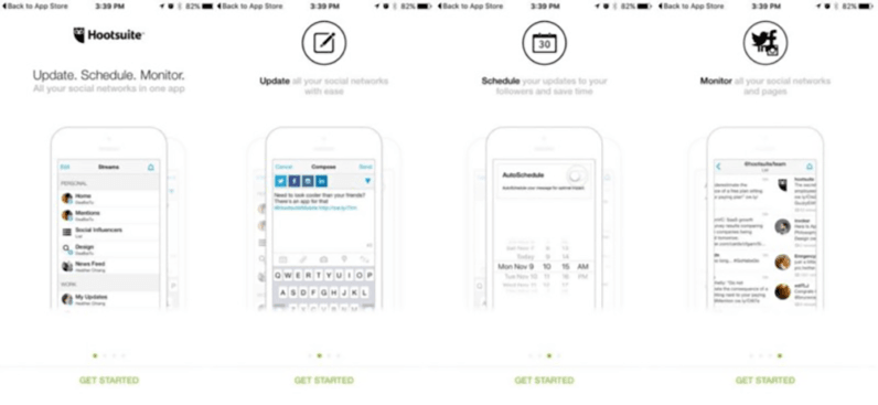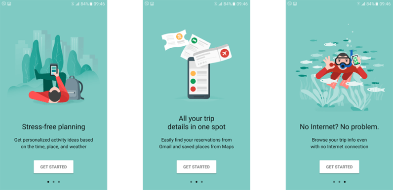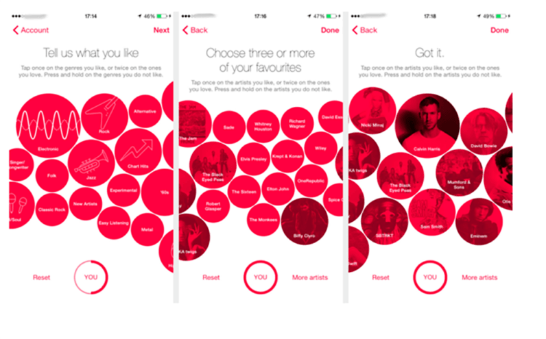
Take a moment to look at the home screen of your smartphone. How many of the apps there have been on your phone for more than three months? What about six months? A year?
For whatever reason, it’s usually only a handful of apps that find a long-term home on the phones of most users. Working with Quettra in 2015, Andrew Chen found that the average app loses 77 percent of its users within three days. Localytics latest benchmarks show that this figure hasn’t improved much, sitting at 64 percent churn within the first 30 days.
Users try out a lot of apps but decide which ones they want to ‘stop using’ within the first three to seven days. For ‘decent’ apps, the majority of users retained for seven days stick around much longer. The key to success is to get the users hooked during that critical first three to seven day period. — Ankit Jain, Head of Search and Discovery, Google Play
Jain’s comment raises the question of how do you actually hook users in the first three to seven day period?
One way to do this is through a great onboarding experience. Decent apps — to use Jain’s term — are functional, and benefit users in some way. And although you know your app is functional and will benefit users, people installing your app don’t. You could hope that they discover this for themselves, but given that three to seven day ‘hook’ period, why take the chance?
The ideal way to show them the benefits of your app is through clever use of onboarding where, instead of showing them how to use your app, you expose users to the benefits of your app.
1) What is your ‘Why’?
Your app description probably gives a nice explanation of why your app would be valuable to users. Peppered with a few choice buzzwords, you might even have split it up into neat bullet points. But when did you last read the full app description? No matter how you try and frame it, scanning is not reading.
A great onboarding experience will explain the ‘why’ again. But this time it will be short, pithy, and more visual. You want to elicit an “A-ha!” from your users, because while that doesn’t mean they’re hooked, it does mean they’re more interested than they were five seconds ago.

2) Keep it brief
Nobody is busy all of the time, but you also don’t know what users are doing when they launch your app for the first time. And honestly it shouldn’t matter whether they are doing this while waiting for their next meeting to get started, or while waiting for the next show in their Netflix queue to start playing. Nobody has time, or patience, for a 10+ step onboarding process. If any of your proposed steps doesn’t demonstrate value, or explains something that is painfully obvious to even novice users, lose it.

3) Get users invested in your app
The IKEA Effect is a cognitive bias that sees people place a higher value on any product they have partially created themselves. And it is something you can take advantage of during the onboarding process for your app. The easiest way to get users invested in your app is by getting them to create an account during onboarding. But providing an email address and password isn’t too much of an investment, so try encouraging users to create a partial profile.
There is considerable risk in asking for too much information this early, so depending on your industry, you could try any of the following:
- Ask them to create/upload an avatar for their account.
- Ask them to add a short bio.
- Ask them to create a wishlist, or their first shopping list.

4) Use contextual hints
Mobile games are quite good at skipping the whole onboarding process, and providing contextual hints instead. Users learn the game controls by actually playing a few levels, with concise hints appearing on screen only when needed. This works because mobile games don’t need to have any value proposition, but elements of this approach can still be used with other apps.
Combine a very brief onboarding process — little more than value proposition and signup/login screens — with an interactive tour. And if you can design it in such a way that users complete actual actions, instead of passively reading hints and tips, you’ll end up getting users invested in the app at the same time.

5) Create an emotional connection
Whether they admit it or not, everybody enjoys knowing when they’ve done something right, when they’ve done a “good job”. You don’t need to admit it now either, just smile and nod.
Great job!
Motivation is, in part, driven by spikes in dopamine, and spikes in dopamine can be triggered through positive feedback. By getting users to complete small tasks as part of the onboarding experience — and then positively recognising their achievement — you’re not only getting them invested, you’re also creating an emotional connection. Adding success states, simple positive messages that acknowledge a user’s achievement, offer a psychological reward, while also encouraging users to continue exploring your app.
Although not part of the onboarding process, anybody who has ever created a campaign using Mailchimp will be quite familiar with the primate themed success state, and how it makes you feel.
Conclusion
What works and doesn’t work with onboarding experiences differs from one app to another. The process should be shaped by the app itself, and the app’s audience, not solely by what you have read. And naturally you should be looking at which of your metrics can be used to evaluate your onboarding process. Because it is unlikely, even by following the tips discussed here, that your first onboarding experience will be perfect.
Get the TNW newsletter
Get the most important tech news in your inbox each week.


