We all know that branding is a vital part of any business. If it wasn’t, you wouldn’t have well-established brands spending many thousands of dollars each year promoting it, and protecting it. Branding improves recognition, establishes trust, and it represents you and your promise to customers. Your brand is made up of many components, but the one that is seen frequently is your logo — so you better make sure it’s good.
We’ve come some way from the day’s when small businesses would slap together their own logo using Clipart in Microsoft Word and a free font. However, even though most businesses now turn to professional designers for help with their logo, their efforts still too often lead to universal blandness.
So how do you design the perfect logo? One that represents your brand without being cast from the same mould as so many others?
It should be easy on the eye
Something all the most recognizable logos have in common is simplicity. They’re by no means plain, but they also avoid the use of unnecessary or flashy elements that make it difficult for your eyes to focus. Overly detailed or ornate logos are not only painful to look at, they’re also difficult to use in a variety of different settings, which is an important consideration.

The 💜 of EU tech
The latest rumblings from the EU tech scene, a story from our wise ol' founder Boris, and some questionable AI art. It's free, every week, in your inbox. Sign up now!
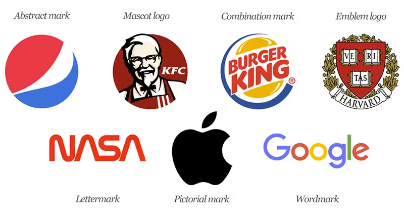
It helps if you have some understanding of the seven types of logos, and what they are best suited for.
Timeless is better than trendy
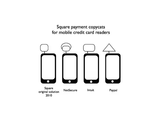
It’s difficult to avoid having some current trend influence the design of your logo, but there are always certain trends that stand out because they’re overused. And overused trends don’t only result in very generic logos, but also logos that date very quickly. There’s nothing wrong with using a minimalistic or vintage style in your logo, but combine the two with generic stock images wrapped in a badge, and suddenly you’re no different to all the other hipster wannabe businesses that launched in 2015.
 That said, even a timeless design will need to be refreshed every now and again, but as shown by McDonald’s, it is possible to do this without completely reinventing the brand. The golden arches have been part of the brand since 1960, with slight changes made every few years.
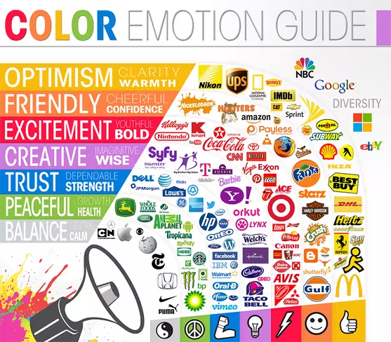
Black is not a color
Black isn’t a color, or well, except when it is. Debates around colour in logos seldom touch on the status of black, but they do sometimes consider the link to emotion. But you can’t select brand colours using an implied emotional link without also considering cultural meanings. And there are just too many variables to consider if venturing down this path.
 Writing for Help Scout, Gregory Ciotti points out that:
[C]olor is too dependent on personal experiences to be universally translated to specific feelings. There are, however, broader messaging patterns to be found in color perceptions.
That means that much of it comes down to how appropriate customers perceive your colour choices to be — does it fit what is being sold?
A good designer will have a sound understanding of colour psychology, and will be able to offer valuable advice. They will also know how where the logo will be used can influence colour choices, including the use of shades and gradients. Finally, they will also know that the easiest way to avoid your own perceptions influencing your choice of logo would be to show you early designs in plain black and white.
Think about where it will be used
For many years, brands only had to consider how their logo would look in print, which forced them to avoid logos with too much detail. Once brands started launching websites, we found that we could be a little more adventurous with our designs, while still having to consider how the logo would look in print. And now we have a multitude of different digital devices, social media profiles, and the ability to launch a branded mobile app. We now not only have to consider how our logo will look in print, but also at different sizes, and as a square avatar or profile image.
 One way to overcome this is to get your designer to create two different logos:
- A logotype — This is either a type-only logo, or a combination of type and a logo mark, which could be an abstract, mascot, or pictorial mark.
- A Glyph — A simpler representation of your brand, generally only using your logo mark. Whatever you use must fit into a square frame, and must be easily identifiable even when small. This would be used as your social media avatar, in small spaces, and possibly even in your app icon.
Established brands can get away with only ever using a logo mark, but you should avoid this until your customers are able to recognise your logo mark even without your brand name.
Choose your typeface and font carefully
There are some typefaces that should never be used in a logo: Comic Sans, Papyrus, and Curlz are three that immediately spring to mind. But although many brands stick to using serif and sans-serif typefaces in their logotypes, some decorative and script typefaces can still work. Though this largely depends on the name of your business, and the skillset of your designer. The biggest problem with decorative and script typefaces is that they become difficult to read when shrunk on smaller screens.
 What is more important to consider is that you have the correct license to use the typeface, and that the typeface pairs well with your brand’s values. It would be difficult to trust a legal firm if their logotype used a fun, juvenile typeface.
Conclusion
Your logo is a cornerstone of your brand, so don’t rush the design, or treat it like an afterthought. And although these tips offer some guidance in the design process, it definitely should not be something you tackle on your own. Spending a bit of money on a professionally designed logo now is a lot better than spending even more on a complete rebrand three to five years from now.
Get the TNW newsletter
Get the most important tech news in your inbox each week.