David Arnoux is Head of Growth and co-founder of Twoodo, helping teams organize using simple #hashtags. This post originally appeared on the Twoodo blog.
In my experience of creating a team workflow tool that people will actually enjoy using, building a product without talking to your customers massively decreases your chances of success. This article is not so much about the content but more about some of the best tools to get in touch with your users and visitors for different purposes.
I’ll dub it my Customer Success Stack. This list is in now way exhaustive so feel free to add your recommendations in the comments. Here are some tips that should eventually help increase your activation rate, retention, revenue and ultimately your customer’s success.
1) Increase initial user buy-in with Olark’s live chat for on- and off-line
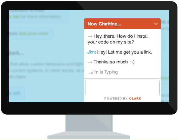
Having a live-chat available on your landing page is extremely valuable to answer quick questions, create hypothesis for how to improve your landing page and help increase user buy-in.
We’ve used a live chat continuously to answer questions of prospective users, create a relationship with them and often find out what was blocking them from signing up. Knowing what blocks a visitor from signing up can be tricky. You can do weeks of A/B testing but sometimes users don’t register for reasons you won’t even have thought about.
Live-chats are great at giving you clues: “Where is your pricing page?“ “Do you integrate with Gmail?” “How do you store my data?” “Can I easily delete my account after creating it?”
As a SaaS service, we are accessible to anyone with an internet connection. Fortunately, we’re a distributed team so we can take on CET and PST no problem!
In any case, live-chat is a great feature to have and even though it may drive you insane to be constantly interrupted remember that this is awesome customer service! Being there for your users builds loyalty and trust in a way that no branding tricks can.
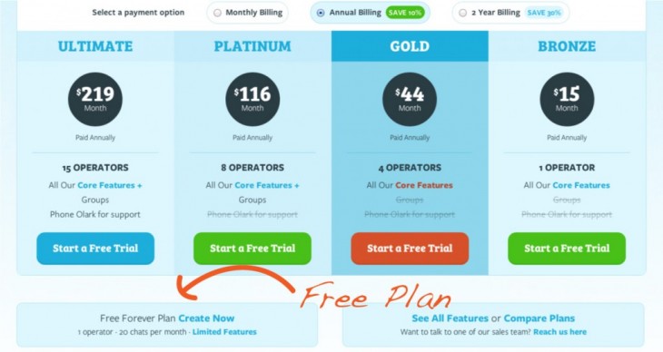
Olark is a great tool for this. If you are SUPER small, you get 20 live chats free per month. After that the rate starts at a very affordable $15 per month (paid annually). There is now even a “live offline chat” option.
The free plan is kind of hidden on its pricing page. Look for it on the bottom left.
If you’re on Mac, another great option is Firehose Chat. You’re not limited in the number of chats however the free version is non-customizable and you can only have 1 operator (1 account)
2) Concierge onboard users with Zoom.us’s smooth shared screen
Skype has been failing us too often to be a reliable customer service tool. A frozen screen and garbled talk is deadly dangerous in customer service, and only the most forgiving people have the patience to stick with you through such events.
We switched to Zoom.us which has a really nice screenshare option and (so far) has not failed us.
We use Zoom.us not only to spend time with high profile customers who require concierge onboarding (we package these as “webinars” which are really a live walkthrough of what is in our tutorial) or who have very specific use cases.
We also spend time with our best customers to better understand their worklflows. The difference being that the user gets to ask specifically about the challenges your tool is presenting to them.
Tutorial videos are certainly important, but this form of educating users has a) a really personal touch, b) is another opportunity to collect data on your users, and what is causing friction for them, c) allows you to create a better onboarding and tutorial videos in the future based on direct feedback.
3) Unearth your unique user perceived value through a Google Drive questionnaire
Not all feedback is created equal. In this video Sean Ellis explains why some feedback is vital (especially from users who love your product) and other feedback is a time-waster (especially small feature requests from non-activated or non-passionate users).
Having said that I firmly believe that your best customers should be your most prized possession. They hold the key to what is great about your product, what is wrong with it, what can be improved and what future developments you should be considering.
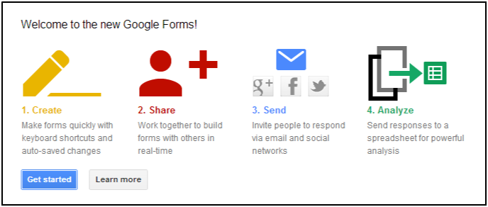
In the earliest of early days, we put our first ever users through a painful but ultimately crucial questionnaire for our customer development. For this, we used Google Forms.
Everyone will tell you that landing a long-winded questionnaire on someone who just signed up is a sure way to never see them again. But you’ve got to get some guinea pigs to taste the dish and tell you if you’ve used too much salt or not enough chili.
We hypothesized a number of things:
- someone who would take the time to do this probably really likes our product =>validation
- initial reactions to the design of the interface were really important to point us in the right direction => change things that the majority stated as true to be true for all
- these enthusiasts were probably the most likely to use us in the future, since they were so hungry to try us out => use the data they provide about themselves to build personas
…and all this data is neatly recorded in the Drive, accessible to our entire distributed team, and can be updated with new data all the time.
Although I won’t go into too much detail about what you should be asking your users I’ve made a list of some of my favorite questions to ask that have always assisted in finding our what value users receive from your product or service:
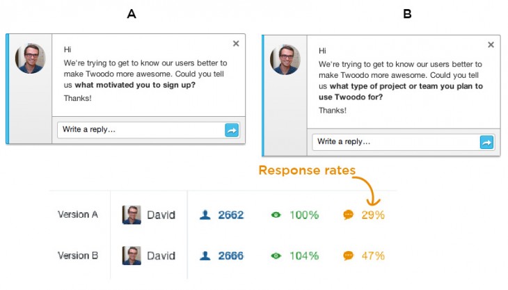
- What motivated you to sign up? (= initial intent)
- What do you love about our product?
- How would you describe our product in 1 sentence?
- What is the most important value we bring you?
- What almost blocked you from signing up?
There’s nothing quite like my obsession for recording everything and sharing it with the team on the trusty Drive. Whip together a spreadsheet, name the columns, add the data validation options, and you’ve got a good place to begin a database for collecting customer information.
One example of how we used this information is with the question “How would you describe our product in 1 sentence?”
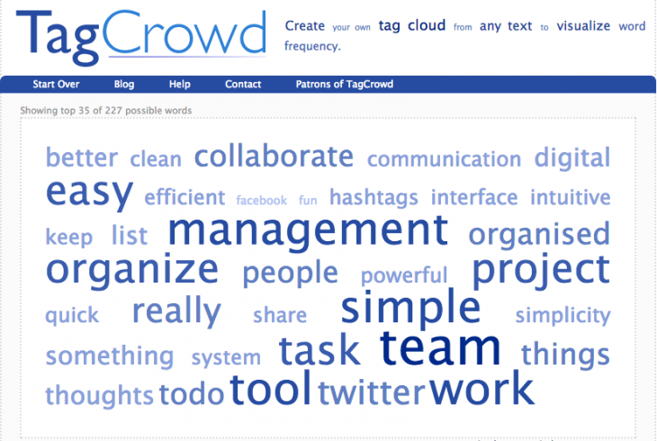
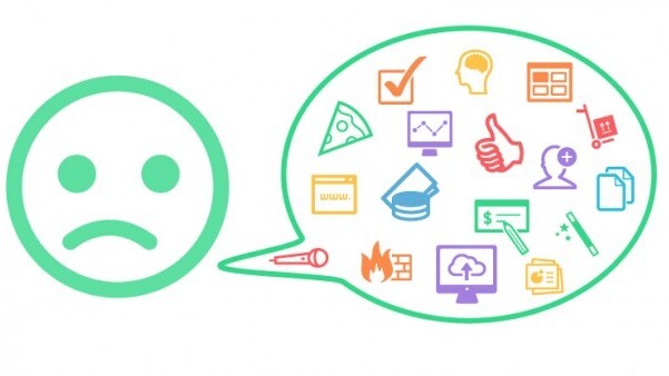
We were careful only to send this out to our top 300 users. We then recorded each answer in a text doc. We ran it through a tag cloud generator tool called TagCrowd and got this.
Based on these keywords we were able to work on our copy. It was a great source of inspiration for A/B testing things like our landing page value proposition, email subject lines, drip email content, Twitter bio, some of our PR material and anything involving copy.
We discovered how powerful it is to re-use your users exact words in order to communicate your value more effectively.
You might wonder what this has to do with getting customers to love you – well, the data you collect from these patient people will be what determine the choices you make for the future. You’ll know what your future customers will want before they even ask for it. You’ll already have built it.
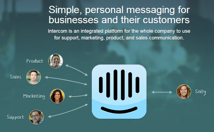
4) Notify about new features and re-activate users with Intercom’s event-based drip email service and in-app messaging
The work doesn’t stop after you drive people to your door: you’ve got to make them want to step through. Do this by offering them something tantalizing on the other side. Check out Step 3 of this blog post to get an idea of how to do drip emails. Quicksprout also give some handy tips here.
People want to be handed things, rather than have to search for them. Use your initial emails to offer them the links to your explanatory videos, documents and other content to entice them into actively using your product. They signed up because they saw some added value in using your product. Remind them of what that is.
Bear in mind that many people don’t start using your product immediately because they want to set aside some time at a later date to learn about it (at least, that’s what we found!).
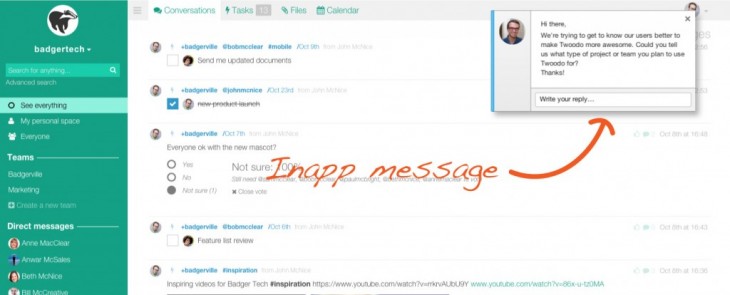
We’ve also found in-app message to be an invaluable tool to actually get your message read!
In our experience emails get a 30/40 percent open rate whereas in-app messages are close to 100%. Emails with questions get a 5-10 percent response rate whereas in-app messages get 30-50 percent response rates and sometimes higher.
It’s simply easier and more relevant to read and reply to a physically contextualized in-app message than an email lost somewhere inside your inbox.
Remember to make it easy for them: don’t use a “do not reply” mailing address. In the early days, make sure customers can simply hit “reply” to get back to you. Reroute these emails into a folder or label to help keep them organized.
5) Find out why users are leaving and more with Qualaroo’s simple Quickie surveys and questions
Yes, the dreaded pop-up. But a nicely designed, well-timed, finely worded call to action (TELL US WHY YOU’RE LEAVING US!!!!! NOOO!) can be extremely effective.
Check out Qualaroo or Bounce Exchange to see what I mean. It shows the user that a) you really give a dang about their experience, and b) you’re trying to make the data gathering as painless as possible.
Many people won’t find it a problem to answer a simple, clear question. Pop-up fails:
- long-winded, complicated statements
- no clear question
- asking for too much
- bad grammar and punctuation
- ugly design
- ALL CAPS
- asking pointless questions
Good tools to set up these slippery little things are Qualaroo and Clicktale. Clicktale will tell you where a customer drops off the page, where they click most and so on. This will help you design where the pop-up should appear and within what time frame.
Also, if you’re using Intercom for your emails, you can use it for your in-app messages as well!
After all of this, there should be no more need for old-school contact forms (unless you’re going on an extended vacation). In actual fact, many users will Tweet you, message you on Facebook or even (rarely, but sometimes) send an inmail on LinkedIn. I’ve even had customer dealings on Google+ after a guest blog post!
Make it easy
With all the tools and technology available you have actually have no good excuse for not talking to your visitors, users and customers. 
It’s also your job to make it easy for them to reach out to you. Think about how customers naturally communicate and use that to design your customer happiness strategy. This is the best customer service tip around
Don’t force them to contact you in ways beyond their usual methods. The phone company knows not to email my grandma her statement – she gets a mailed paper copy and a direct phone call for feedback.
Start-up gaming companies can maximize customer service by having forum threads in the right places to communicate with users. You fit into the customer’s lifestyle, not the other way round.
Read next: Get epic business growth by instilling these data gathering habits
Get the TNW newsletter
Get the most important tech news in your inbox each week.
