
Interaction design demands continuous personal improvement. It’s a discipline that remains exciting because of the continual stream of new ideas and technical capabilities.
But keeping up with all the trends can equally become overwhelming. Developing some proven UX habits makes your job as a designer easier. Forming good habits helps cut through the noise.
In this piece, I’ll explain a few useful habits for successful interaction design.
1. Design for Clarity
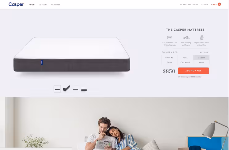
Photo credit: Casper
As Gerry McGovern first suggested, every page of your design must answer the following questions for users:
- Where am I?
- What actions are possible?
- Why would I take those actions?
- What will happen once I do?
While personas and user flows help you arrive at the right answers, you also need to follow these design conventions for clarity:
- Choose appropriate UI patterns – Use sites like UI Patterns and free guides like Mobile UI Patterns and Web UI Patterns to know popular design solutions for common problems. For example, cards are popular because they help organize large amounts of content. Hero images are great for product sites since they leave an immediate impression. Use these patterns as a baseline, then layer on your own creativity.
- Don’t break mental models – Design based on what people are already familiar with. Icons in the top left should link back to the homepage. Calendars should let you pick dates, instead of requiring users to type in the day and time.
- Use good copy – As explained in Interaction Design Best Practices, words are the foundation of all interaction design. Reading words on the screen is a very basic, but powerful interaction. Make sure that the tone of the copy matches the visual design, since everything is all a part of the same interface. Any discrepancies will likely confuse people.
- Include meaningful labels & icons – Don’t get too clever with how you label interface objects like the navigation. It should be clear what is and is not clickable.
Let’s take a look at the homepage for Tictail. Sure, it doesn’t look particularly clever or mind-blowing, but that’s not the point of design. It is, however, extremely clear.
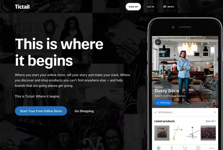
Photo credit: Tictail
The interface matches UI patterns we’ve come to expect thanks to the horizontal navigation and sectioned-out layout. The copy is crisp, presented in effective contrast with legible and readable typography.
The overall design is certainly inspired by flat design principles, but the buttons still have a tactile feel thanks to the rounded corners. In doing so, the buttons better encourage interaction (which makes a lot of business sense, since they’re both trial CTAs). Color helps to distinguish between the two CTAs since one is blue and the other is white.
On a subtler note, see how they also label the hamburger menu to make it more visible. The body copy also follows an F-shaped reading pattern to reduce visual strain, leading users naturally to the free trial CTA.
Remember that clarity is not the same as simplicity. Not all good design is simple – just think about the technical complexities behind the iPhone or all the dating sites that let you pick partners based on the almost any criteria. But when these features are paced and presented correctly, you achieve clarity, which always encourages interaction.
2. Let Users Guide Your Design Decisions
Did your mother ever ask, “Would you jump off a cliff just because your friends did it?”
Risks can be smart when they’re calculated and deliberate. But unintentional risks lead to unfortunate consequences. So too is the case when you design based only on trends.

Designers can be auteurs, but ultimately, the design must center around the needs of the user.
Listening to user feedback is the easiest way to unlock specific design requirements. Too often user feedback is treated like a nuisance to ignore or sweep under a carpet. But there is a goldmine of insights sitting within every customer service team. Don’t deflect customer feedback – use it to improve your designs.
A great tool for listening is Get Satisfaction. The features are designed to evoke honest discussions. The greater the transparency, the greater the insights.
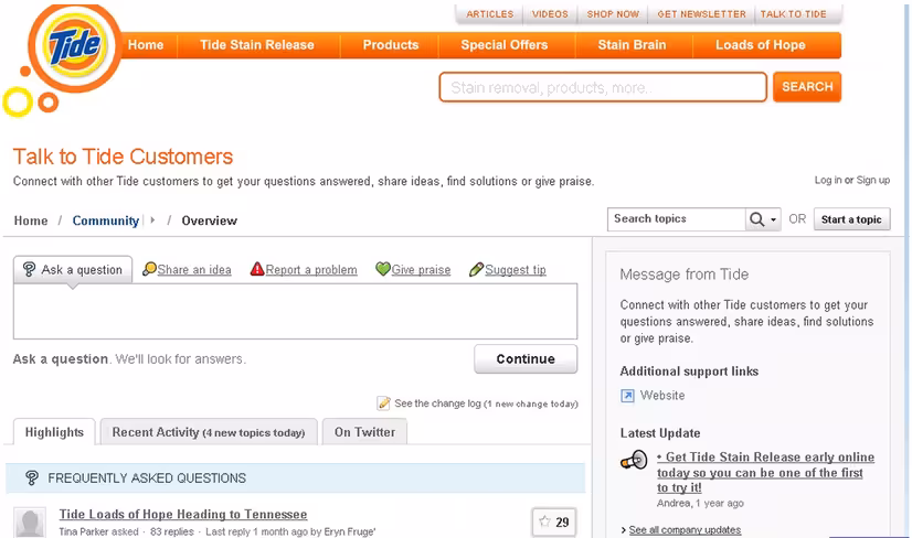
Image Source: zdnet.com
Another great feature of tools like Get Satisfaction is that they can negate the need for surveys because users serve up their own questions and answers. Borrow from the language and communication style of users to create better website copy, calls to action and error messages.
3. Ask the Right Questions by Observing User Behavior
Interaction design requires user participation. Without users performing an action, there is no interaction. Learn from Etsy about continuous A/B Testing: don’t overthink or guess, test.
These practices are brought forward in the Lean UX Lifecycle methodology, which dictates that you should always iterate your designs based on hyper-focused usability studies. As provided in this thorough Smashing Magazine article, use analytic tools, heatmaps and eye tracking to observe behavior over time.
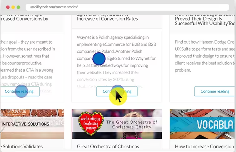
Photo credit: Usability Tools
A great start for anyone new to usability testing is applying a SUS score, which is a fast way of objectively measuring a very subjective UX. You can implement this kind of test using services such as Survey Monkey. Here’s two crucial tips:
- On your site, insert hot links to provide help content and a link to the SUS survey
- Always invite users to participate. Never annoy users with pop-up surveys that distract the user from completing their task
Finding the right design solution begins by asking the right questions. But figuring out what questions to ask takes a bit of time and practice. Once you’ve observed your users, try IDEO’s Methodology Cards to discover the right probing questions to identify the root of a particular design problem.
4. Know When to Jump Ship
Sometimes designs just need to be tossed in the garbage. Design long enough, and you’ll eventually need to bite this bullet.
Signs that your design isn’t working may include:
- Users get stuck in an never-ending loop
- Space doesn’t fit the necessary content
- Users get confused or overwhelmed
- Content takes too long to load on the device or browser of choice
- Design doesn’t work in different languages
- Unable to integrate with vital services
- Users don’t use the design as intended and end up with error messages
That’s why it’s so important to start design work in a sketchbook or on a whiteboard.
There is no need to add to the ever growing pile of bad design that’s all around us. Embrace these moments as opportunities to grow as a designer. One of the biggest mistakes is committing too soon by moving into pixels before you’ve really had a chance to think through all of the user and system requirements.
Photo credit: Simon Berry. Creative Commons.
For me, rapid prototyping with a tool like UXPin helps with iterative design by making me problem solve before I commit to a design idea. Jakob Nielsen actually provides a great instructional iterative design process on his blog.
Learn to fail quickly and move on. The faster you recover, the faster you’ll get to the right design solution.
Conclusion: Think Like a Service Designer
Products are often just one part of a user’s experience. If you consider how product teams are set up, it’s possible for a user to interact with several products at once. Sometimes the products are housed in the same website or app, but other times a user might interact with unconnected products.
Consider a user looking up travel information. Users might use products like: currency exchange calculator, flight aggregator, international ATM locator, accommodation aggregator, calendar, email client, etc. And the user might be using multiple devices at the same time depending on their preferences.

Image source: resonanceco.com
When you know more about the context and motivations of a user to interact with a particular product it’s possible to create a service blueprint or customer journey map. These tools help you bring the user experience to life and create design interaction patterns that support the user’s needs.
When you realize that your product is likely just one touchpoint within a larger customer journey, you’re better able to design interactions that add value with each click or swipe.
If you found this post helpful, check out the free e-book Interaction Design Best Practices for 100+ pages of additional advice. Visual case studies are included from 30+ companies like Apple, Google, Etsy, and Behance.
Read Next: Augmented reality is the future of design
Image credit: Shutterstock
Get the TNW newsletter
Get the most important tech news in your inbox each week.