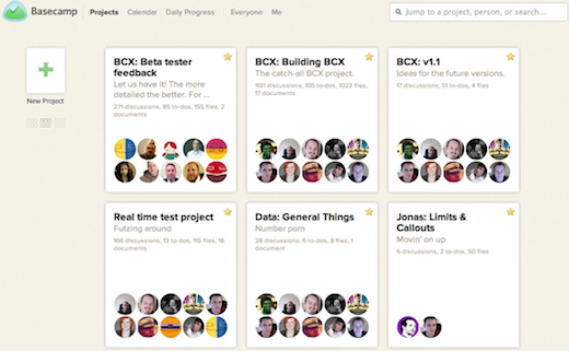
Basecamp, the highly popular Web app for collaborating on projects, is undergoing an UI overhaul and the team has decided to share its progress on Vimeo. Basecamp creator 37Signals specifically shows off the new “page stacking UI,” which is featured prominently in the forthcoming release.
As a past user of Basecamp, the UI really was due for a complete redesign. Honestly, the old design was starting to look like it came out of a free Web templates site instead of a ground-breaking Web app development company.
In the video, 37Signals explains how they focused on three things: “speed, big picture and focus.” All of these aspects, specifically the way the new UI lets users to dig deeper into projects, resonate well with the actual results.
 Aside from intense speed improvements, the new design features single project pages and the ability to focus on specific items, like to-dos, in an overlaid fashion. Essentially, all navigation is sheet-based, which leads to different layers of pages instead of a traditional sub-pages.
This approach certainly couldn’t work for most sites and Web apps (TNW, for example), but it is an interesting and possibly very useful take on project management.
Overall it’s a clean and welcome change to the product, with a highly visual take on managing all the massive details that can collide into professional projects. The new UI lacks in distracting details (like the original design), but has an added warmth to it that should make using the site a more enjoyable experience in the long-run.
Get the TNW newsletter
Get the most important tech news in your inbox each week.


