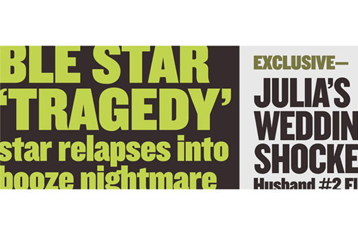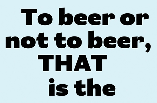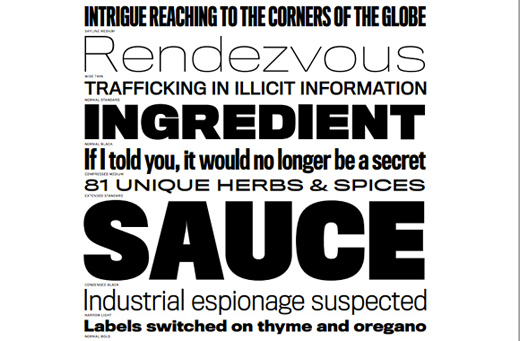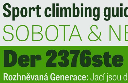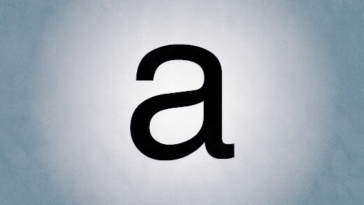
Helvetica is a tried and true typeface. It’s a testament to Swiss design culture, with its clarity, flexibility and outright perfection. This famous typeface is loved for countless reasons, including its ability to take on any feeling, emotion or imagery, which it can do simply because it has no personality of its own.
Helvetica deserves our utmost respect, but there’s a problem with Helvetica that needs calling out: too many designers are permanently stuck on it, and that’s a disservice to every other sans-serif typeface out there.
And so, to help you begin exploring the endless alternatives that exist in the world of type, Typecache, an independent online compendium for Typography, has teamed up with TNW to create this list…
30 must-see Helvetica alternatives:
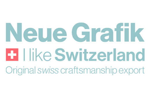
1. Neue Haas Grotesk
.
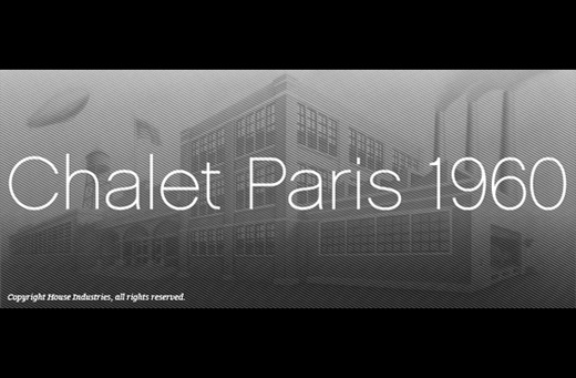
2. Chalet 1960
.
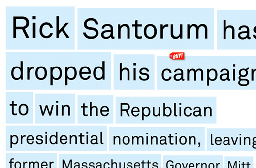
3. Akkurat
.
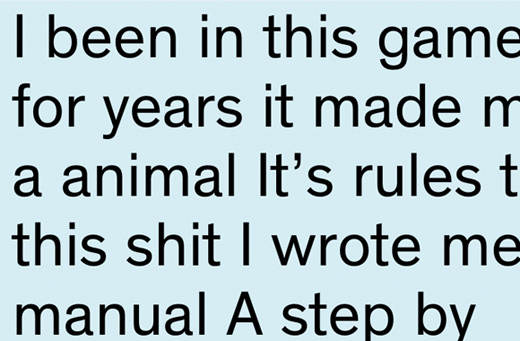
4. Theinhardt
.
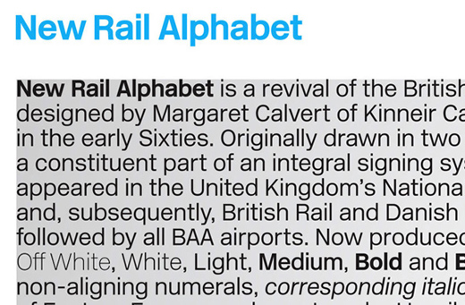
5. New Rail Alphabet
6. Graphik
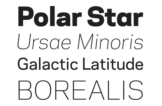
7. Galaxie Polaris
.
8. Replica
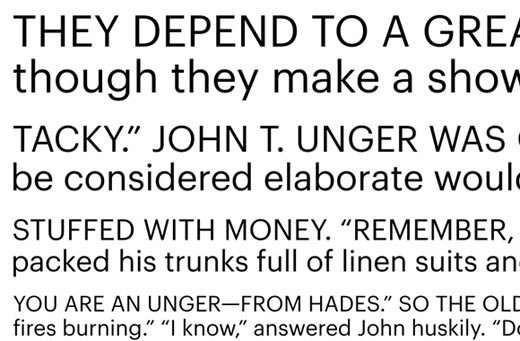
9. Suisse BP Int’l
10. Fakt
11. Aktiv Grotesk
12. ARS Region
13. Relevant
14. Synthese
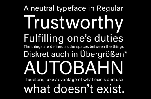
15. Neutral
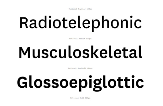
16. National
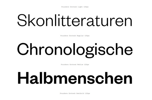
17. Founders Grotesk
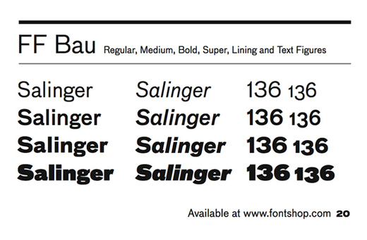
18. FF Bau
19. ARS Maquette
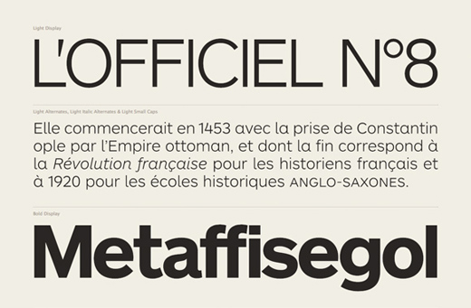
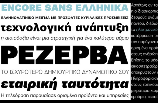
20. Encore Sans
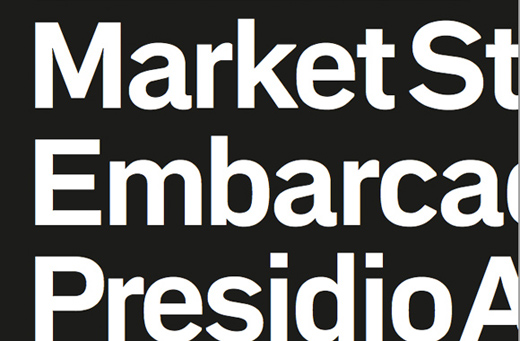
21. Embarcadero MVB
22. Paralucent
.
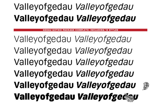
23. Gedau Gothic
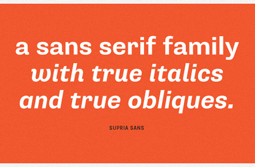
24. Supria Sans
25. Akzidenz Grotesk
26. Bureau Grot
27. Knockout
28. Parry Grotesque
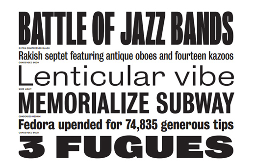
29. Titling Gothic
30 Tablet Gothic
About this list
While we were at it, we also spent a little time talking with Typecache cofounder Taro Yumiba to learn more about the site, and how this list came to be:
HW: Why did you create this list of alternatives?
Yumiba: Obviously Helvetica is overused and we think designers are constantly looking for alternative typefaces to replace it. However, I am not surprised to hear that designers often give up on finding one and just go for Helvetica. It is almost becoming a default or a given option as a San Serif font. We think that finding a good typeface is part of the designers’ job, and through the list, we would like our fellow designers to explore other options so that they can start embracing all typefaces.
HW: What can these fonts offer that Helvetica doesn’t?
Yumiba: Each face is different. There are so many different characteristics to the shapes of letters, too. We cannot describe every single difference of those alternatives, but there are many better typefaces than Helvetica, so why not try using them? (Don’t get me wrong Helvetica is not bad.)
HW: Should designers balance the use of highly popular fonts with lesser known ones for variation?
Yumiba: I don’t think it is necessary, but I would rather see designers that try lesser known fonts than ones that just stick to whatever popular typefaces is out there. However, the bottom line is that it’s all about choosing and using a typeface that works best in the context where it is used. That makes a great difference.
HW: Lastly, could you tell us a little bit about Typecache?
Yumiba: There are many great type foundries around the world. It has been really difficult to keep up with the activities of every single one of them…so why not collect their information and make an online compendium?
This is how we started the project. As typographic literacy grows, the site will hopefully be a useful resource for designers, art directors and type enthusiasts.
For more, check out Typecache’s complete “font cluster” of Helvetica alternatives — there are 90 total alternatives! The team has created an impressive list of Din alternatives, as well.
Get the TNW newsletter
Get the most important tech news in your inbox each week.

