This post originally appeared on the Crew blog.
I’m a marketing consultant.
Clients come to me and say, “I need more traffic to my site, can I pay you to do that?” To which I often have to reply, “No.”
“What?”
Why would I say no? Why would I push someone away who is trying to give me money? Why would I refuse a new client?
“Your design is not conversion-focused, traffic wouldn’t help you. I can help guide you to a better conversion-focused design though – then I can help build your traffic.”
You see, marketing is a good thing, but I believe marketing should be married with design. Marketing is nothing if it doesn’t have great design backing it up, because without conversion-focused design you aren’t going to reach your end goal: actually selling.
I can release a waterfall of traffic to your site but if they all rush in the wrong direction like holes in a sinking ship, what’s the point?
There are three main reasons I believe you should invest in design for marketing, here they are:
1. Beautiful aesthetics are the “curb appeal” of your website, app, or product
Increased bounce rates, less retention, people put off, less media craze, less investors – that’s what you can expect from a badly designed app or website.
Fashion is fashion for a reason – it generates buzz, it will illicit attention. Design trends are design fashion, it’s as simple as that. Your unique style is important, but fashion can always be adapted to meet a certain style.
Take Apple, Google or Microsoft as great examples of keeping with a distinct style while moving fluidly with design trends. If these huge monstrosities can be nimble with their design, you can be too.
2. People won’t share or engage with your product if they aren’t excited by it visually
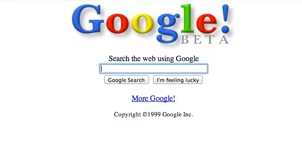
This may sound stupid, but think about it, honestly. If you had to use a version of Google that looked like this, today, would you? No, you wouldn’t.

Would you share it with your friends? Hell no, unless you were specifically referencing retro-looking novelty sites.
People don’t want to come back to things that aren’t pleasing to them. It’s human nature. It’s the same reason we make our workspaces look pristine and lovely. It’s the same reason we shop for designer brands, they speak to our own personal taste. Our choices denote a sense of our own style. So it is with clothing, cars, and art, it is with web design.
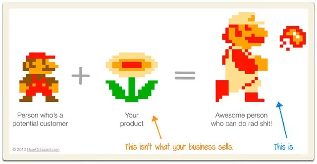
As User Onboarding says:
“People don’t buy products – they buy better versions of themselves.”

You wouldn’t want to use a product that looks as though it was designed in Microsoft Paint in 1995, much less share it. Design says something about you, and furthermore says something about your customers that use it.
Make it say something good. Make your customers be excited to share your product, because it will say something good about who they are, and their choices. Make your users feel at home.
I write on Medium, a website for writing and reading. I write on Medium not because it’s a simple platform to get started on, not because of its social interaction, not because of its tech-buzzyness (though those are all valid reasons). I write on Medium because it’s a beautiful experience, I’m delighted to be a part of it, and it visually pleases me in a very visceral way that is simply lost on every other publishing platform. I share my love for Medium because of all of those things.
3. Ultimately people won’t buy from you, they won’t convert
I’ve seen sites that cost tens of thousands of dollars fall to pieces without conversions, simply because the right emphasis wasn’t taken on design. Conversion and business goals were not clearly defined and weighted in the design process.
If your designers aren’t thinking properly from a sales and business goal perspective, your site will fail – no matter how beautiful you think it is. If it doesn’t fail entirely, it will be sub-optimal at best.
You need designers who will be thinking about the bottom-line. Most good designers are heavily focused on conversions, so listen to their feedback. The problem of most website redesigns have rooted from the business’s own “visionary” behind the design, not the designer.
We sometimes get too close to the design, and can’t step back and say “will this be best from a business standpoint?” This is why we need to be very careful at analyzing and listening to our designer’s feedback objectively.
When a single hexadecimal difference on a call to action can mean the difference between 3x more or 3x less leads for the business, we cannot afford to be hard-headed with our design choices.
Design and marketing are married
It’s a match made in heaven. But like any relationship, without the right care it can go to hell in a handbasket.
Here are some take-aways to consider when you’re having your next app, website, email template, slide-deck template, or whatever else designed:
- Don’t be too close to your vision for the project, take feedback objectively from your designer, and seek it from them.
- Focus design on selling, on converting, on the end-goal. Hire designers that have your best interest in mind.
- Align with current design trends, while focusing on the soul style of your business.
- Think about how people are going to respond to every interaction. Try to make people excited about sharing your product, instead of happy to ignore it.
The saying, “content is king” has reverberated in the online marketing echo-chamber to a dizzying level, but there is something to be said about the interest level of engaging content. “Content” starts with your app, your website, your product. Make it engaging, make it exciting, make the design tell your story as much as the text and app or product itself.
This will make marketing 10x easier for you. Great design makes me excited to be marketing for you, and it makes any content or marketing effort you undergo that much more likely to succeed.
Marry your design to your marketing, and get the most out of every interaction.
Read next: Steal your competitor’s customers with highly effective comparison pages
Get the TNW newsletter
Get the most important tech news in your inbox each week.


