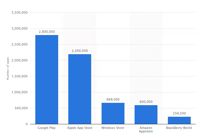
It seems like there is an app for everything these days. As of the first quarter of 2017, there were 2.2 billion apps available on the Apple App Store and almost 3 billion on Google Play.

Unfortunately for new developers, the mobile app boom is over. Most people are content with the current apps on their device and are not actively seeking new ones. Although plenty of programs are still coming out, the days of rapid growth and mindless downloading are in the rearview mirror.
However, this does not mean the market is completely impenetrable. App Annie’s Consumer App Usage report found that on average, people use 10 different apps every day and 30 each month. In order to break through this tough barrier, you really need to create something special.
Let’s talk about three common threads that define a must-have app.
1. Focused on UX
One of the biggest mistakes developers make is creating for themselves, not the user. Now, this idea can encompass many different parts of the usability.
One of the most common instances is going overboard with ads. Bogging down the user with pop-ups and bothersome promotions is a surefire way to send people packing.
Another big one is failing to find a healthy balance where people can fully enjoy the extent of the program without paying. This is extremely prevalent in mobile games. There are many cases in which the “Freemium” version is used up too quickly and it becomes blatantly obvious that in order to advance, you have to pay.
Temple Run, one of the pioneers of the “endless runner” genre, is one of the few games that gets this right.

The foundational parts of the game are 100% free. The bulk of the in-app purchases are for cosmetic changes that take away nothing from the actual gameplay.
At the end of the day, people can tell when they are being nagged for money. While monetizing your app is important, it should not take away significance from the UX. The UX is what makes people fall in love with your creation.
2. Simple, Yet Powerful
Some of the most successful apps known to the market were built on the concept of simplicity. (Flappy Bird, anyone?) Regardless of the app’s primary objective, the path to achieving results needs to be as quick and easy as possible. If you are designing a game, the instructions should be overly simple to pick up. No one wants to spend hours and hours learning how to enjoy an app.
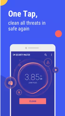
If you are designing a more technical-based program with a well-defined purpose, that facet should be clearly spelled out in a way the everyday user can understand. Try and steer clear of jargon wherever possible. For example, CM Security Master, an app built to protect mobile devices from security hacks, goes above and beyond to make their platform user-friendly for everyone. Although most of the lingo in this field is typically for IT specialists, the app does a phenomenal job in ensuring every aspect of the program can be absorbed by even the most novice user, given the scary prevalence of attacks, viruses, and phishing incidents prevalent these days.

Keep this concept close in the development stage. As a general rule, if you can’t explain the functionality of the app in a sentence or two, it’s too complex.
3. Community-Based
Perhaps the most interesting notion, of the time period we currently live in, is the fact we are able to seamlessly share information across the planet in a matter of seconds. Humans can now bond and build worldwide communities around shared interests – regardless of geographical location.
A good app is one that brings people together. Whether it’s for practical or entertainment purposes, the trick is finding commonalities between a mass number of people.
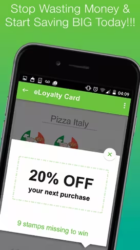
Take Planet Peepz for example. The app is essentially a DIY advertising platform where companies have 100% control to craft auto engage ads, coupons, upsells, and more. The developers have their sights set on building a following where the users can easily share and promote local deals. Billed as the “very first discount shopping platform,” Planet Peepz prides itself on being designed “For the People, By the People.”

There is even a free software included to help owners manage things like appointments and reservations. The core idea is to create an authentic community in which both customers and businesses can compile a shared pool of information about the current promotions happening in the area.
Regardless of your app’s overarching goals, without a clear-cut, devoted community on board, your efforts will flounder. Look for common problems or concerns within your niche. Your program should provide users with solutions and a sense of belonging they can’t get anywhere else.
Parting Thoughts
Creating an app that sticks is a tough job these days. At the beginning, it will almost always seem like you’re fighting an uphill battle to gain traction. Even though the app boom is over, a remarkable program speaks for itself. If you are looking to break into the market, keep these successful factors in mind.
Get the TNW newsletter
Get the most important tech news in your inbox each week.


