Sean Mitchell is an interactive designer based in Vancouver, British Columbia, and the editor of Type Release.
Did October bring us all kinds of festive, spooky typefaces? We’ll find out in this month’s roundup of our favorites from last month.
Latinotype: Texta
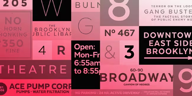
Texta is a contemporary, rational, transparent and useful sans to compose all kind of texts.
Typotheque: Woodkit

The 💜 of EU tech
The latest rumblings from the EU tech scene, a story from our wise ol' founder Boris, and some questionable AI art. It's free, every week, in your inbox. Sign up now!
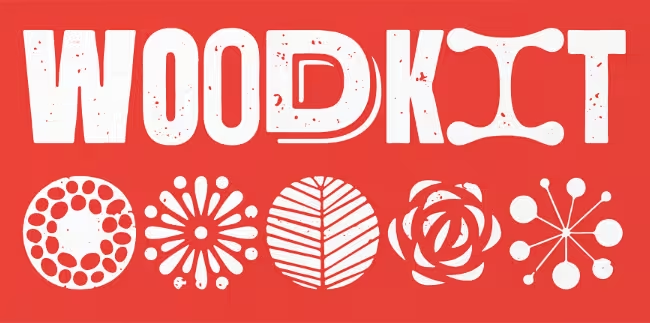
Woodkit is a playful fixed-width display series of typefaces inspired by wood type.
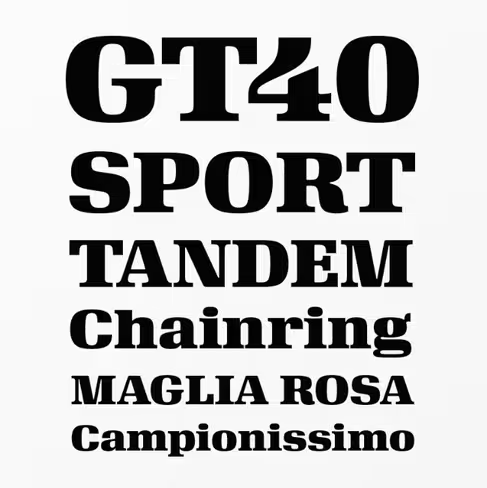
Miller Type Foundry: Uniform
Uniform is a multi-width geometric type family.
Laura Worthington: Boucherie
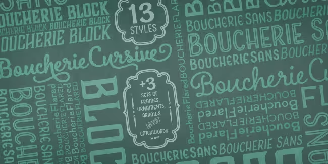
Boucherie includes four distinct display types, plus ornaments, catchwords, and frames.
Type Supply: Queue
Queue was drawn to reflect the contradictory and complex world of today.
Sudtipos: Bowling Script
Bowling Script is loaded with all kinds of alternation, swashing and over-the-top stuff.
Positype: Love Script
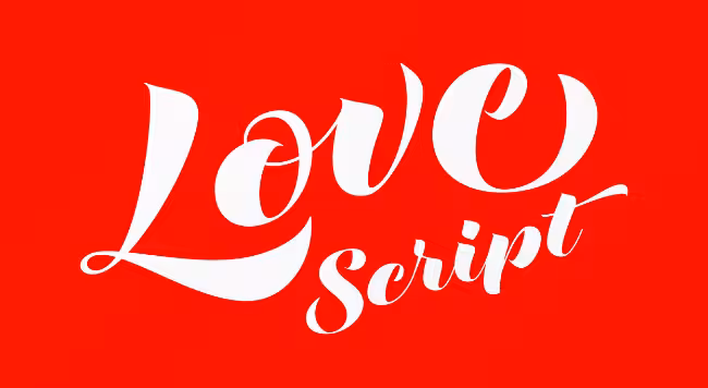
Love Script is a font with a big heart.
House Industries: Velo Serif
Super-elliptical shapes and sturdy serifs.
Calligrafiction: Peter
Peter is a neo-grotesque sans with rational and clear basic letterforms.
Tipo Pèpel: Naste
A lush splurge on pure basic geometrical shapes and sizes.
Commercial Type: Darby
A contemporary family of two related sans serifs: one is the functional Darby Sans; the other a refined display version for large sizes, where the contrast is dramatically higher.
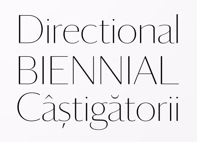
Ludwig Type: Diogenes
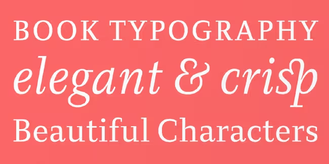
Diogenes is an elegant and crisp text typeface.
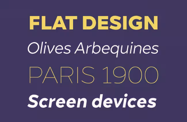
Lettersoup: Ropa Soft
The Ropa Soft family brings a warm and friendly feel.
Font Bureau: Big Caslon FB
An expansion of Matthew Carter’s classic display serif.
The Northern Block: Merel
Merel is a modern geometric typeface with humanist attributes.
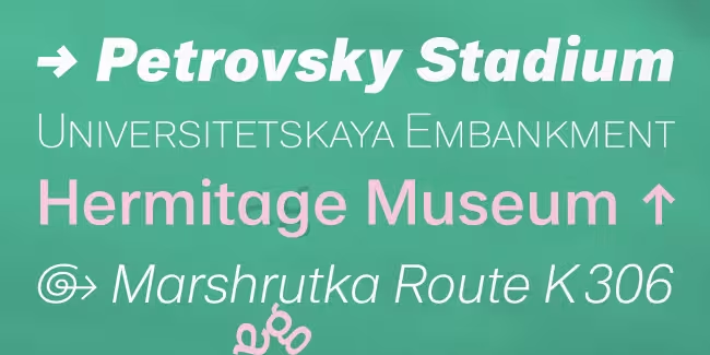
FaceType: Newcastle
Newcastle gives you great opportunities for spicy typography.
Hungarumlaut: Westeinde
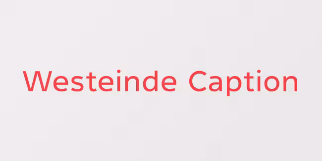
Westeinde has been optimized for the best legibility in print and screen.
Hoftype: Foro Sans
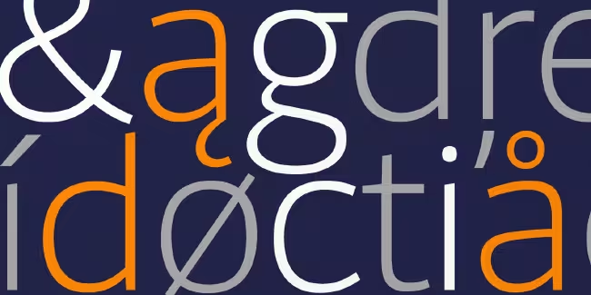
Foro Sans is well suited for ambitious typography.
Tipografies: Trola Text
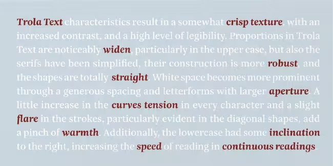
Trola Text keeps the original spirit of Trola, but some of the letterform features have been modified so it can perfectly adapt to the needs of typefaces used in text of continued reading.
Linotype: Quitador
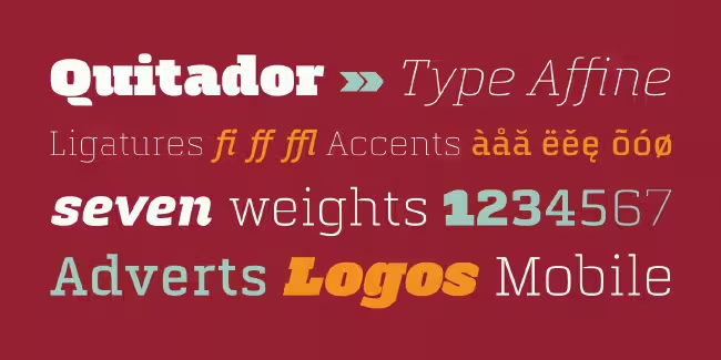
Quitador is a constructed slab serif typeface with a humanistic touch.
The Northern Block: Grottel

Grottel is a modern grotesque sans serif font family that follows the philosophy of original grotesque typefaces with enhanced personality.
Want more? Check out our roundup of favorites from September 2014.
Get the TNW newsletter
Get the most important tech news in your inbox each week.