Game website design is often maligned by designers interested in the usability of their interfaces, and for good reasons. A bunch of Flash menus and explosive animations don’t make a great website–not an easy to use one, not a fast-loading one, and most of the time, not even an attractive one.
In this round-up, we’ve dug up 12 game website designs that we think are actually attractive–and in some cases, usable as well.
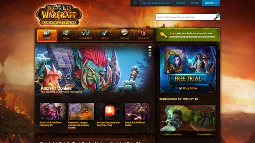
World of Warcraft
Blizzard recently updated their aging World of Warcraft website. Not only is the new design more vibrant, it’s far more usable as well–the main navigation in particular is no longer an epic list of links, but a hierarchical approach that is easier to drill down through. Points go to Blizzard for creating a design that incorporates the art of the game world without sacrificing usability.
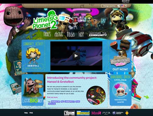
Little Big Planet 2
Little Big Planet 2’s website conveys the brand’s sense of fun with plenty of imagery, without bogging the site down by using Flash or Silverlight–though it does, at first glance, look like one of those game sites done entirely in Flash.
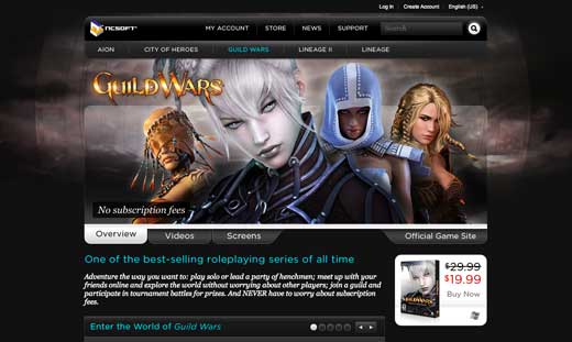
Guild Wars
NCSoft is interesting in that its game sites are a subsection of the corporate site, not separate entities as most other game sites tend to be. In the Guild Wars design, NCSoft artfully combines corporate branding with Guild Wars artwork without making either component seem out of place.
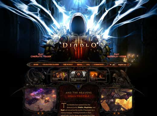
Diablo III
Blizzard’s much-anticipated Diablo III boasts a teaser website that is mostly driven by artwork, both in the interface and as the main form of content on the site. The site tastefully gives fans a sneak peak at the game–neither disclosing too much nor appearing visually boring by not disclosing enough.
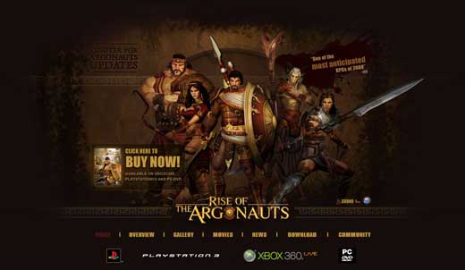
The Rise of the Argonauts
This 2008 game didn’t do too well at the checkout counter, and by now most of you have probably forgotten all about it. Credit goes to the developers for keeping the site online, at least, which is one of the more tasteful Flash websites I came across while I put together this list.
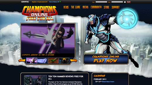
Champions Online
Cryptic’s Champions Online site is information rich, but doesn’t let managing all that text get in the way of a good show. The site uses fonts and elements from comic books to give it that clichéd superhero cartoon feel that’s probably intended to fill the target market with a good dose of nostalgia.
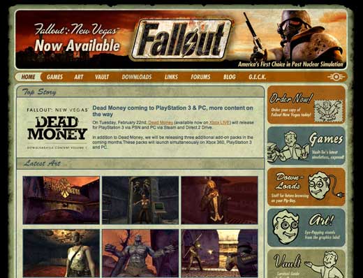
Fallout
Fallout’s website is a great exemplar of retro-meets-grunge design, using mid-century motifs in much of the artwork and then giving it an aged appearance. The design very much signals the post-apocalyptic nature of the game.
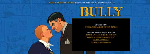
Bully
In Rockstar’s typical style, the Bully splash page combines entertaining cartoons with private school motifs to give you a sense of the point of the game… which, of course, is causing trouble for your teachers.
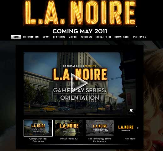
L.A. Noire
L.A. Noire is another Rockstar game, and this site features a more serious tone. The logo and fonts scream retro gangster, compounded by Monroe-esque figure in the background. Unfortunately, the lack of any space between the top of the window and the logo just makes the rest of the page look off to me.
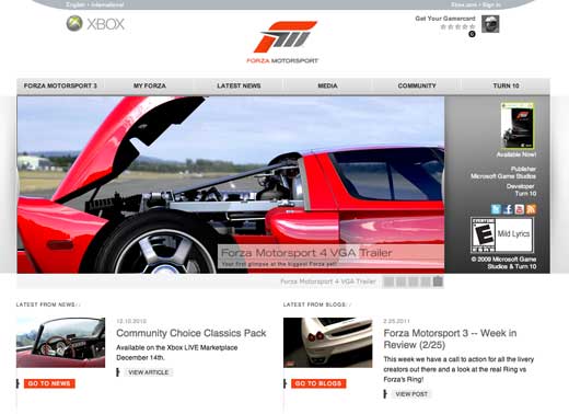
Forza
Minimalism isn’t often seen in the game world, but Forza makes full use of the style. The site is built around clean lines and white space, where the content and pictures do all of the talking.
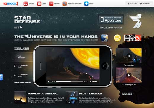
Star Defense
I’ve never played Star Defense, but the site is quite easily one of my favorites. Star Defense’s designers have taken the game site to a whole new level with a perfect marriage of game art and usability.
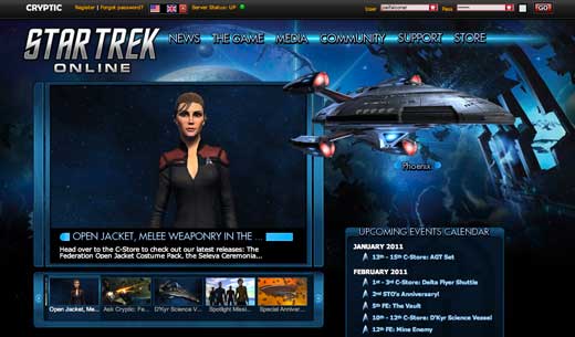
Star Trek Online
Star Trek Online takes the well-known computer interface of the Star Trek television shows and tones the color scheme down and makes the lines more angular. A beautiful job of keeping the feel of an established intellectual property, while updating it for a new iteration.
Get the TNW newsletter
Get the most important tech news in your inbox each week.
