
There are two reasons why I love gathering heaps of beautiful designs together into one place: First, designers tend to be aesthetically driven. Second, if you’re in a dry spell, nothing gets your mind churning faster than a fist full of inspiring work.
With roundups like these, it’s not about mimicking what you see or worrying about making something derivative. It’s about adding great ideas to your palette. The more you absorb, the more your ideas expand.
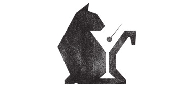
With this in mind, here’s 15 beautiful logo designs, most of which have only just hit the Web. All of them are impressive:

Hypercompact: It’s not often you see 3D animated logotype, and this work, created by Igor Ginzburg and Evgeny Skidanov (inspired by Morgan Allan Knutson’s logo), got our attention. See it in HD here.
Bread & Pepper: According to the creators, the bread symbolizes simple interfaces and the pepper symbolizes spicy code. The thought was that when people interact with their products, the results should look and feel simple and basic — even when the code and technique behind the product is really complicated/spicy.

disco naiveté: This logo packs beautiful colors that are playful without being childish. It’s curvy and organic, with enough order to keep everything flowing together smoothly.

.

.
.
.

.

.
Check out our full Design and Dev channel for more inspiration.
Get the TNW newsletter
Get the most important tech news in your inbox each week.
