Can you remember what life was like before the Internet? Queuing in banks during lunch hour, buying music in record shops and writing letters with a pen and paper. It’s almost laughable now.
But as useful as the Internet is, there’s still plenty happening online that falls short of game-changing, and not much closer towards useful.
We’re not talking about well-meaning Web apps that set out to change the world but fail, and we’re not talking about badly-designed websites either. We’re talking about websites that have no ultimate goal: websites that make you go…’huh’?
1. Llama Font: Say it in llama
“Why would anyone want to write something in llamas? Because llamas make everything better.”
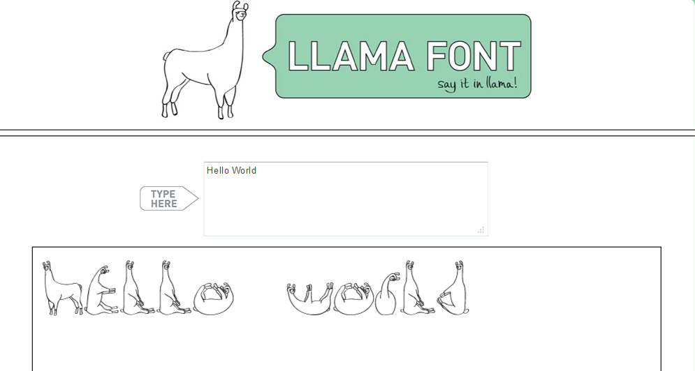
A simple, elegant website created by Avery Oldfield, an art director, and Jack Inscoe, a creative technologist. Llama Font does one thing: it transforms your text into a llama-style font. You can enter any message you like into the input box, and it translates your text in real-time into characters that resemble, well, llamas.
“It’s especially helpful in taking the edge off bad news”, claims Llama Font’s tongue-in-cheek what? section. I’m not in love with you anymore, or I’m sorry we amputated the wrong leg are two examples of such messages. “Helvetica is cold. Say it in llama.”
2. Do nothing for 2 Minutes: Relax, and listen to the waves
We covered this back in January, but it’s worth another mention. Do Nothing for 2 Minutes is a website that challenges you to do literally nothing for 2 minutes. If you touch the mouse, or press a key, then you fail and the counter goes back to the start. If you can sit on your hands for 120 seconds, well done.
Okay, this isn’t entirely pointless. It’s designed to encourage all you Internet addicts out there to sit back, relax and do nothing whilst staring at a beautiful sunset set against a soundscape of crashing waves.
Do Nothing for 2 Minutes was the brainchild of Alex Tew, the very same creator behind another pretty pointless Internet endeavor 6 years back – The Million Dollar Homepage. You can read all about that here.
3. Tetris 1D: It’s like Tetris meets patience
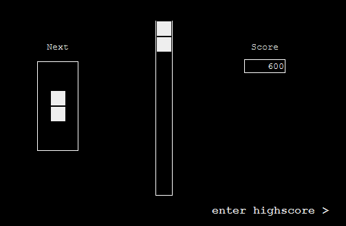
Tetris 1D is about as pointless as a website gets. It’s a Flash game involving your beloved Tetris, re-imagined as a one-dimensional game. You can’t turn the blocks, and even if you could, it wouldn’t do much good. You can make the blocks fall faster by pressing the downward arrow key, though:
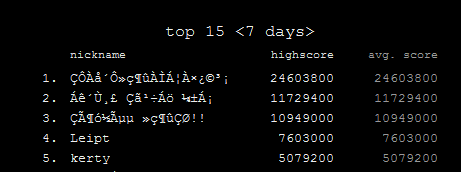
To get on the leaderboard, you simply leave your browser open as long as you can, wait for the inevitable and then click ‘enter highscore’ when you’ve had enough. That’s if you don’t switch off and head somewhere a little more useful and do nothing for 2 minutes instead.
4. Shady URL: Discourage people from clicking on your links
URL shorteners are incredibly useful tools. For starters, they help you squeeze every millimeter of space from your tweets, and they can be used to help monitor the click-through rates of links that you circulate.
The downside to shortened URLs, however, is that you can’t easily see where the link is taking you – it could be to a 100% bona fide website, or it could be somewhere a little more sinister. There are ways ’round that, of course, and the overall pros of URL shorteners outweigh any downsides.
Shady URL, on the other hand, has no discernible use:
When you enter the URL, and you click submit, you’re then presented with a randomly generated, shady-looking link containing words that probably wouldn’t prompt you to click on it.
You can even tick the ‘shorten’ box and receive a shorter, but ‘somewhat less shady-looking’ link.
5. The Drama Button: Making mountains out of molehills
Some people need a bit of drama in their lives. Ensure you always have this website loaded, and the next time you’re in the office and someone’s creating a big hoo-hah about nothing, you can activate The Drama Button. Also available in various different guises in dedicated mobile app format, The Drama Button makes a dramatic ‘duh, duh, duuuhh’, when pressed:
6. Dice simulator: Life’s a gamble
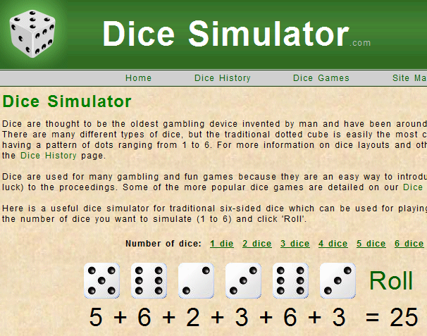
“Dice are thought to be the oldest gambling device invented by man and have been around since before 2000 BC. There are many different types of dice, but the traditional dotted cube is easily the most common with each side having a pattern of dots ranging from 1 to 6.”
With the advent of the Internet era, it seems that dice no longer have to be physical objects. Dice Simulator lets you choose from between 1 and 6 dice, and it uses pseudo-random numbers to mimic the rolling of the dice. There aren’t too many practical use-cases for this website, but it works:
7. Selleck Waterfall Sandwich: Erm, yeah…
The Internet is awash with websites dedicated to everything from cats that look like Hitler to beard contests, and you probably thought you’d seen it all. Until now, that is. Believe it or not, there is an entire website specializing in photographs containing former Magnum PI actor Tom Selleck, waterfalls and sandwiches.
Aptly titled Selleck Waterfall Sandwich, this Tumblr blog has countless Photoshop mock-ups of these three aforementioned entities, and this ranks pretty highly on the ‘huh?’ front:
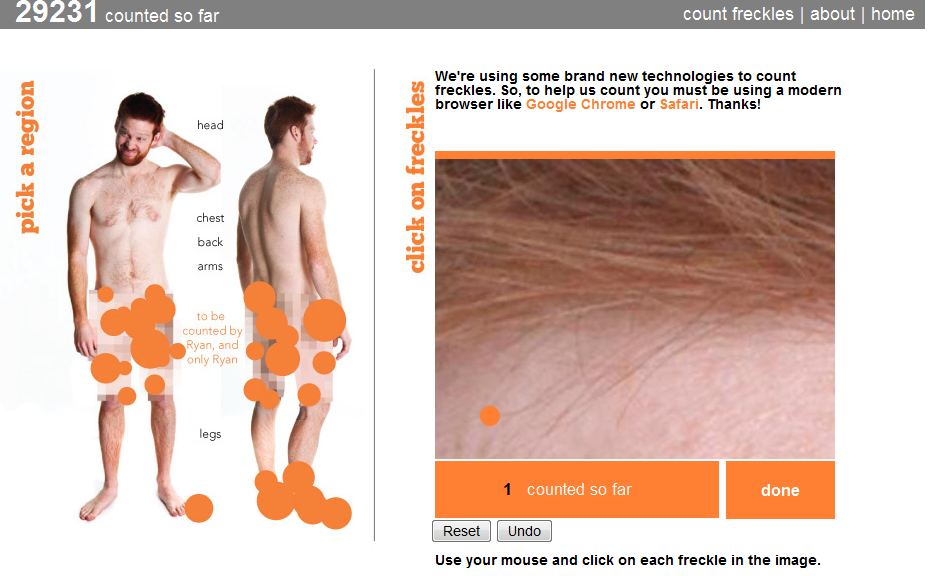
8. Freckle Count: A crowdsourced freckle-counting project
“This project has shown me parts of myself I’ve never seen before, nor did I ever want to see. I’ve certainly not felt so awkward, exposed or pale in my entire life. I suppose that’s the price you pay to count your freckles.”
Where to start? This isn’t actually a gimmick or a link-baiting website, Freckle Count is a genuine endeavor to have one man’s freckles counted by the global online populace. Every inch of Ryan’s body was photographed close-up, and visitors to the site click on a section of skin when they spot a freckle…and so on. The Freckle counter is currently at just over 29,000. Here’s a video of what was involved pre-project:
http://youtu.be/cJcKjbHDSp8
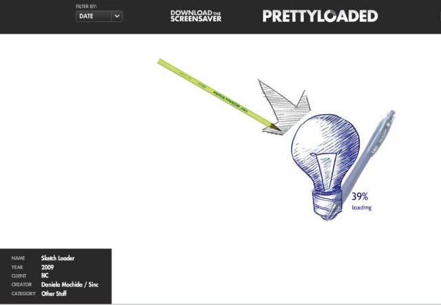
9. Pretty Loaded: Watch a website ‘load’…over and over and over
Nobody likes watching websites load do they? Thankfully, with broadband on tap these days, most websites load pretty quickly. But if you do have a penchant for watching animated ‘Loading’ graphics, Pretty Loaded is the site for you. It is actually mildly entertaining, seeing how imaginative people have been with some of the submissions on show here, and you can download these as screensavers too.
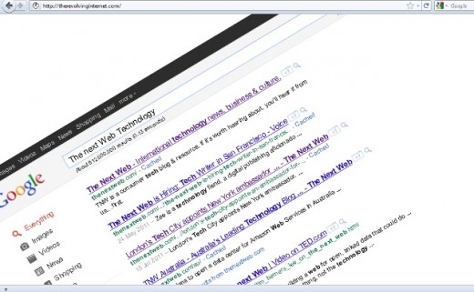
10. The Revolving Internet: Turn, turn, turn…
Oh boy, someone has actually developed a revolving version of the Internet. The Revolving Internet launches with Google swiveling in a clockwise manner. You can still enter text in the search box:
Whilst the site is revolving, The Windmills of your Mind plays in the background on loop. And when you arrive at your destination website…it continues to revolve too:
A completely pointless website, you’ll no doubt agree.
Over to you
Okay, these are just some of the random/pointless/’huh?’ websites out there. For every Amazon and YouTube, it seems there’s at least 10 Freckle Counts and Llama Fonts, so feel free to post your own suggestions in the comments below.
Get the TNW newsletter
Get the most important tech news in your inbox each week.
