
Big data is one of the largest idea trends of 2013, and the biggest question surrounding it has been figuring out the best way to interpret it all.
Whether you are a corporation trying to communicate earnings and innovations to investors, a designer looking for a job that needs a unique resume, an organization that needs to effectively communicate the issues they care about, or an educator teaching a challenging topic in a short amount of time, the problem remains the same: how do you take the wealth of information at your disposal and effectively simplify and present it in an engaging and informative way? One answer is infographics.
Infographics are graphic visual representations of data that are intended to present complex information quickly and clearly. The best way to explain an infographic is with another infographic (source: Customer Magnetism):
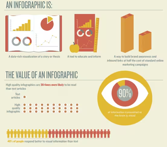
Infographics simplify information in a visually engaging way in order to attract and inform a large audience. The best infographic designers use basic principles of design to support the information presented and to make it more easily accessible to a larger audience or to target one particular audience over another.
No matter the purpose, as more and more content is being funneled through the Internet every day, infographics communicate an idea simply and quickly and is a huge asset for any brand, business, educator, designer, or blogger.
Here are ten different ways that infographics can be used.
A recruiting tool
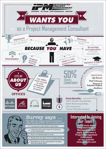
Infographics have long been used by designers on resumes as a way of visually simplifying their careers and highlighting specific skill sets in utilizing their own design style. At some point, recruiters realized they could use infographics to do the same thing but in reverse.
The infographic below was designed to recruit for a project management position and summarizes the skill set of an ideal candidate while also effectively communicating facts about the company itself.
Presenting survey data
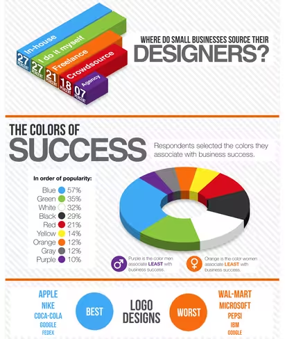
Infographics are highly useful for presenting results gathered from survey data. Statistics and numbers can overwhelm a lot of audiences, and therefore lose much of their significance. When organized in an infographic it becomes much easier to quickly draw meaning from data, as is evident in the example below.
It’s clear that design is “Very Important” to businesses (data that supports the need for infographics!) and that blue is the color most associated with success. Had this information been presented in a spreadsheet they would have most likely been much less impactful and not as easily understood upon first glance.
Simplifying a complicated concept
The core purpose of an infographic is to simplify a complex idea which makes them great educational tools, especially when presenting an overview of a topic instead of an in-depth analysis. One topic that it suits particularly well is the Bitcoin – a virtual currency that is simple to understand with a basic background knowledge of economics, but is still difficult to comprehend given its virtual nature.
Motion graphics are especially suited for Bitcoin because it is not only constantly changing and fluctuating in value, but also because there are so many different ideas, elements, and factors that go into the concept. Though a simple .jpg designer Duncan Elms effectively communicated its variability and movement in an engaging way. The video is brief but the viewer comes away with a greater understanding of a very complex concept.
Explaining how something works
In addition to simplifying complex ideas, infographics are often used to reveal the mechanics behind how intricate objects work.
Skilled designers can create infographics that pull apart complex products like cameras, iPhones, and clocks, and graphically explain their core features. The simplicity of the designs makes it easier to explain the function of each piece. In the example below, designer Jing Zhang went so far as to add an element of fantasy to each product, feeding into the reader’s imagination while accurately revealing how they work.

Comparisons
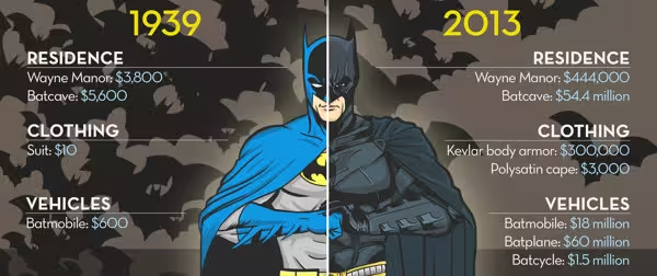
When drawing comparisons, infographics help organize similarities and differences by visually creating parallels that complement the information being presented. Comparisons can be difficult to express with words, sometimes to the point of being more confusing than revealing to the audience.
By presenting the same information in a neatly organized infographic, comparisons become clearer. Earlier this year, a series of infographics compared how the price of being a superheroes has changed from the year they were created to 2013.The infographics were effective because they made use of the changes in each superhero’s costume as a visual starting point.
Interesting facts
There are lots of interesting facts that aren’t quite interesting enough to be organized in simple lists. When displayed in an infographic, these facts can be brought to life. The designer’s interpretation of the facts, and how they should be organized, can attract readers and turn a previously uninteresting list or story into an engaging and enlightening piece of art.
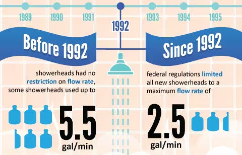
Facts related to showers are a perfect example. Showers are used (almost) every day by (almost) everyone, but if the information below were written as a paragraph it would most likely slip by unnoticed. However, when displayed as an infographic, the designer can organize relevant interesting facts into a visually appealing series digestible chunks that catch the eye and draw in an audience.
When words just don’t work
The perfect use of an infographic is to visually explain things that can’t be explained with words. Some concepts just don’t have words associated with them, or, as in the case below, some words don’t translate outside of their native tongue.
Maptia took words from foreign languages and illustrated them whimsically, adding an additional layer of understanding to each translation. Like infographics about interesting facts, the same information could have been communicated with a simple list, but the addition of visuals makes the information more inviting and engaging, and the foreign concepts are transformed.

Raise awareness
There is a lot of important information that is often dry or unpleasant, but that needs to be communicated to raise awareness of issues or concerns.Infographics can make information more interesting to read and more likely to be shared.
The example below is an infographic about pool safety and drowning [source], essentially a wealth of very important information about a slightly morbid but very real hazard. The typography, illustrations, and color palate all soften the presentation of the information while still effectively communicate its importance.
 Inform consumers
Consumers prefer making informed decisions so that they can be assured that they are spending their money wisely on something that will fit their needs. Businesses can instil confidence in their customers by presenting information that is relevant to purchasing decisions in easily accessible ways.
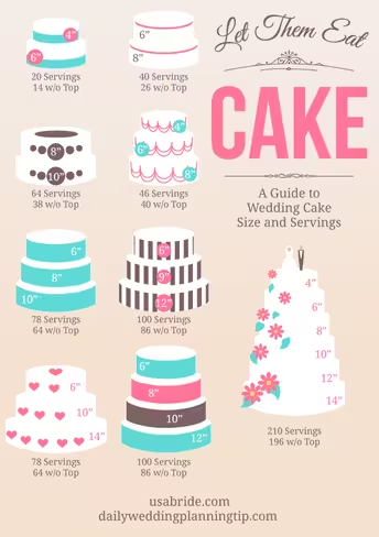
When planning an event, one of the greatest difficulties is making sure there will be enough food for the party. This infographic [source] simply illustrates the different cake shapes and the number of servings each will yield. The cake shapes are instantly recognizable and help facilitate the purchaser’s decision to go with one cake over another. There are so many other stresses associated with entertaining and an infographic that helps make at least one decision a little bit easier.
Leverage a holiday season
As the holiday season approaches, brands scramble to produce relevant celebratory content that’s still original. So, why not try an infographic?
The infographic below deconstructs the elements of a traditional Christmas dinner, offering little tidbits about everything that can be found on the table. Additionally it combines line drawings with photos of the food, an artistic style that differentiates the infographic from other holiday marketing. Come dinner time on the 25th, it’s not too difficult to imagine the little annotations as lines on the family tablecloth, informing everyone of the history behind the dishes they are about to enjoy.

This post comes courtesy of Fueled, a mobile design and development company based in New York and London. You can read more posts like it at the Fueled blog.
Header image credit: ra2studio
Get the TNW newsletter
Get the most important tech news in your inbox each week.


