Last week, we featured some of the most beautiful blogs that run as businesses. This week we’re taking a look at some of the most beautifully designed online stores.
We can admit that narrowing this list down to just 10 was pretty hard, but we got a little something in there for everyone. From makeup, to design, and clothing to crafts, these 10 stores have some pretty unique layouts, and some pretty cool products to go along with them.
Balancing a beautiful layout, which is easy to navigate and showcases your products, can be a huge challenge, and there are certainly a whole bunch of online stores out there that are doing it all wrong. These 10, on the other hand, have got their finger firmly on the pulse of beautiful design, and more.
Hu2
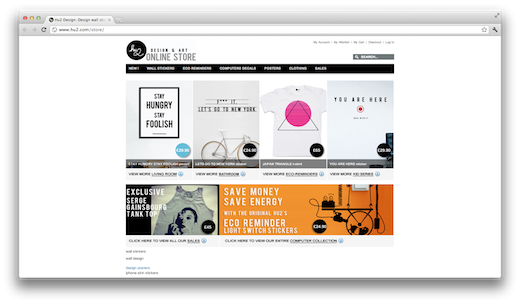
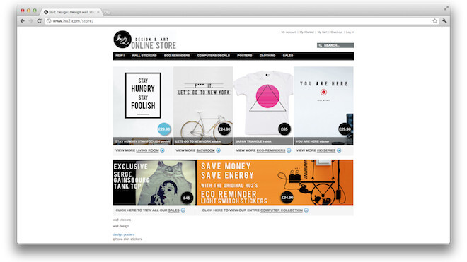
You would only expect the best from an online design and art store and Hu2 definitely delivers.
The homepage features some of Hu2’s main collections, as well as some select t-shirts, stickers and posters. The London and Paris-based design agency is best known for its eco-decals that fit snuggly alongside electricity switches and outlets, as a beautifully designed reminder to conserve energy.
Dakine
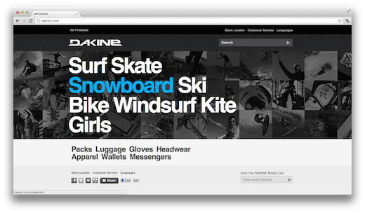
Dakine is a store specializing in the skater, surfer, snowboarding world. With everything from clothing to tools to bags, there’s a lot of products featured on the site.
The homepage layout with a grid of active photos, along with a bold font pulls the viewer right in, makes navigating the site to your preferred products as easy as ever.
Converse
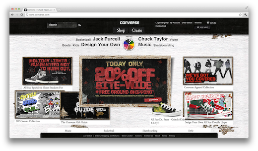
Our favourite feature by far on the site is the ability to filter designs by colour, so each page becomes a beautifully colour-coordinated showcase of some pretty cool shoes.
Rice Bowls
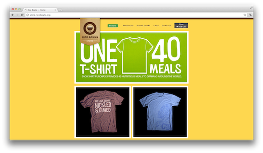
The online store features some awesome t-shirts, and one t-shirt can provide 40 meals for an orphaned child. The site’s colourful design, touching photos and great graphics make it an easy choice for this list, and the fact that it’s all for a good cause, is the cherry on top.
Etsy
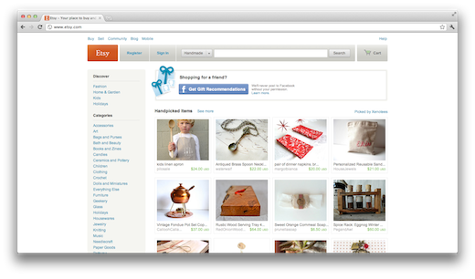
What really stands out about the site’s design and layout is the way that editors painstakingly go through the thousands of daily submissions, and create a gorgeously colour-coordinated front page.
Its attention to detail coupled together with a clean and minimal design make it one of the prettiest online stores on the Web today.
Zara
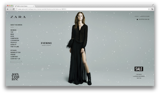
The site does exactly what it aims to do – make viewers lust after Zara’s threads. The snowflakes fluttering across the screen accompanying the winter collection usually come across as pretty cheesy on most websites, but for some reason, it simply works here.
The full collection is featured in a simple, minimal grid, while each piece opens up in an individual full screen photo.
Pussies on Parade
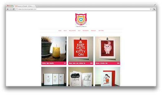
The hot pink accents and modern kitty logo give the page that little extra bit of kick that it needed to earn it a spot on this list.
Blik
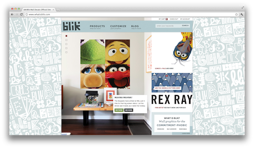
Founded in 2002, Blik bills itself as the world’s first removable wall graphic company. The whimsical design of the site goes perfectly hand-in-hand with the cute, modern posters, and if you manage to close the site without buying at least one product – we’re impressed.
Tattly
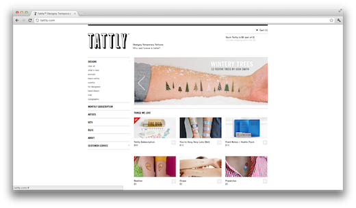
Of course the über cool removable tattoo designs that are featured on the site don’t hurt either. The available temporary tattoos will appeal to any geek, designer, or just about anyone who has a taste for something a little different and creative.
Mac Cosmetics
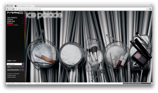
The black background, neon accents and borders, along with full screen photos of the products make it a joy to navigate the site.
What are you favourite, beautifully designed online stores? Let us know in the comments.
Get the TNW newsletter
Get the most important tech news in your inbox each week.
